Monday, February 27, 2006
Museum Ink
 Paul Werner's new book, Museum, Inc.: Inside the Global Art World, is going to make some people at the Guggenheim very unhappy. Staff there become a little tetchy when the infamous motorcycle and Armani shows are dragged up and used as cheap shots. But occasional blog snark is child's play next to Werner's more sustained critique.
Museum, Inc. takes its share of cheap shots (many of which are spot on and quite funny), but it also makes a serious case for why these two notorious shows stand for something important that shouldn't be forgotten. Of them and former director Thomas Krens, Werner writes:
Krens imagined that circulating new objects (bikes or blouses) through auratic channels (museums) would automatically confer an aura on them and authority on the museum.... His critics were wrong to claim Krens was trying to commodify culture: he was trying to culturificate commodities, and he failed.The failure wasn't total, though. Werner, a former lecturer at the Guggenheim, writes about engaging with his groups and about those groups engaging with the bikes in unusually intense ways. The Guggenheim's failure was not in hosting these shows. It was in not challenging the current paradigm of how a museum could and should interact with its visitors.
The Guggenheim dramatically expanded its reach during the Krens years, but it never looked beyond the admissions numbers at the quality of its visitors' experiences. The numbers, and the numbers alone, mattered. Of the first (and only) Krens expansion that was an unqualified success, Werner writes:
Bilbao was supposed to demonstrate that the Guggenheim had amassed a certain experience in attracting audiences, and the Guggenheim was saying it could sell that intangible experience.... The Guggenheim's stated mission was no longer making art available to an audience, it was delivering "its" audience to a new sponsor."Get them in the door first," management seemed to be saying. "We'll worry about what happens once we've got them." But no one at the Guggenheim ever worried much about what happened when people showed up. That's where Werner becomes most vocal. Working on the front lines--where curatorial outputs meet admissions desk inputs--Werner found the museum's worst failure.
He decided to step into the gap by making institutional critique a standard part of his lectures. If the exhibition is weak and if the institution is condescending to the people coming to see it, why not enlighten them on both points? The people loved it, Werner says, and no one at the museum ever knew that he was lifting the curtain to show visitors the little man pulling the levers. Why? Because museum management never bothered to spend time on the floor during opening hours.
Like other titles in the Prickly Paradigm Press line, this short work (a thin 76 pages that can be digested in a single sitting) is lively and passionate--sometimes so much so that the rigor of argument and exposition gets short changed. But for those interested in the current state of the art in museum management, Werner leads an interesting tour through the museum that has embraced corporate models for growth more openly than any other. And he's got plenty of good stories to tell along the way.
Friday, February 24, 2006
News Flash: Curators Are Not Artists
There's plenty of opportunity to edit that syntactical construction for use in the artworld. Let me try it this way: "Those who can't paint-sculpt-draw-make prints-take photographs-assemble installations-perform-film-conceptualize-or otherwise create art objects or environments, curate. Those who can't curate, curate art blogs."
So now that I've taken a dig at myself, let me give a well deserved poke to the curatorial class.
Everyone wants to assume that his or her job is important. The smarter the people are who tend to hold a job, the more important the job tends to become in their own eyes. (I've seen this at its worst; I used to be an academic.)
I don't know why it's happening all of a sudden, but lately I'm starting to get tired of curators who become so enamored of their own process that they stop thinking about the art they are presenting for display and viewers' engagement with it.
I'm sure lots of you have stories about cases where this has happened, but the most visible manifestation of this tendency is the press release. At least one annoying one arrives in my inbox every day. You can tell that the release has been written by a striving curator when it spends paragraph after paragraph explaining the lofty theme behind the show but never quite gets around to describing the work that's going to be shown.
 But the one case of curatorial self-aggrandizement that has caused me to raise my eyebrows especially high recently is the Wrong Gallery's contribution to this year's Whitney Biennial. The trio of Maurizio Cattelan, Massimiliano Gioni, and Ali Subotnick were given the Gilman gallery on the museum's mezzanine level. For the space, these three have selected works from the Whitney's collection (with a few outside additions) that show representations of the outlaw in American culture.
OK, you get what's going on here, don't you? With this installation, the Biennial's curators have defined curating to be an artistic activity.
Sure, curating is creative work. No question about it. The best curators are incredibly creative people. But the act of curating is fundamentally different than the act of creating a work of art. I'm all for expanding the bounds of what constitutes artistic practice, but this goes too far. Call me old school if you want, but I'll stick by my guns on this point.
I shouldn't be so surprised, though, by the decision to self-justify in this way. This year's Biennial curators, Chrissie Iles of the Whitney and Philippe Vergne of the Walker, pretty much completely embarrassed themselves by admitting to Artforum that they've invented an imaginary friend to validate their labor while they've been working on the show. She even gets a catalogue credit. (But she's now got more than just a catalogue credit. Their admission has given rise to a spritely blog where the jokes made at their expense tend to be so esoteric that even I don't get most of them. But I do dig the site's soundtrack.)
Fortunately, though, I sense that there's a backlash developing. SITE Santa Fe announced the line up for its biennial this week, and curator Klaus Ottmann made sure to be quoted in the first paragraph of the press release with a very sensible statement, "I want this Biennial to be about the artists, not about the curator." That he felt the need to do this says something about the state of the curatorial profession today.
Thursday, February 23, 2006
Current Chelsea Picks
 Two shows in Chelsea have caught my attention over the last couple weeks.
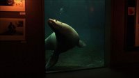
At Alona Kagan Gallery, Pawel Wojtasik is screening his latest video project, The Aquarium. Filmed mainly at the Sea Life Center in Seward, AK, the work juxtaposes the unbounded expanse of Alaska's Resurrection Bay with the close confinement experienced by sea mammals held in captivity at the aquarium.
Much like Wojtasik's earlier work Dark Sun Squeeze, the long gaze and rhythmic flow of the piece force viewers into a meditative state while calling attention to a deeper issue--in this case, the aquarium as simulacrum of a natural environment that is rapidly disappearing. When I visited Seward in 2003, I was standing at the edge of the bay right next to the Sea Life Center when I spotted a large sea mammal swimming in the waters just off shore. Why, I wondered, would anyone choose to visit a re-creation of this breathtaking natural environment when the real thing existed right there? Wojtasik raises that question, along with others about humans' treatment of the environment and the ethics of animal captivity, in this transfixing piece.
 I've had Andrea Zittel's show at the New Museum, Critical Space, listed in the sidebar for a few weeks now, but I haven't posted anything about it. I'm still not completely decided about the exhibition, but the fact that I keep returning to think about it tells me that there's something of interest there.
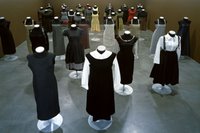
Typically when we think of the design process, we think of the end product being a mass-produced item. Zittel works very much in the design tradition, and I find that I'm intrigued by her embrace of design practices for her projects. Her creation of one-offs and functional (but not mass-marketable) objects somehow elevates the outputs she produces to being contemplative objects that still retain their full functionality.
Not all her work is of the same quality, though. Many of the small paintings and the conceptual project documented in a large photo-based installation fall flat. But Zittel's clothing and live/work spaces force viewers to rethink their own relation to the products with which they surround themselves every day.
Pawel Wojtasik, The Aquarium, at Alona Kagan Gallery through March 4, 2006.
Andrea Zittel, Critical Space, at the New Museum of Contemporary Art through May 27, 2006.
Wednesday, February 22, 2006
Why This Is the Only Post I'll be Publishing on This Year's Armory Show
 A few weeks ago I decided to go all mainstream, so I requested press credentials for next month's Armory Show. I even mentally checked off several of the requirements as I was completing the form: art press, international audience, an assignment from my editor (moi). I even had the application in way before the deadline.
So I was surprised, sort of, to get notification yesterday that I could not be "accommodated." Thinking that this was an opportunity to educate another PR flack about this blogosphere thingie, I fired back a note, listed some of my bona fides, dropped the number of unique visitors the site receives annually, mentioned who these readers (you) are, and implied how it would be to the fair's benefit to have me attend.
Here's the response I received in return:
So it's not that they don't understand the blogosphere. It's that they don't understand me!No, it's not about blogs. Every request is reviewed on a case by case basis.
We reviewed your coverage of last year's show and we do not find that it meets our criteria for a press pass.
Warm Regards,
Pamela Doan
Communications Director
The Armory Show, Inc.
As I didn't attend last year's fair on a press pass and as the silly piece I wrote wasn't really even about the fair, I figure that the folks at the Armory Show just don't have a sense of humor. Or that they're total control freaks who carry grudges. Or maybe both.
Update: I don't feel quite so all alone now.
Tuesday, February 21, 2006
Rauschenberg and the Art of Collaboration
 In between viewings of the Rauschenberg show at the Met, I've been reading Calvin Tomkins's recently reissued book, Off the Wall: A Portrait of Robert Rauschenberg.
Throughout the book Rauschenberg emerges as an anti-Romantic hero. There are plenty of scenes that show him working away in obscurity in his New York version of a garret. But rather than presenting him as an isolated, solitary genius whose vision changes the world around him, Tomkins shows Rauschenberg to be at his best when he's working in collaboration with others.
Throughout the book, Rauschenberg comes across as a catalyst, rather than a solitary creator. In his presence, objects, ideas, and the work of other artists engage and combine in ways that would not have been possible without him. Rauschenberg, meanwhile, loses none of his own creative power through the reaction.
This notion, artist as catalyst rather than creator, is the most interesting thing to emerge from Tomkins's work, but he stops a few steps short of completing the picture. Because, I believe, he and Rauschenberg have a long standing friendship and because Rauschenberg has always been reserved (if not secretive) about his personal life and his sexuality, Tomkins avoids going into detail on what could well be the most important story to be told about twentieth-century American art history--Rauschenberg's relationship with Jasper Johns.
Granted, there are several scenes in the book of these two as young men working in their studios a floor apart, critiquing each others' work, and sharing ideas. But this relationship coming as it did at such a crucial point in both artists' development really ought to be examined in more depth. Of their eventual falling out, Tomkins has only this to say:
They both went up to Connecticut College in the summer of 1962, to work with Merce Cunningham, who was there under the college's dance residency program. By the time the summer ended they were no longer together. The break was bitter and excruciatingly painful, not only for them but for their closest associates--Cage and Cunningham and a few others--who felt that they, too, had lost something of great value.And of the lifelong animosity that has remained between the two after their split, we get only this from Tomkins:
I would love to read a more detailed version of how these two worked together during the early-1960s as their individual styles developed and as they supported each other emotionally in the years before they began receiving market acceptance for their work. A detailed portrait of the relationship in these years would provide incredible new insight into the work of both artists and might even provide new thoughts on the nature of collaboration itself.Rauschenberg came to Johns's opening [for his 1977 Whitney retrospective], and at one point in the evening he even tried to tell Johns how he felt about seeing the paintings all together, but it was no use, they could not talk to each other any more on that level.
Sadly, though, there are only two people who could provide the detail necessary to write this account. And they're still not really speaking to (or about) each other.
Thursday, February 16, 2006
Playing It Straight, Or Not
All that may change, though, when the Biennial opens next month. I'm taking this, from a press release issued today by the Whitney, as permission to play a little fast and loose with the truth this time around.
The Biennial features an ongoing performance throughout the run of the exhibition. The artist Momus will appear at random times, in random locations, to offer improvisational tours. Wearing a costume and equipped with a portable sound system, Momus leads visitors into the realm of the imagination with freely invented "unreliable" tours that open up new possibilities for experiencing the Biennial.I don't have my costume (a costume!) designed yet, but the little details like that will take care of themselves when the time arrives.
Tuesday, February 14, 2006
So Who's Supporting This Stuff?
Earlier today Greg Allen posted a dismissive response that Artnet editor Walter Robinson sent him after receiving Allen's letter of complaint about Finch's most recent piece. Robinson, it seems, has no issue with using Artnet's name, credibility, and 2M monthly page views to support Finch's predatory work.
I wonder, though, if Artnet's advertisers feel the same way. On one recent page load of the Finch piece, the following organizations' ads appeared in the right-hand sidebar:
- Tobey Fine Arts
- Nicole Klagsbrun Gallery
- The Caldwell Gallery
- Western Project
- Stella Vine
- Alan Koppel Gallery
- Worthington Whittredge
- Guy Hepner Contemporary
- Master Wan Ko Yee
- Artsystems
- Natural History Museum of Los Angeles County
- Oxford University Press
- ARCO
- Art New York at Pier 94
Monday, February 13, 2006
Monday Morning Linkage
- I once overheard a couple standing in front of a Jackson Pollock painting having a serious discussion about what it was a painting of. The man insisted that he saw a horse in the painting. The woman couldn't make it out. With a little help from Photoshop, Edward Winkleman makes the case for one Pollock work as a self-portrait. You determine how persuasive the argument is.
- Unless you've been living under a rock for the last week, you know by now what's happened at the Getty. Given the terms of Munitz's departure, I predict that the story isn't over.
- Planning to make a purchase on the secondary art market? Be sure to do your homework first.
- It's been, what, four or five years now that art blogs have been around? It's hard to believe that some people still don't get it.
- All hail the well conceived hoax.
- I've always wondered what happened when pieces donated for charity auctions don't sell. (Updated.)
- And, finally, what do I have to do to get a dinner invitation?
Thursday, February 09, 2006
Calling All Guerrilla Girls
At first Finch's studio visit peccadilloes were sort of funny--in an incorrect kind of way. Then they started to become troubling. Now, with the sense of exploitation that is creeping in, they're just plain disturbing. Seriously disturbing.
Update: This post has generated more email than anything else published here recently. For a taste of how sentiment is running, see other posts on the topic by Brian Sholis and Edna V. Harris.
But Seriously, Folks
There are only two things MoMA can do with it: nothing or site specific installations.
The museum's design, frequent visitors have realized, is stultifyingly "corporate," for lack of a better word. To a certain extent, that's what the board asked for when it made the choice to go with Yoshio Taniguchi over an architect known for creating new ways of thinking about and using space.
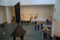 Taniguchi built the museum around this gigantic, non-functional space, co-opting a 1980s corporate move designed to display institutional power and prestige. Dedicating so much space to nothing more than enabling oblique sight lines between galleries says something--especially when it's in a building situated on a block that has what must be some of the most expensive real estate per square foot of any place in the country. MoMA's got dough, it proclaims. Dough enough to burn. No other institution can burn as much dough as MoMA.
The purpose of the space, then, is to display the power, dominance, and prestige of the institution. With that being the case, there's no incentive to actually use the space for anything. Sitting empty--displaying a few pretty pictures that get lost on the walls and a massive sculpture so large that it really ought to be shown outdoors--the space accomplishes the function it is supposed to serve. So, by doing nothing with it, MoMA is allowing the space to do exactly what it is supposed to do.
But it does seem to be a shame to waste that much real estate. Since the space itself is about spectacle (the spectacle of MoMA's largesse), the only suitable use for it (if a function has to be imposed on it) is as a container for spectacle. Used in any other way, the space itself will always overpower whatever it houses.
So MoMA could take a page from the Tate Modern's playbook and commission site-specific installations for the atrium. Artists forced to wrestle with massive, ungainly spaces like the Turbine Hall or like MoMA's atrium can come up with brilliant works. Think of Olafur Eliasson's The Weather Project and Bruce Nauman's Raw Materials. There's always the chance, though, that an individual work (like Rachel Whiteread's Embankment) won't quite rise to the occasion.
Wednesday, February 08, 2006
What to Do with That Atrium?
 MAN asks; FtF answers: Guggenheim MoMA.
Lease the atrium space to Thomas Krens for 99 years, commission Zaha Hadid to design a building within the building, and then rent the space out to (I mean "partner with") corporations to show exhibitions of their products (I mean "work;" no, I mean "cutting edge design;" no, I mean "products").
Since he's already done fashion and transportation, Krens could even open with a film company. A company like, maybe, Pixar.
Oh wait. Scratch that. The Pixar part. But keep the Guggenheim MoMA part. That hasn't been done yet.
Monday, February 06, 2006
Bingeing on Museum Mile
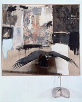 Rauschenberg at the Met: Each time I go back to see this show, I like it more, although I still feel somewhat like Alfred Barr did about Rauschenberg's work from this period: I respect it, but I just can't make myself get completely passionate about it. Barr passed up the opportunity to purchase several of the pieces in this show for MoMA back when the getting was good--and cheap. It's a treat to see all of these great combines reunited back here in the city of their creation: both halves of Factum, Canyon (at right), Monogram, the bed, etc. (OK, so two of these pieces are owned by MoMA, but just think what could have been if Barr hadn't been so worried about vermin nesting in the goat's hair.) What a shame, though, to have several of the works on display boxed up behind half-inch thick Plexi. Seeing the infamous angora goat caged like this is almost no better than not seeing the beast at all. Best conversation I've overheard in the galleries: a father saying to his young son, "See that chicken up there. It was lucky. Most chickens end up getting eaten, not shown in museums." There's something interesting about that comment. Rauschenberg's best combines all have taxidermied animals--or parts of animals--in them. And I'm not the only person I know who has come to this conclusion after seeing the show.
 - David Smith at the Guggenheim: Finally, a serious, scholarly exhibition that has been wonderfully installed at the Guggenheim. It's enough to make the largest spiral ramp in the city look like it's a museum again instead of a trade show hall for rent. While this exhibition made me realize that I actually appreciate Smith's work more in smaller quantities, the show has made the Guggenheim look better than it has looked in ages. All the disadvantages of Wright's awkward bays and uneven floors disappear in the presence of Smith's airy, massless metal sculptures. If you go to see the show, pay special attention to the pedestals on which the sculptures sit. Each has had to be created with an uneven bottom to provide a horizontal surface on which to display the work.
- Egon Schiele at the Neue Galerie: This small exhibition of exquisitely troubling drawings shows Schiele to be the father of just about every artist making drawings today. Perhaps "the unconscious" would be a better metaphor since most young turks probably don't even know who Schiele was. If they did, though, his work would blow their minds.
- And coming later this week to the neighborhood: The Hudson River School gets tossed across the Park as the New-York Historical Society closes its impressive permanent collection show and the National Academy Museum opens two new ones: a selection of works from Frederic Church's own collection and an exhibition of Hudson River School works from the Henry and Sharon Martin Collection.
Wednesday, February 01, 2006
I Can't Believe My Spam Filter Let This One Through
 I could hardly believe my eyes when I started reading this blast email sent out today by the Museum of Contemporary Art in Chicago.
 While this come on doesn't really turn my crank, the hotness that is me predicts that the MCA will see a full house (but very little interest in the art) this coming Friday.Remember those long stemmed roses from a "secret admirer" that were whisked into your office last February 14? We know you ordered them for yourself. It's cool -- we've all been there. And as sexy as self-love is, we also know that you might be looking to meet a real, live admirer who understands the hotness that is you this Valentine's Day. That's why we made some plans for you this Friday night.
Sexplicit plans, no less.
Hook up with us on February 3 for our Sexplicit First Fridays. Get it on to the soulful sounds of DJ Squeeze, satisfy your desire for drink with an Absolut Ladykiller Cosmo or Maneater Martini, find that special someone at our Love Post Office, and enjoy daring insights from the sexperts at Early to Bed. The latest 12 x 12: New Artists/New Work exhibition will debut, featuring the work of Dianna Frid.