Thursday, February 09, 2006
But Seriously, Folks
OK, so seriously now. What to do what that atrium?
There are only two things MoMA can do with it: nothing or site specific installations.
The museum's design, frequent visitors have realized, is stultifyingly "corporate," for lack of a better word. To a certain extent, that's what the board asked for when it made the choice to go with Yoshio Taniguchi over an architect known for creating new ways of thinking about and using space.
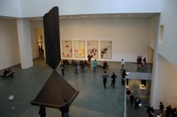
 Taniguchi built the museum around this gigantic, non-functional space, co-opting a 1980s corporate move designed to display institutional power and prestige. Dedicating so much space to nothing more than enabling oblique sight lines between galleries says something--especially when it's in a building situated on a block that has what must be some of the most expensive real estate per square foot of any place in the country. MoMA's got dough, it proclaims. Dough enough to burn. No other institution can burn as much dough as MoMA.
The purpose of the space, then, is to display the power, dominance, and prestige of the institution. With that being the case, there's no incentive to actually use the space for anything. Sitting empty--displaying a few pretty pictures that get lost on the walls and a massive sculpture so large that it really ought to be shown outdoors--the space accomplishes the function it is supposed to serve. So, by doing nothing with it, MoMA is allowing the space to do exactly what it is supposed to do.
But it does seem to be a shame to waste that much real estate. Since the space itself is about spectacle (the spectacle of MoMA's largesse), the only suitable use for it (if a function has to be imposed on it) is as a container for spectacle. Used in any other way, the space itself will always overpower whatever it houses.
So MoMA could take a page from the Tate Modern's playbook and commission site-specific installations for the atrium. Artists forced to wrestle with massive, ungainly spaces like the Turbine Hall or like MoMA's atrium can come up with brilliant works. Think of Olafur Eliasson's The Weather Project and Bruce Nauman's Raw Materials. There's always the chance, though, that an individual work (like Rachel Whiteread's Embankment) won't quite rise to the occasion.
There are only two things MoMA can do with it: nothing or site specific installations.
The museum's design, frequent visitors have realized, is stultifyingly "corporate," for lack of a better word. To a certain extent, that's what the board asked for when it made the choice to go with Yoshio Taniguchi over an architect known for creating new ways of thinking about and using space.
 Taniguchi built the museum around this gigantic, non-functional space, co-opting a 1980s corporate move designed to display institutional power and prestige. Dedicating so much space to nothing more than enabling oblique sight lines between galleries says something--especially when it's in a building situated on a block that has what must be some of the most expensive real estate per square foot of any place in the country. MoMA's got dough, it proclaims. Dough enough to burn. No other institution can burn as much dough as MoMA.
The purpose of the space, then, is to display the power, dominance, and prestige of the institution. With that being the case, there's no incentive to actually use the space for anything. Sitting empty--displaying a few pretty pictures that get lost on the walls and a massive sculpture so large that it really ought to be shown outdoors--the space accomplishes the function it is supposed to serve. So, by doing nothing with it, MoMA is allowing the space to do exactly what it is supposed to do.
But it does seem to be a shame to waste that much real estate. Since the space itself is about spectacle (the spectacle of MoMA's largesse), the only suitable use for it (if a function has to be imposed on it) is as a container for spectacle. Used in any other way, the space itself will always overpower whatever it houses.
So MoMA could take a page from the Tate Modern's playbook and commission site-specific installations for the atrium. Artists forced to wrestle with massive, ungainly spaces like the Turbine Hall or like MoMA's atrium can come up with brilliant works. Think of Olafur Eliasson's The Weather Project and Bruce Nauman's Raw Materials. There's always the chance, though, that an individual work (like Rachel Whiteread's Embankment) won't quite rise to the occasion.