Thursday, June 30, 2005
A Monument to Disappointment
 If you do project-based work in a corporate environment for long enough, you're certain to run across a project that turns out to be impossible to complete to anyone's satisfaction.
Too many people have a political stake of some sort in the outcome. None of them want to be involved or helpful, and no one really cares about the project's ultimate success. But they all need to make sure that what's eventually delivered has some aspect to it that they can use to cover their ass someday in the event of failure.
The team running the project on a day-to-day basis gets fed up with the work. There's no way they can win because the project hasn't been set up to succeed. Every creative, novel, or unique idea they have tried to implement has been killed off by the whim of one stakeholder or another. Team morale plummets. Instead of wanting to deliver a winning solution, they begin wanting the project to be over, no matter how mediocre the final product. So everyone holds his or her nose and puts in long hours to finish off something that no one is proud of.
The individual who holds ultimate responsibility for the work eventually stands up in a big meeting somewhere and presents the results. Everyone involved in the effort knows that the works is mediocre, but no one admits it. (Maybe it's not a total disaster, but it's nowhere near what everyone thought they would be able to deliver in the early, heady days of the effort when anything seemed possible.) Instead, the team leader claims victory, and everyone moves on--hoping that no one asks them if they worked on this project when they interview for their next job. And people on the team will be interviewing for that next job shortly because working on this project has caused them to hate their company, their bosses, their client, and perhaps even their choice of a profession.
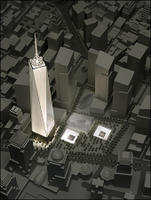
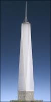 This scenario occurs all the time in corporate America. It's just that this week the results of one such project have played out in a very public way on a very large scale--a 1,776 foot scale to be exact.
Behold, Skidmore, Owings, and Merrill's revised plans for the Freedom Tower--disappointment made tangible, on a monumental scale. Or, rather, disappointment that will be made tangible by 2010.
A 200-foot high wall of concrete at ground level--right next to the planned World Trade Center Memorial? Every innovative feature of the somewhat lackluster original design stripped away in this version? Damn it. What a wasted opportunity.
The situation is almost enough to make me nostalgic for the days of Robert Moses, when a single individual with a strong vision had enough political power to realize revolutionary public works. In the absence of that power, we get buildings like this--an embodiment of the lowest common denominator result that occurs when politicians and bureaucrats design by committee and architects agree to do their bidding.
Related: New York Times slideshow of the new design. NY Times architecture critic Nicolai Ouroussoff doesn't attempt to hide his disappointment with the new design.
Wednesday, June 29, 2005
Good Reads
A couple interesting things have popped up around the internets this morning.
Artnet has a piece about the real-life adventures of a real-life art handler. The piece made me think of some funny stories I heard recently (which I can't really share) about the installation of the Smithson show.
Via ArtsJournal today, the Times (the other one) has an interesting piece on corporate art collections. There's nothing too terribly revealing in the piece, but I did love this bit. Call it "art history in the elevator":
Over at [Deutsche Bank] corporate headquarters, the twin towers building in Frankfurt, “one of the briefest attempts at art history ever made can be seen in the lifts”. Every one of its 55 floors is named after a particular artist, and when you reach, say, floor B — Beuys — you get “ the inevitable picture of him in his felt hat”, a statement about his work, and various works on paper. “Travelling down the building the artists get younger and younger,” comments Hicks. “The floors are arranged chronologically.”Only the Germans.
Dia: Beacon, Two Years Later
Last weekend I paid my first visit to Dia: Beacon since shortly after it opened. I couldn’t help but notice how little has changed there in the last two years, and I was surprised by how mediocre much of what’s on display seems now that the gloss of the grand opening has worn away.
When Dia: Beacon opened in a former Nabisco box factory in May 2003, the building and the collection it housed were received with a level of media and public attention not to be topped until MoMA opened its renovated Midtown home last year. The facility drew 100,000 visitors in its first six months (against an opening year projection of 60,000) and received ample coverage in the art and mainstream press—including a cover story in the New York Times Magazine.
Two years later, the institution pushes ahead, offering a few, small special exhibitions but sticking close to its mission of presenting long-term (very long-term) installations of works by select artists.
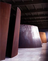 On the one hand, this is a blessing. The three Richard Serra torqued ellipses and one torqued spiral housed in the building’s former train shed (at right) are so wonderful that it would be a shame to ever take them off view. Ditto for the large number of works by Fred Sandback that Dia: Beacon shows. Sandback’s simple yarn pieces, the most minimal of all the minimalists’ work, never receive this much attention elsewhere.
But much of the work at Dia: Beacon is second-rate work by well-known artists. Walter de Maria’s The Equal Area Series just isn’t up to the task that it’s asked to perform in the building’s long, long, light-filled opening galleries. I would much prefer to see Dia move de Maria’s The Broken Kilometer out of its Soho home and install it in these galleries. This space, with its long sight lines and beautiful light, would be the perfect location to view this much more interesting piece.
Along with de Maria, Andy Warhol gets too much space for what is pure second-rate work. His Shadows series, installed in a large gallery here for the long term, failed to impress me the first time I saw it. It failed again this time. One current special exhibition “Dia’s Andy: Through the Lens of Patronage” trots out a host of mostly mediocre works from the era when Warhol was more interested in making a buck than in making art. Seeing all these horrible, formulaic celebrity portraits from the 1980s gathered together in one place does nothing to enhance his reputation, Dia’s reputation, or the reputation of the Warhol Museum which now owns the pieces.
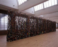 Dia’s mission has always been in its commitment to a limited number of artists and its willingness to collect their work in depth. In some cases that’s a strength. Dia’s collection of Dan Flavin’s works is outstanding. So is its selection of John Chamberlain’s pieces (at right). But often this approach results in Dia holding a few remarkable works by an artist and dozens of mediocre ones. The display of Robert Ryman’s works illustrates this weakness. Two or three of his pieces on view are stellar. A number are good. The vast majority are not notable in any way.
To devote so much space to so much mediocre work by so many artists for such long periods of time makes me think that other opportunities are being missed. Fortunately, the high points of the collection (the Serras, the Sandback installation, the Judd pieces, the Flavin Monuments for V. Tatlin, the special exhibition of Agnes Martin paintings from the 1960s, and Michael Heizer’s Negative Megalith which takes my breath away each time I see it) more than offset that limited sense of disappointment.
When Dia: Beacon opened in a former Nabisco box factory in May 2003, the building and the collection it housed were received with a level of media and public attention not to be topped until MoMA opened its renovated Midtown home last year. The facility drew 100,000 visitors in its first six months (against an opening year projection of 60,000) and received ample coverage in the art and mainstream press—including a cover story in the New York Times Magazine.
Two years later, the institution pushes ahead, offering a few, small special exhibitions but sticking close to its mission of presenting long-term (very long-term) installations of works by select artists.
On the one hand, this is a blessing. The three Richard Serra torqued ellipses and one torqued spiral housed in the building’s former train shed (at right) are so wonderful that it would be a shame to ever take them off view. Ditto for the large number of works by Fred Sandback that Dia: Beacon shows. Sandback’s simple yarn pieces, the most minimal of all the minimalists’ work, never receive this much attention elsewhere.But much of the work at Dia: Beacon is second-rate work by well-known artists. Walter de Maria’s The Equal Area Series just isn’t up to the task that it’s asked to perform in the building’s long, long, light-filled opening galleries. I would much prefer to see Dia move de Maria’s The Broken Kilometer out of its Soho home and install it in these galleries. This space, with its long sight lines and beautiful light, would be the perfect location to view this much more interesting piece.
Along with de Maria, Andy Warhol gets too much space for what is pure second-rate work. His Shadows series, installed in a large gallery here for the long term, failed to impress me the first time I saw it. It failed again this time. One current special exhibition “Dia’s Andy: Through the Lens of Patronage” trots out a host of mostly mediocre works from the era when Warhol was more interested in making a buck than in making art. Seeing all these horrible, formulaic celebrity portraits from the 1980s gathered together in one place does nothing to enhance his reputation, Dia’s reputation, or the reputation of the Warhol Museum which now owns the pieces.
Dia’s mission has always been in its commitment to a limited number of artists and its willingness to collect their work in depth. In some cases that’s a strength. Dia’s collection of Dan Flavin’s works is outstanding. So is its selection of John Chamberlain’s pieces (at right). But often this approach results in Dia holding a few remarkable works by an artist and dozens of mediocre ones. The display of Robert Ryman’s works illustrates this weakness. Two or three of his pieces on view are stellar. A number are good. The vast majority are not notable in any way.To devote so much space to so much mediocre work by so many artists for such long periods of time makes me think that other opportunities are being missed. Fortunately, the high points of the collection (the Serras, the Sandback installation, the Judd pieces, the Flavin Monuments for V. Tatlin, the special exhibition of Agnes Martin paintings from the 1960s, and Michael Heizer’s Negative Megalith which takes my breath away each time I see it) more than offset that limited sense of disappointment.
Tuesday, June 28, 2005
Surprises at the Smithson Show
I have been looking forward to seeing the Robert Smithson retrospective since well before it opened in LA last year. I finally had my chance last Sunday at the Whitney, and it would be fair to say that my expectations weren't met.
I was surprised by several things:
Like the other films included in the show it's hokey and arrogant. Smithson starts the film with close-up images of the sun and shots of dinosaur skeletons in a museum. (The dinosaur shots, for some reason, were taken through a red filter.) By doing so, he chooses to situate Spiral Jetty in the context of nature and natural history. Throughout the film Smithson keeps the view of Spiral Jetty closely cropped so that nothing other than his work and the work's immediate surroundings is visible. This effectively established the framework for critical discussions of the work that would occur over the next two and a half decades.
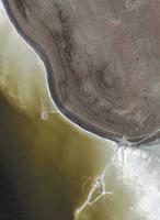 This is interesting because Smithson could just as easily have chosen to place Spiral Jetty within the context of the industrial landscape in which he built it. At two points during the film, viewers get a passing, background glimpse of the oil-drilling jetty situated less than half a mile to the east. You have to be watching for it to see it, the shots are so quick. (See the satellite photo at right for an indication of how close these two jetties are--and by how much the industrial jetty dwarfs Smithson's work.)
I was surprised by these two shots in the film because they both show not just the oil drilling jetty that remains at the site today, but they also clearly show a giant drilling derrick at the end of the jetty that is no longer there. The site was even more clearly a working industrial landscape at the time Smithson built his piece than it is today, but Smithson chose not to highlight that fact in the film--even though his Non-site works had explored the concept of the industrial, entropic landscape a few years before. It's only been in the last few years, since Spiral Jetty reemerged from the water and people started visiting the site again, that discussion of this aspect of the work has arisen.
The show does an admirable job of providing context for Smithson's great earthworks, but the gallery-sized pieces themselves (other than the Non-sites and a couple of the Displacements) disappoint.
Related: MAN has a great piece today on the experience of visiting Spiral Jetty which also mentions the industrial landscape that Smithson chose to elide in his own presentation of the work.
I was surprised by several things:
- How horrible Smithson's paintings, drawings, and collages from the 1960s are. Most of this work is figurative, and his talent clearly wasn't in his ability to depict the human figure.
- On a related note, Smithson wasn't a very good draftsman, period. Even when he moved away from the figure and started drawing plans for site-specific works, the drawing has a hard time standing on its own, as one would hope that it would be able to.
- Smithson's early sculpture is painfully bad. Think of the perfect wall decoration for a 1960s-style conversation pit lined with shag carpet and filled with fuzzy throw pillows. There. You've got the picture.
- The Whitney's own Non-site is not installed as part of the show. It's just as good as, or better than, any of the Non-site works that are included.
- The films are horrible. In general, the bar for watchability is set amazingly low for artists' video and film, but Smithson's filmmaking has a hard time clearing even that bar. The production quality is low. There's no sense of drama or conflict or plot in the works; there's nothing to push the films along. And there's not much in the works of intrinsic interest to get someone to want to stay with them through their duration. (Nancy Holt carrying a camera through a swamp with Smithson giving direction from behind? I mean, really.) And, worst of all, most of the film work is painfully, painfully pretentious.
Like the other films included in the show it's hokey and arrogant. Smithson starts the film with close-up images of the sun and shots of dinosaur skeletons in a museum. (The dinosaur shots, for some reason, were taken through a red filter.) By doing so, he chooses to situate Spiral Jetty in the context of nature and natural history. Throughout the film Smithson keeps the view of Spiral Jetty closely cropped so that nothing other than his work and the work's immediate surroundings is visible. This effectively established the framework for critical discussions of the work that would occur over the next two and a half decades.
This is interesting because Smithson could just as easily have chosen to place Spiral Jetty within the context of the industrial landscape in which he built it. At two points during the film, viewers get a passing, background glimpse of the oil-drilling jetty situated less than half a mile to the east. You have to be watching for it to see it, the shots are so quick. (See the satellite photo at right for an indication of how close these two jetties are--and by how much the industrial jetty dwarfs Smithson's work.)I was surprised by these two shots in the film because they both show not just the oil drilling jetty that remains at the site today, but they also clearly show a giant drilling derrick at the end of the jetty that is no longer there. The site was even more clearly a working industrial landscape at the time Smithson built his piece than it is today, but Smithson chose not to highlight that fact in the film--even though his Non-site works had explored the concept of the industrial, entropic landscape a few years before. It's only been in the last few years, since Spiral Jetty reemerged from the water and people started visiting the site again, that discussion of this aspect of the work has arisen.
The show does an admirable job of providing context for Smithson's great earthworks, but the gallery-sized pieces themselves (other than the Non-sites and a couple of the Displacements) disappoint.
Related: MAN has a great piece today on the experience of visiting Spiral Jetty which also mentions the industrial landscape that Smithson chose to elide in his own presentation of the work.
Sunday, June 26, 2005
Weekend Reading
I paid a visit to Dia: Beacon on Saturday (more on that later), so I had several hours on the train to spend working through a pile of magazines that has been rapidly growing in the living room.
To recap a couple of the high (or low) points, we begin by continuing the architectural eyewear meme started here. I finally finished a months-old issue of the New Yorker that has a profile of Rem Koolhaas by Daniel Zalewski. The author can't help himself, and he hits on the topic on the first page of the piece:
To recap a couple of the high (or low) points, we begin by continuing the architectural eyewear meme started here. I finally finished a months-old issue of the New Yorker that has a profile of Rem Koolhaas by Daniel Zalewski. The author can't help himself, and he hits on the topic on the first page of the piece:
Like many architects, he signals his profession with intimidatingly unusual eyewear. He currently favors a modular design, in which rectangular plastic lenses snap into chopstick-straight temples of various colors. Today's choice was reserved: tortoiseshell.And I came across an anti-almanac entry in the most recent issue of Artforum (which is usually good for at least one per issue). This one comes from "a roundtable discussion on land art's changing terrain." The critic (as usual) remains anonymous here:
I completely agree with you that today the exterior lies in the social, in that so many artists posit the latter as the only authentic point of resistance to capital.I don't know any artists who are resisting capital. If anything, they're using their social networks to try to get some of it for themselves.
Thursday, June 23, 2005
D'Arcy on Lewis, Krens, and the Guggenheim
In today's Wall Street Journal David D'Arcy shows that he's not going to be threatened by another major New York art institution and goes for the Guggenheim's throat. (Or maybe he just figures that if it's only a single freelance piece no one can get him fired for it.)
D'Arcy has former Guggenheim chair Peter Lewis on the record with details of what caused him to leave the board after a public fight with museum director Thomas Krens.
D'Arcy has former Guggenheim chair Peter Lewis on the record with details of what caused him to leave the board after a public fight with museum director Thomas Krens.
And on his partnership with Krens over the years, Lewis says the following."In speeches, it was, 'We're the museum of the future.' It was sold that sort of way," he says. In fact it was driven by the need for revenue. "The rationale always was, 'We had a nongenerous, noncontributing set of trustees--therefore we had to have other sources of revenue and capital--that's why we must expand,'" he says.
"It's not the Guggenheim--it's the Guggenheim merchandising the Bilbao effect," says Mr. Lewis.
"They tried to keep me from leaving. They told me, 'You two were such a team,'" Mr. Lewis said. "Yeah, we were a team. I wrote the checks and he [poured] the money away."Lewis does plan to honor his pledge to support restoration of the Frank Lloyd Wright building, even though he has left the board. But he has his own architect monitoring the process and determining when, and how much, to dole out as work is completed.
Book of the Week
 Loretta Lux has received a good deal of attention from collectors and the media over the last few years. The attention has been well deserved.
Her mesmerizing, highly manipulated portraits of children grab viewers’ attention with the intensity of their color and the emotion conveyed through the poses into which she places her subjects. (At right, The Blue Dress, 2001.)
The Aperture Foundation has recently published the first monograph of Lux’s work. Entitled Loretta Lux, the book presents 45 of Lux’s portraits from recent years and includes an essay on her work by Francine Prose.
Related: the artist’s website with more examples of her work.
Tuesday, June 21, 2005
Back in Action Shortly
It's been unusually quiet here for the last few weeks because it's been unusually unquiet on the work front. But it looks like the worst of the marathon work weeks and visits to unattractive Midwestern suburbs are behind me now, so I'll be back with more frequent fresh content here shortly.
This morning I need to put together an acceptance speech for the Encore Awards ceremony this afternoon. After that item is checked off the list, I'll see if I can pull together a couple things I've been thinking about for the blog.
This morning I need to put together an acceptance speech for the Encore Awards ceremony this afternoon. After that item is checked off the list, I'll see if I can pull together a couple things I've been thinking about for the blog.
Wednesday, June 15, 2005
The Multi-Generational Curatorial Meme
I've been hearing a curious amount of talk lately about curating shows so that they are "multi-generational." It was a stated objective of the last Whitney Biennial, and the idea keeps coming up as I visit nonprofit exhibition spaces and talk with the curators there.
I'm not completely sure what's going on here. Is this just a reaction to a youth-obsessed market by those who aren't directly selling art? Or is it an emerging, latter-day, anxiety-of-influence type of movement among youngish curators?
I'm not completely sure what's going on here. Is this just a reaction to a youth-obsessed market by those who aren't directly selling art? Or is it an emerging, latter-day, anxiety-of-influence type of movement among youngish curators?
Monday, June 13, 2005
The Smell of 12 Tons of Prison Compost
The temperature had moved above 90. The humidity was unbearable. What better way to spend the day than visiting a room filled with 25,000 pounds of prison compost mixed into 50,000 pounds of Home Depot topsoil?
The surprise of the day? How little smell there was. Nothing noticeable at all, really.
The New York Dirty Room, Mike Bouchet’s riff on Walter De Maria’s The New York Earth Room, is on view at Maccarone through August. Holland Cotter unpacked about everything possible from the work in a short Times review last month (archived at NEWSgrist).
Everything, that is, except the fact that the work lacks a revulsion factor. I was expecting a real, rotting stench. I was expecting to see steam rising from the piece as the compost continued to ferment on such a nasty hot day. But no luck.
Sure, the conceptual element is there—what Cotter talks about as the clean and the unclean—but the work suffers because it doesn’t slap its viewers in the face (or, more precisely, in the nose) with a visceral gross out. Without something in the work itself that raises the ante or subverts the original, the piece comes across as a poor knock off of De Maria. It’s not enough to be handed a Dia-like gallery guide (you know the kind, the 8 ½ x 5 ½ brochure) and told that this isn’t the same sort of dirt that De Maria used.
It comes down the this: the work would be much better if it smelled much worse.
Tuesday, June 07, 2005
And the Waters Keep Rising
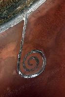 By way of the art blogosphere's native Utonian (what do you call someone from Utah, anyway?) comes this link to a Salt Lake Tribune piece about rising water levels in the Great Salt Lake.
Spiral Jetty, it appears, may be spending a portion of this summer under water.
Elevation of the Great Salt Lake has risen, the Tribune piece reports, a foot in the last thirty days, and it is a foot and a half higher than it was at this time last year. (Compare the photo in this post with the one from last June linked in the post.) The rise in water level has been attributed to low- and mid-range snowmelt. The lake will continue to rise over the next month as snow melts off the tops of the mountains in the Wasatch Range.
Monday, June 06, 2005
Impressions from a Sunday Afternoon Ramble
I was able to get out yesterday to see a few things I’ve been wanting to see.
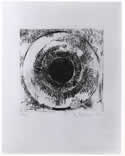 One of the most consistently well-curated exhibition spaces in New York right now is the small Ames Family Gallery on the Whitney’s fifth floor. Usually showing works from the museum’s permanent collection of prints and drawings, this space always has a single gallery show up that’s worth making a point to see. Yesterday I took a second look at the current show there, Prints into Drawings, and liked what I saw as much as I did on my first impression last week. The show’s premise, that artists are using the approaches of drawing to invigorate the craft of print making, focuses on process. While process stories usually bore audiences, this one is stimulating. Using process to think about the works on view here by artists such as Jasper Johns (at right), Brice Marden, and Julie Mehretu provides a fresh perspective on familiar (and not so familiar) work.
Downstairs Julie Mehretu is represented in a much bigger way in the interesting summer exhibition Remote Viewing: Invented Worlds in Recent Painting and Drawing. I’m not giving gallery talks this summer, and after seeing this show installed today, I’m a bit disappointed about that. I tend to think about exhibitions I lecture on in three ways: the exciting exhibition that loses my interest after a month of lectures, the exiting exhibition that retains my interest for three months, the ho-hum show that never becomes anything more than ho-hum for me. This show feels like it’s something categorically different. It’s a strange show that I wasn’t eagerly anticipating, but now that I’ve seen it I think it will continue to grow on me with each viewing. I’ll reserve further comment until I’ve had the opportunity to spend more time with it.
The high point of my Whitney visit, though, had nothing to do with the art. I happened to run into the playwright Charles Mee in the elevator and ended up having a nice discussion with him while we were standing in front of a large Julie Mehretu painting. I adored his Love Trilogy that showed in three theaters around the city a few years ago, and I was especially fond of the scene in Big Love where his female characters literally launch themselves through the air and come crashing to the stage while cursing the men in their lives. I’ve never laughed as hard at a BAM performance as I did during that scene, and I’ll probably never laugh that hard at BAM again. It was nice to be able to give the creator that kind of positive feedback.
 After leaving the Whitney, Mrs. FtF and I managed to slip through the Salute to Israel parade on Fifth Avenue to run into the Met for a quick visit. She wanted to see that advertisement masquerading as an exhibition. I was more interested in seeing the two new Tony Oursler video installations. I was somewhat disappointed with both works (installation view of Seven Months of My Aesthetic Education (Plus Some) at right). Oursler tends to do better on a smaller, more intimate scale than with these large, more complex installations. Seeing Oursler’s video-based work in these mezzanine galleries reminded me, though, of how big a deal it was a few years ago when the Met put its Bill Viola on display there. Look how far they’ve come. I hope they’ll continue to open up their contemporary galleries to living artists like Oursler who are producing challenging work.
No promises but that could be it for me this week. When duty calls, blogging stalls. And duty is calling this week.
One of the most consistently well-curated exhibition spaces in New York right now is the small Ames Family Gallery on the Whitney’s fifth floor. Usually showing works from the museum’s permanent collection of prints and drawings, this space always has a single gallery show up that’s worth making a point to see. Yesterday I took a second look at the current show there, Prints into Drawings, and liked what I saw as much as I did on my first impression last week. The show’s premise, that artists are using the approaches of drawing to invigorate the craft of print making, focuses on process. While process stories usually bore audiences, this one is stimulating. Using process to think about the works on view here by artists such as Jasper Johns (at right), Brice Marden, and Julie Mehretu provides a fresh perspective on familiar (and not so familiar) work.Downstairs Julie Mehretu is represented in a much bigger way in the interesting summer exhibition Remote Viewing: Invented Worlds in Recent Painting and Drawing. I’m not giving gallery talks this summer, and after seeing this show installed today, I’m a bit disappointed about that. I tend to think about exhibitions I lecture on in three ways: the exciting exhibition that loses my interest after a month of lectures, the exiting exhibition that retains my interest for three months, the ho-hum show that never becomes anything more than ho-hum for me. This show feels like it’s something categorically different. It’s a strange show that I wasn’t eagerly anticipating, but now that I’ve seen it I think it will continue to grow on me with each viewing. I’ll reserve further comment until I’ve had the opportunity to spend more time with it.
The high point of my Whitney visit, though, had nothing to do with the art. I happened to run into the playwright Charles Mee in the elevator and ended up having a nice discussion with him while we were standing in front of a large Julie Mehretu painting. I adored his Love Trilogy that showed in three theaters around the city a few years ago, and I was especially fond of the scene in Big Love where his female characters literally launch themselves through the air and come crashing to the stage while cursing the men in their lives. I’ve never laughed as hard at a BAM performance as I did during that scene, and I’ll probably never laugh that hard at BAM again. It was nice to be able to give the creator that kind of positive feedback.
After leaving the Whitney, Mrs. FtF and I managed to slip through the Salute to Israel parade on Fifth Avenue to run into the Met for a quick visit. She wanted to see that advertisement masquerading as an exhibition. I was more interested in seeing the two new Tony Oursler video installations. I was somewhat disappointed with both works (installation view of Seven Months of My Aesthetic Education (Plus Some) at right). Oursler tends to do better on a smaller, more intimate scale than with these large, more complex installations. Seeing Oursler’s video-based work in these mezzanine galleries reminded me, though, of how big a deal it was a few years ago when the Met put its Bill Viola on display there. Look how far they’ve come. I hope they’ll continue to open up their contemporary galleries to living artists like Oursler who are producing challenging work.No promises but that could be it for me this week. When duty calls, blogging stalls. And duty is calling this week.
Friday, June 03, 2005
Fakes and Faking It
Two interesting pieces on the ARTnews site right now: one on fakes and forgeries, the other on how to fake it when you're talking to an artist.
Thursday, June 02, 2005
The Muster Meister, in Her Own Words
Nick Stillman interviews Chief Muster Officer Allison Smith in this week's issue of NYFA Current, and he gets her to say what she's fighting for.
![]()