Sunday, April 23, 2006
The Week That Wasn’t (and a Visit to the Pulitzer Foundation)
 Last week passed with absolutely no activity around these parts. That’s the start of a trend that’s probably going to continue through this week. An unholy alliance of new projects, new clients, and travel is sucking away excess time and energy typically used for blogging.
That’s not to say that the radio silence means it’s a completely art-empty period for me. I spent last week in Saint Louis and managed to slip in a quick visit to the Pulitzer Foundation for the Arts to see Minimalism and Beyond.
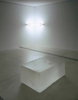
If I had to summarize the show with one word, it would be this: stunning. Not a detail has been missed in the selection or installation. The exhibition focuses on the core groups of minimalist and post-minimalist artists (think Judd, Flavin, and Serra), but it also looks back to the work of Barnet Newman and forward to trace minimalism’s legacy into the 1990s and 2000s with several pieces by Felix Gonzalez-Torres and Roni Horn. The combinations selected for the installation are engaging. Dan Flavin and Roni Horn are brilliantly paired in one small gallery (above right) and a large Judd with a blue Plexi interior is paired with the Pulitzer’s permanently installed blue and black Ellsworth Kelly (below right).
I can’t think of a more perfect space to host this show than the Pulitzer’s Tadao Ando galleries. One of my top picks for 2004 was the Guggenheim’s stab at minimalism and beyond, Singular Forms (Sometimes Repeated). I didn’t realize until visiting the Pulitzer last week how much more I would have liked that great Guggenheim show if the work hadn’t been forced to compete with Wright’s space. I hadn’t even realized the conflict between the work and the exhibition space until I saw how effortlessly Ando’s building harmonized with the work in this show. It’s not often that the work, the installation, and the gallery space resonate to create a perfect environment. One of those environments exists for a few more days in Saint Louis.
 I mentioned that even the details of the installation are perfect. Here’s a case in point: there is no wall text. None. Think about that. I honestly can’t remember the last time I saw a museum exhibition with absolutely no text on the walls. Instead, the Pulitzer Foundation distributes a gorgeous little booklet at the entrance desk (more a mini catalogue than an exhibition brochure) filled with beautiful installation photographs with numbers superimposed next to each artwork. The numbers correspond in the book to factual information about the piece and a brief description or discussion of the work.
I typically take exhibition brochures with me and discard them after I’ve written something on the show. This one will go onto the bookcase with my collection of catalogues when I finally arrive back home. It’s the sort of exhibition brochure that would probably break the budget for most museum shows, but there’s a lesson to be learned from it for museum curatorial and education departments. It is possible to do a show without wall text that does not abdicate the pedagogical responsibility to provide interpretive context. Consider this approach as an alternative to text-heavy wall cards. Please.
That will probably have to do it for the blogging this week. But I do hope to make one little field trip. I’m in Port of Spain, Trinidad for the next few days, and I have plans to attend Peter Doig’s Studio Film Club this Thursday night. I’m not sure what’s being screened this week, but I’m sure I’ll have a report next weekend.
Thursday, April 13, 2006
Another Way of Looking at Seventeen Ways of Looking
Back in the day (way back in the day), I learned an important lesson from a college professor. It's one I haven't forgotten, but it's one that hasn't been learned by everyone in MoMA's curatorial department.
In my junior year of college, I came down to the last couple weeks of class without having found a suitable term paper topic for a course in seventeenth-century British poetry. In a last ditch effort to find inspiration, I started skimming through the course's textbook, looking at work by poets we hadn't been assigned to read for the course. As I did so, I started to notice something. Many of them had written about death. Hmmm, I thought, that would make an interesting paper topic: representations of death in seventeenth-century poetry.
So I wrote my essay and was surprised when I got an unacceptable grade. The mark came with an explanation. You can't select a topic with a scope that large and expect to do it justice by dipping into a little bit of this and a little bit of that, the professor noted. If you define a project's scope to be so ambitious, you need to deliver by doing much more extensive reading and research. The support offered for the thesis, she taught me, had to match in scale the ambition that was stated for the project.
It was a timely lesson for me to learn, and it's one that has served me well through the years.
A show on exhibition now at MoMA suffers from the same problem as my undergraduate essay. Without Boundary: Seventeen Ways of Looking has taken a good deal of heat since it went up. Tyler Green justifiably eviscerated the show on MAN and in The New York Observer for its lack of political content. But the problems with the show are more fundamental than this. It's missing so much more than just political content.
The problem is highlighted by the explanatory text written to contextualize the show. The website spins the show one way, the gallery brochure another, and the gallery wall text yet a third. It's actually a paragraph from the wall text that I think explains the curator's intentions for the show most clearly:
But the MoMA show doesn't do this. Instead, the exhibition fills a small gallery space on the third floor and the video gallery on the second floor with a limited selection of works by seventeen artists. Some pieces contain calligraphy. Others make use of carpets and miniature painting. But nowhere do we get an exploration of these formal concerns or a dialogue between a number of artists using them in different ways to different ends as they address contemporary issues.
The show, as a result, comes off as a jumble of work by artists who have nothing in common other than the fact that they hail from countries where many people practice the Islamic faith.
But even that connecting thread isn't absolute. A piece by Mike Kelley and another by Bill Viola have been included. Kelley riffs on carpet design. Viola reflects "spirituality without necessarily rooting it in a specific faith," according to the exhibition brochure. Why this work in this show? I have no idea. I wonder if Kelley and Viola were included as afterthoughts in response to comments or pressure from some administrator. (Here's why I wonder: Click here to view the webpage for the show. Look at the URL that appears in your browser's address box, and you'll see that at some point very close to its opening this show was being called Fifteen Ways of Looking instead of Seventeen Ways of Looking.)
All in all, it's a problematic show, and not just because it lacks political content. It's a problematic show because MoMA has allowed its curator to make a fundamental mistake--to define a hugely ambitious project and then attempt to realize it by mounting a small-scale exhibition.
By significantly limiting the scope of what the show attempted to do (say, by focusing on how a select group of artists is using traditional Islamic calligraphy and carpet design to explore issues in contemporary society), MoMA could have fielded a much more focused and engaging show. The fact that no one in MoMA's curatorial department called a time-out as this show was being prepared makes me wonder if there are organizational issues there that will have negative impacts far beyond the failures of this particular exhibition.
Without Boundary: Seventeen Ways of Looking, at the Museum of Modern Art through May 22, 2006
In my junior year of college, I came down to the last couple weeks of class without having found a suitable term paper topic for a course in seventeenth-century British poetry. In a last ditch effort to find inspiration, I started skimming through the course's textbook, looking at work by poets we hadn't been assigned to read for the course. As I did so, I started to notice something. Many of them had written about death. Hmmm, I thought, that would make an interesting paper topic: representations of death in seventeenth-century poetry.
So I wrote my essay and was surprised when I got an unacceptable grade. The mark came with an explanation. You can't select a topic with a scope that large and expect to do it justice by dipping into a little bit of this and a little bit of that, the professor noted. If you define a project's scope to be so ambitious, you need to deliver by doing much more extensive reading and research. The support offered for the thesis, she taught me, had to match in scale the ambition that was stated for the project.
It was a timely lesson for me to learn, and it's one that has served me well through the years.
A show on exhibition now at MoMA suffers from the same problem as my undergraduate essay. Without Boundary: Seventeen Ways of Looking has taken a good deal of heat since it went up. Tyler Green justifiably eviscerated the show on MAN and in The New York Observer for its lack of political content. But the problems with the show are more fundamental than this. It's missing so much more than just political content.
The problem is highlighted by the explanatory text written to contextualize the show. The website spins the show one way, the gallery brochure another, and the gallery wall text yet a third. It's actually a paragraph from the wall text that I think explains the curator's intentions for the show most clearly:
This exhibition addresses the application of the unexamined rubric "Islamic" to contemporary artists and emphasizes individuality rather than a collective identity. Without Boundary approaches the subject from a variety of perspectives. It looks for links as well as ruptures with the classic traditions of Islamic art, such as calligraphy, miniature painting, and carpet design. In addition, the exhibition tunes in to what the artists themselves have to say about identify and spirituality. In the complex expressions that draw inspiration from different traditions and defy simplistic categorizations, these artists belie the mentality of division and the binary oppositions of present-day politics.If you can get beyond the jargon ("unexamined rubric," "collective identity," "ruptures," "binary oppositions") to parse what's actually said in this statement, you see some big claims for the show. This is an ambitious curatorial project--a very ambitious project. This is the kind of project, actually, that needs the treatment that only the Centre Pompidou seems to give to thematic shows today. It's a curatorial project that needs to be supported by the inclusion of about 400 works by around fifty artists from over a dozen countries.
But the MoMA show doesn't do this. Instead, the exhibition fills a small gallery space on the third floor and the video gallery on the second floor with a limited selection of works by seventeen artists. Some pieces contain calligraphy. Others make use of carpets and miniature painting. But nowhere do we get an exploration of these formal concerns or a dialogue between a number of artists using them in different ways to different ends as they address contemporary issues.
The show, as a result, comes off as a jumble of work by artists who have nothing in common other than the fact that they hail from countries where many people practice the Islamic faith.
But even that connecting thread isn't absolute. A piece by Mike Kelley and another by Bill Viola have been included. Kelley riffs on carpet design. Viola reflects "spirituality without necessarily rooting it in a specific faith," according to the exhibition brochure. Why this work in this show? I have no idea. I wonder if Kelley and Viola were included as afterthoughts in response to comments or pressure from some administrator. (Here's why I wonder: Click here to view the webpage for the show. Look at the URL that appears in your browser's address box, and you'll see that at some point very close to its opening this show was being called Fifteen Ways of Looking instead of Seventeen Ways of Looking.)
All in all, it's a problematic show, and not just because it lacks political content. It's a problematic show because MoMA has allowed its curator to make a fundamental mistake--to define a hugely ambitious project and then attempt to realize it by mounting a small-scale exhibition.
By significantly limiting the scope of what the show attempted to do (say, by focusing on how a select group of artists is using traditional Islamic calligraphy and carpet design to explore issues in contemporary society), MoMA could have fielded a much more focused and engaging show. The fact that no one in MoMA's curatorial department called a time-out as this show was being prepared makes me wonder if there are organizational issues there that will have negative impacts far beyond the failures of this particular exhibition.
Without Boundary: Seventeen Ways of Looking, at the Museum of Modern Art through May 22, 2006
Tuesday, April 11, 2006
Art in the Corporate Space
Midtown corporate lobbies host some of the most overlooked exhibition spaces in the city. On a walk that took me almost straight across town last weekend, I passed six spaces showing notable work. Four feature rotating exhibitions. The other two are permanent installations of important pieces.
UBS Gallery, 1285 Avenue of the Americas (between 51st and 52nd): Art loving UBS has created a large gallery space in its lobby that often features unusual exhibitions. I’ve seen interesting work by emerging artists, ab ex painting, and art from the subway system featured in the space. Currently on view is Great Pots: The Vessel as Art 1900-2000, Twentieth-Century Ceramics from the Newark Museum.
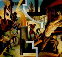 AXA, 1290 Avenue of the Americas (between 51st and 52nd): Across the street from UBS, the international insurance firm AXA permanently displays Thomas Hart Benton’s mural America Today from 1930-31 (detail at right). Originally commissioned by the New School for Social Research, the piece was sold in 1982 when the school realized it could not care for it as needed. The Equitable (a company purchased some years ago by AXA) bought the piece for its lobby in 1984.
Gallery W52, 31 W. 52nd St. (between Fifth and Sixth Avenues): Dinaburg Arts curates this space located near MoMA. Often showing work by emerging artists, the gallery currently has on display an exhibition entitled Beyond Pastoral featuring work by seven contemporary artists who use landscape to address cultural or psychological states. Interpretative essays for shows in this space are often written by the best-dressed member of the art blogosphere.
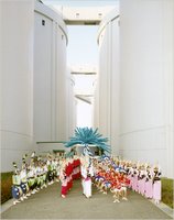
Lever House, 390 Park Avenue (between 53rd and 54th): What’s probably my favorite building in midtown is a work of art in itself. In recent years, though, building owner and mega-collector Aby Rosen has turned the lobby into a showcase for work by contemporary artists. Currently on display is an army of 96 inflatable Incredible Hulks; some red, white, blue, and green fluorescent stars; beach toys; ladders; fencing; paintings; and popcorn in lit vitrines. Jeff Koons is responsible for this disaster of an installation.
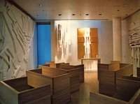 St. Peter’s Church, 619 Lexington Avenue (entrance on 54th St. between Lexington and Third Avenues): Long known for its support of contemporary art and performance, this church tucked into the Citigroup Center boasts one of the most sublime spaces in midtown. In 1977 the church commissioned Louise Nevelson to design The Erol Beker Chapel of the Good Shepherd (at right). Her white on white room is only large enough for 28 seats, but the environment creates a psychic space that rivals the great cathedrals. Sadly, the installation is in need of restoration.
The Lipstick Building, 885 Third Avenue (between 53rd and 54th): I only stumbled across the art in this space on my way to a meeting last week. I’m not sure if the building has created a regular art program, but the exhibition on view now of work by Phoebe Washburn, Olav Westphalen, and Taylor McKinen is worth seeing. I liked Washburn's piece, 2 BLT's (bought and lovely towns), better than her 2004 installation at LFL which garnered so much critical praise.
Readers' Favorite Corporate Art Spaces in Midtown (feel free to e-mail with others that I missed in the post above):
UBS Gallery, 1285 Avenue of the Americas (between 51st and 52nd): Art loving UBS has created a large gallery space in its lobby that often features unusual exhibitions. I’ve seen interesting work by emerging artists, ab ex painting, and art from the subway system featured in the space. Currently on view is Great Pots: The Vessel as Art 1900-2000, Twentieth-Century Ceramics from the Newark Museum.
AXA, 1290 Avenue of the Americas (between 51st and 52nd): Across the street from UBS, the international insurance firm AXA permanently displays Thomas Hart Benton’s mural America Today from 1930-31 (detail at right). Originally commissioned by the New School for Social Research, the piece was sold in 1982 when the school realized it could not care for it as needed. The Equitable (a company purchased some years ago by AXA) bought the piece for its lobby in 1984.Gallery W52, 31 W. 52nd St. (between Fifth and Sixth Avenues): Dinaburg Arts curates this space located near MoMA. Often showing work by emerging artists, the gallery currently has on display an exhibition entitled Beyond Pastoral featuring work by seven contemporary artists who use landscape to address cultural or psychological states. Interpretative essays for shows in this space are often written by the best-dressed member of the art blogosphere.
Lever House, 390 Park Avenue (between 53rd and 54th): What’s probably my favorite building in midtown is a work of art in itself. In recent years, though, building owner and mega-collector Aby Rosen has turned the lobby into a showcase for work by contemporary artists. Currently on display is an army of 96 inflatable Incredible Hulks; some red, white, blue, and green fluorescent stars; beach toys; ladders; fencing; paintings; and popcorn in lit vitrines. Jeff Koons is responsible for this disaster of an installation.
St. Peter’s Church, 619 Lexington Avenue (entrance on 54th St. between Lexington and Third Avenues): Long known for its support of contemporary art and performance, this church tucked into the Citigroup Center boasts one of the most sublime spaces in midtown. In 1977 the church commissioned Louise Nevelson to design The Erol Beker Chapel of the Good Shepherd (at right). Her white on white room is only large enough for 28 seats, but the environment creates a psychic space that rivals the great cathedrals. Sadly, the installation is in need of restoration.The Lipstick Building, 885 Third Avenue (between 53rd and 54th): I only stumbled across the art in this space on my way to a meeting last week. I’m not sure if the building has created a regular art program, but the exhibition on view now of work by Phoebe Washburn, Olav Westphalen, and Taylor McKinen is worth seeing. I liked Washburn's piece, 2 BLT's (bought and lovely towns), better than her 2004 installation at LFL which garnered so much critical praise.
Readers' Favorite Corporate Art Spaces in Midtown (feel free to e-mail with others that I missed in the post above):
- The AXA Gallery, 787 Seventh Ave. (at 51st St.)
- The Whitney at Altria, 120 Park Ave. (at 42nd St.)
Sunday, April 09, 2006
Portrait of a Relationship
 From the conclusion of Randy Kennedy's piece in today's NY Times entitled "The Bjork-Barney Enigma Machine":
 And you think your relationship is tough to sustain. Imagine how hard it must be for the two of them to find compromises. "OK, I think I can manage to sneak two deer up to the observation deck at Rockefeller Center. Your job is to get a small jar of peanut butter to cover our fingers with. Or do you think deer prefer almond butter?"On the simplest level, Bjork said, she sees this as a nod to a debate she and Mr. Barney have had for years on the nature of creativity.
"Matthew is obsessed with restraint," she said, describing his love of Manhattan as an example. "The idea that you're stuck between all these gigantic skyscrapers is a restraint. And he finds it's a turn-on for him, it excites him."
"I find that really fascinating, because I'm the other way around," she said. "I'm like, put me on the top of a mountain with deer licking my fingers or something, and that's creative to me. That's like heaven."
Tuesday, April 04, 2006
Nothing's the Matter with Kansas
What the world needs more of: municipalities recognizing the importance of the arts and politicians demonstrating a sense of humor. Thanks, Lawrence, Kansas (via).
Monday, April 03, 2006
Judd at Christie's
Today Christie's opens its preview of work from the Judd Foundation.
The exhibition will run through May 9 when the 36 pieces will be sold. Two large works are installed in Christie's showroom, in a specially constructed environment near the central stair. The remainder are being shown around the corner, on the 20th floor of 1230 Avenue of the Americas.
The sale is controversial (see MAN's first and second posts on the issues involved), and to this point Christie's has been somewhat coy about what is being included. But now that the preview has opened, the auction house is providing a two-page sale list to exhibition visitors. As far as I can tell, Christie's has not made this information available on-line yet, so I have posted page 1 of the list here and page 2 here. (Apologies for the poor quality of the scans.)
The preview really should not be missed. Christie's has put a $23.5M high estimate on the sale. But judging from the resources put into marketing it, I would guess that they expect the final result to substantially top that estimate. Not only have they created a uniquely fitting installation environment for the work (whitewashed brick walls and no drop ceiling in the space) but they have also put together what may be a first--an iPod exhibition tour. The program includes images of each work, specialist audio commentary on every piece, and a few video segments--one of which is a 24-minute-long look at Marfa.
Parody, Sweet Parody
Someone has been busy over the last few weeks taking on the College Art Association and the infamous Artforum Diary. It's too bad, though, that it's impossible to parody something that's already a parody of itself. (From the latest installment: "MoMA curator Klaus Biesenbach stepped up to the podium and delivered a brief introduction, noting wryly that despite having invited only four hundred members of 'the inner, inner circle,' more than eight hundred had RSVPed.")
![]()