Sunday, April 23, 2006
The Week That Wasn’t (and a Visit to the Pulitzer Foundation)
 Last week passed with absolutely no activity around these parts. That’s the start of a trend that’s probably going to continue through this week. An unholy alliance of new projects, new clients, and travel is sucking away excess time and energy typically used for blogging.
That’s not to say that the radio silence means it’s a completely art-empty period for me. I spent last week in Saint Louis and managed to slip in a quick visit to the Pulitzer Foundation for the Arts to see Minimalism and Beyond.
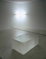
If I had to summarize the show with one word, it would be this: stunning. Not a detail has been missed in the selection or installation. The exhibition focuses on the core groups of minimalist and post-minimalist artists (think Judd, Flavin, and Serra), but it also looks back to the work of Barnet Newman and forward to trace minimalism’s legacy into the 1990s and 2000s with several pieces by Felix Gonzalez-Torres and Roni Horn. The combinations selected for the installation are engaging. Dan Flavin and Roni Horn are brilliantly paired in one small gallery (above right) and a large Judd with a blue Plexi interior is paired with the Pulitzer’s permanently installed blue and black Ellsworth Kelly (below right).
I can’t think of a more perfect space to host this show than the Pulitzer’s Tadao Ando galleries. One of my top picks for 2004 was the Guggenheim’s stab at minimalism and beyond, Singular Forms (Sometimes Repeated). I didn’t realize until visiting the Pulitzer last week how much more I would have liked that great Guggenheim show if the work hadn’t been forced to compete with Wright’s space. I hadn’t even realized the conflict between the work and the exhibition space until I saw how effortlessly Ando’s building harmonized with the work in this show. It’s not often that the work, the installation, and the gallery space resonate to create a perfect environment. One of those environments exists for a few more days in Saint Louis.
 I mentioned that even the details of the installation are perfect. Here’s a case in point: there is no wall text. None. Think about that. I honestly can’t remember the last time I saw a museum exhibition with absolutely no text on the walls. Instead, the Pulitzer Foundation distributes a gorgeous little booklet at the entrance desk (more a mini catalogue than an exhibition brochure) filled with beautiful installation photographs with numbers superimposed next to each artwork. The numbers correspond in the book to factual information about the piece and a brief description or discussion of the work.
I typically take exhibition brochures with me and discard them after I’ve written something on the show. This one will go onto the bookcase with my collection of catalogues when I finally arrive back home. It’s the sort of exhibition brochure that would probably break the budget for most museum shows, but there’s a lesson to be learned from it for museum curatorial and education departments. It is possible to do a show without wall text that does not abdicate the pedagogical responsibility to provide interpretive context. Consider this approach as an alternative to text-heavy wall cards. Please.
That will probably have to do it for the blogging this week. But I do hope to make one little field trip. I’m in Port of Spain, Trinidad for the next few days, and I have plans to attend Peter Doig’s Studio Film Club this Thursday night. I’m not sure what’s being screened this week, but I’m sure I’ll have a report next weekend.