Friday, March 31, 2006
Topics of the Week
Two topics have been driving discussion around the blogosphere this week: the premier of Matthew Barney's new thing, Drawing Restraint 9, and Marc Spiegler's piece in New York Magazine on the coming collapse of the art market. Some blogger blather of note:
- AFC on Barney: "Barney's latest movie which premiered yesterday at MoMA, is by far the worst film he has ever made."
- Grammar.police on Barney: "without having even seen DR9 I know I can emphatically agree with AFC's Johnson that Barney should employ neither CGI nor Björk."
- MAO on Spiegler: "While I agree there may be some froth in the modern and contemporary art market, I disagree a crash is coming anytime soon."
- The OC Art Blog on MAO on Spiegler: "MAO is probably a great financial whiz but I think he's wrong on this one. The market is going to crash. I thought it would happen sooner but what do I know....other than it is going to happen. How many more spaces can open in Culver City??"
- And In Search gracefully brings the two threads together: "In discussing the paparazzo cage and photo-op line at last night's screening of Drawing Restraint 9 at MoMA, I mentioned to an office colleague that I occasionally hear that the last time the contemporary art world was covered this extensively by general-interest magazines was right before the early-'90s market crash."
- I'm already on record as believing that an art market correction will occur. It's not a matter of "if" but "when." So I'm predisposed to agree with several of the things that Spiegler writes. With apologies to regular readers in Greenwich (and especially those at SAC Capital Advisors--because everyone loves Damien's shark and can't wait to see it at MoMA), I took special delight at the line that Spiegler says is making the rounds among art consultants today: "The hedge-fund guys are the new Japanese."
- Will future art historians look back and see Matthew Barney as the Julian Schnabel of the late 1990s--grand ambition, work based on spectacle, but not much that actually continues to engage viewers once the initial impression begins to age? I wouldn't be surprised. Over the last week I've been dipping into Doug Aitken's new book Broken Screen: Expanding the Image, Breaking the Narrative. The text collects interviews Aitken has conducted with 26 artists (including Barney) who are creating in a non-narrative manner. The discussions are interesting to follow, but I don't completely buy the concept. Why not? It's a long story. Maybe I'll save it for a post next week. Or maybe not. I'm afraid that if I start spouting theory here I'll bore all the new Japanese.
Wednesday, March 29, 2006
With World Enough and Time
If I had time and funding, I would design and run an empirical study to test the hypothesis of this interesting Artinfo piece by João Ribas.
Is the art being created by emerging artists changing over time in response to the increased cost of living in New York? The anecdotes indicate that it is. I wonder what hard data would say.
Is there anyone out there working on a cross-disciplinary PhD in macro economics and art history who is searching for a dissertation topic? Here's a great one for you.
Tuesday, March 28, 2006
When the Boundaries Collapse
 The typical division of responsibilities in the art world is fairly clear.
Artists create. Dealers make the market. Collectors acquire. Curators contextualize work and present it for public display. Publications staff create printed and web material to extend the reach and impact of the show.
What happens, though, when the boundaries between these functions become elided? When an individual plays more than one role along this spectrum of responsibilities, conflicts of interest emerge. Think of the heat that Charles Saatchi takes regularly for displaying, promoting, and then trading the work that he collects.
But what if one person were to exercise control over every link in the chain from creating to dealing to curating to publishing and educating? How rife for abuse would that situation be?
In his new book The Last Folk Hero: A True Story of Race and Art, Power and Profit, Atlanta based writer Andrew Dietz tells just such a story. But rather than flattening and simplifying his characters’ motivations into a easy good vs. bad dichotomy, Dietz provides a neutral presentation that allows the complexity and ambiguity of this unique situation to emerge.
Dietz tells the tale of Bill Arnett—patron, collector, dealer, curator, publisher, and primary promoter of Southern, African-American folk art. Arnett is the genius behind the critically successful and wildly popular Quilts of Gee’s Bend exhibition that has made stops at the MFA Houston, the Whitney, the Milwaukee Art Museum, and eight other venues to date. (The exhibition opened last week at the High Museum in Atlanta.)
While Arnett has assembled work for the exhibition, he isn’t the typical freelance curator. Arnett owns many of the quilts in the show. He could well be making a market in Gee’s Bend quilts in his role as one of the most prolific dealers of Southern vernacular art. Through his company Tinwood Media, he has also published the critically acclaimed catalogue that accompanies the exhibition.
If Larry Gagosian was operating in a similar manner, the art world would cry “foul.” But in Arnett’s case, the situation is different because Arnett, for all his idiosyncrasies (the high strung personality, the constantly updated enemies list, the practice of storing his inventory of art in a leaky warehouse that lacks climate control), is bringing much deserved recognition to artists who have been neglected and/or taken advantage of by other collectors and dealers in the past.
Arnett (a white man) has made a name for himself and has built his business on the work of poor African-Americans, but in Dietz’s presentation Arnett’s activities are undertaken with the best interest of his artists in mind. Without Arnett, it’s probable that Gee’s Bend would still be a town so small and remote that even Google Maps could not locate it. But because of Arnett’s work, the town, the quilters, and their work is now known and appreciated across the country and around the world. And, yes, it’s probably safe to assume that Arnett has made (or will make) a profit on his investment in the quilts, the quilters, and the community as a result.
Dietz doesn’t shy away from the ethical ambiguities that exist in the intersection of roles that Arnett has played in promoting, dealing, and publicizing his artists’ work. And that ambiguity makes for an interesting read. While the book lacks the clear dramatic arc and the easily identifiable heroes and villains of the best non-fiction narratives, the more complex picture he give of his main characters’ intentions is a credit to Dietz’s fairness and balance as a writer.
Sunday, March 26, 2006
Graciously Admitting Defeat
 At the conclusion my gallery talk at the Whitney today, a couple approached me with a question.
"Can you tell us where they put that room that's filled with speakers?" the man asked. I knew right away what he was talking about, but I hesitated for a moment while I contemplated the most diplomatic way to answer the question. His wife must have taken my pause for confusion because she jumped in to clarify. "It plays a choir piece, I think. A friend told us we had to see it while we were in New York this week."
I did the right thing.
"That's Janet Cardiff's Forty Part Motet. It's not here. It's at MoMA," I told them. "You really ought to go down there to experience it," I added. "It's the best thing you'll see today."
Update: If you haven't seen the piece yet, you're now out of luck. MoMA has closed its second floor galleries for a reinstallation.
Thursday, March 23, 2006
And Today That Will Get You?
 Maybe a closet in the neighborhood. And that's if you're lucky.
Today's NY Times Homes section takes us to Donald Judd's former residence at 101 Spring St. in SoHo (photo at right; link via). The piece mentions an interesting fact about the building that I didn't know. Judd bought it in 1968 for $70,000. Those were the years when SoHo was an ugly, industrial neighborhood and artists were just realizing that they could acquire live-work loft space there at reasonable prices.
But just how reasonable was $70,000 in 1968? Pretty darn reasonable.
Plugging the numbers into The Inflation Calculator tells us that $70,000 in 1968 is the equivalent of $387,308 in 2005.
If he had just under $400,000 and he were shopping in that neighborhood today, Judd would be able to afford a closet. Maybe. But I'm sure he would be able to turn it into the sleekest, most functional closet anyone has ever seen.
Related: Frank Stella cashes out his East Village real estate investment.
Wednesday, March 22, 2006
The Value of the Auctions
Despite what I wrote yesterday, I'm not totally opposed to the bi-annual New York contemporary art auctions. As flawed and disturbing as the scene around them can become, they do serve several useful purposes for collectors.
The previews for the sales give a brief glimpse of important work that is moving from one private collection to another, often providing a chance to see early work by living (and recently deceased) artists.
But more importantly, they provide a workout for the eye. It's always good to exercise the critical eye, and the previews provide a great opportunity to do it. I typically find myself walking quickly through the day sale preview saying to myself, "junk, crap, junk, awful, horrid, junk" when I'm stopped in my tracks by something that surprises me with a presence that's strong enough to rise above the garage sale ethos that these events have. Knowing that there is always going to be one, the previews offer a great opportunity to try to spot the needle in the haystack, the kernel of wheat among all the chaff, the diamond in the rough, or [insert your cliche of choice here].
Sure, as Jerry Saltz complains, the whole auction scene has its tribal aspects that have nothing to do with the art. But let's not forget that the auction houses do put on extensive exhibitions of contemporary art twice a year. It's all what you choose to make of it.
Tuesday, March 21, 2006
Collecting as a Competitive Sport
I've been surprised by the response to John Colapinto's March 20 New Yorker profile of Sotheby's Tobias Meyer.
Everyone's favorite critic Jerry Saltz got himself all worked up over the piece in a letter posted on MAN yesterday, and Edward Winkleman used it as an occasion to work through the conflicts he feels about being a market maker.
Saltz's main beef (that the piece neglected to critique the auction scene in its glossy presentation of Meyer's work and lifestyle) misses the point. The critique is there. You just need to read between the lines to find it.
 Colapinto goes to great length to set Meyer up as the ultimate connoisseur. In addition to contemporary art, Colapinto tells us, Meyer can pontificate on medieval painting, and "he is also an authority on Renaissance and rococo art, gilt bronzes, antique French furniture, German porcelain, French illuminated manuscripts, and countless other man-made objects."
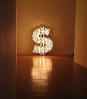
But then we get a chance to enter Meyer's home. What have he and his partner, the well connected art consultant and WPS1 personality Mark Fletcher, installed in their living room on the sixty-sixth floor of the Time Warner Center? Pieces by Tim Noble and Sue Webster (a dollar sign), Andy Warhol, and assume vivid astro focus.
My antennae start to twitch (and not in a good way) whenever I hear of a collector who owns a piece by any one of these artists. To have scored the trifecta makes a strong statement.
To be fair, this bit of information is really too small to use to make a judgment on the collection as a whole, but let me say this anyway. It appears that Meyer and Fletcher aren't collecting quality. They're collecting names--the most recognizable names of the past half century and the hottest names of the moment. This doesn't make them the ultimate connoisseurs of today's art. What it makes them is very successful consumers in today's white hot market.
And that's what Saltz despises about the auction scene. The dropping of names and the showy display. The conspicuous preening and the games related to building prestige. Collecting as competition, not collecting for love of the work.
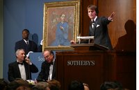 Colapinto drives the point home by quoting Meyer extensively in the closing paragraph of the piece. Here's Meyer wrestling with his career demons:
Everyone's favorite critic Jerry Saltz got himself all worked up over the piece in a letter posted on MAN yesterday, and Edward Winkleman used it as an occasion to work through the conflicts he feels about being a market maker.
Saltz's main beef (that the piece neglected to critique the auction scene in its glossy presentation of Meyer's work and lifestyle) misses the point. The critique is there. You just need to read between the lines to find it.
 Colapinto goes to great length to set Meyer up as the ultimate connoisseur. In addition to contemporary art, Colapinto tells us, Meyer can pontificate on medieval painting, and "he is also an authority on Renaissance and rococo art, gilt bronzes, antique French furniture, German porcelain, French illuminated manuscripts, and countless other man-made objects."
But then we get a chance to enter Meyer's home. What have he and his partner, the well connected art consultant and WPS1 personality Mark Fletcher, installed in their living room on the sixty-sixth floor of the Time Warner Center? Pieces by Tim Noble and Sue Webster (a dollar sign), Andy Warhol, and assume vivid astro focus.
My antennae start to twitch (and not in a good way) whenever I hear of a collector who owns a piece by any one of these artists. To have scored the trifecta makes a strong statement.
To be fair, this bit of information is really too small to use to make a judgment on the collection as a whole, but let me say this anyway. It appears that Meyer and Fletcher aren't collecting quality. They're collecting names--the most recognizable names of the past half century and the hottest names of the moment. This doesn't make them the ultimate connoisseurs of today's art. What it makes them is very successful consumers in today's white hot market.
And that's what Saltz despises about the auction scene. The dropping of names and the showy display. The conspicuous preening and the games related to building prestige. Collecting as competition, not collecting for love of the work.
 Colapinto drives the point home by quoting Meyer extensively in the closing paragraph of the piece. Here's Meyer wrestling with his career demons:
 "I was laughing with Mark yesterday, because I was having my anxious moment. I was saying, 'I'm not doing enough of this, I have to do more of that, and what's going on, and blah-blah-blah.' And he said, 'Baby, will you relax? Tobias, you just sold the most expensive work of art ever'--meaning Picasso's Boy with Pipe two years ago. "And I said, 'I know, but that was then!'"So at the end of the day, what Meyer has is not the love of the object, the satisfaction of scholarship, the intellectual rewards of intelligent connoisseurship, or the delight he could find being in the presence of great art on a daily basis. What he has is the mega-huge sale. It's subtle, but that's a pretty damning critique.
Friday, March 17, 2006
You Get What You Pay For
Since I don't pay anything to host this site with Blogger, it shouldn't really be a surprise that it goes down every so often. But 16 consecutive hours of down time seems a little extreme.
Anyway, welcome back. And, yes, a new vanity URL and Movable Type are looking pretty good right now.
Anyway, welcome back. And, yes, a new vanity URL and Movable Type are looking pretty good right now.
Thursday, March 16, 2006
Why We Go to Art Fairs
 As I mentioned the other day, for me fairs aren’t about purchasing. They’re about finding galleries with innovative programs in cities that I don’t regularly visit. This year’s Scope introduced me to three European galleries showing interesting work.
London-based Chinese Contemporary features Chinese work in all media created since 1989. The gallery has the strongest and most clearly enunciated program that I have ever seen. (You think this is hyperbole? Check this out. See. I’m not kidding.)
If I were to allow myself to dream, here’s what I would imagine. Some hugely moneyed person with an interest in art asks me to assemble an important collection. Money and time are not issues. The sole focus is on building a historically significant collection with a well defined scope that represents our age.
If this were my brief, I would start going after contemporary Chinese art. I know next to nothing about contemporary China, and I don’t speak the language. But China today is rapidly undergoing a transition that is more fundamental than any other cultural transformation that I can think of.
Mass migration, rapid urbanization, accumulation of wealth in urban centers, loosening of cultural and political restrictions (but not complete loosening) on artistic creation, conflict between history and contemporaneity. If this all sounds familiar it’s because this same dynamic was at work in America at the turn into the twentieth century. If, as the Whitney so strongly posited with its two 1999 exhibitions, the twentieth century belonged to American art, the twenty-first will belong to Chinese art.
Chinese Contemporary is already there, boots on the ground in Beijing, bringing interesting, charged work to the West. While I saw much of interest at their booth, I was especially taken with work they were showing by Chen Quilin which combines tradition, contemporary capitalism, and urbanization in elaborate staged photographs. (Unfortunately, I can't find any images from this series to post here.)
 Galeria Jorge Alcocela from Madrid was showing four face-mounted, digitally manipulated photographs by Inigo Navarro that I found delightful. Each of the pieces features multiple images of the artist, his grandmother, his girlfriend, or his dog (Tica, above right). Each piece is lighthearted and shows a real tenderness for its subject. I don’t see enough work these days that has been created with such a palpable sense of joy.
Bonelli Arte Contemporanea from Mantua was featuring watercolor portraits by Federico Lombardo. At first glance, the pieces reminded me of Kim McCarty’s work—but with slightly older subjects (one example at right). On a more detailed look, though, I began to see that Lombardo’s paintings have much more presence and depth than McCarty’s. They have the same sense of dissipation as her work, but because of the different paper and slightly different technique he uses, the subjects retain more presence than McCarty’s children do. I actually saw a few of McCarty’s pieces the next day at LA Art. Frankly, after seeing Lombardo’s more nuanced work, McCarty’s didn’t impress me as much as it has in the past. An artist who is able to change the way a viewer looks at another artist’s work is doing something powerful.
Monday, March 13, 2006
Seen and Scene at Scope
Let me start by saying this: I trust Barry and James. So when both of them posted on Friday (here and here) about how much they enjoyed Scope, I changed my Saturday plans and opened up the full day to spend there. I’m glad I did.
Overall, the work on display was about what I expected from galleries exhibiting at the fair—lots of small figurative work on paper, with a good smattering of edgy stuff thrown in. (The subject matter of most work at Scope in six words: breasts and blood, striptease and sex.)
But the fair organizers did an admirable job of creating a strong buzz of excitement about the fair that turned it from a mere marketplace into an event. Not all (not any?) of the non-gallery, non-New Museum programming actually stood on its own as interesting installation or performance, but that didn’t really matter. The energy dissipated throughout the space by so much non-sales activity was infectious. I imagine that Scope, as a fair this year, had the same ludic energy that the great medieval religious festivals had. (And, no, I’m not going to explain that reference any further.) It’s an energy that Pulse didn’t have and that the Armory Show never has had.
When I go to art fairs, I don’t really go to buy. That’s not to say that I haven’t ever bought at a fair, but it’s not my primary objective. Collectors who swoop in before the shows open to the public to binge purchase, dropping thousands upon thousands of dollars in the art world version of the bacchanal, make my stomach turn. (Doing it is bad enough, but there has to be a special place in purgatory for those who do it and then publish a detailed account of their activity.) I use fairs to find new artists and new galleries that I’m interested in following.
In that respect, this year’s Scope was the best yet—especially with its stronger international representation. I was introduced to three European galleries featuring interesting work (some of which was new to me), and I saw a few things at galleries closer to home that piqued my interest.
Details to follow.
Sunday, March 12, 2006
Pulse Picks, or Good Things Come in Threes
If Pulse is going to grow in the future, it needs to define a more clear niche for itself.
The Armory Show is, well, the gold standard of the New York fairs. (And it knows it.) Scope, while growing and featuring pricier work every year, has kept its funky vibe by pushing its focus on emerging artists. Pulse suffered this year from not looking different enough from the Armory Show and from not generating the buzz on-site that Scope did.
But an afternoon spent there wasn't a complete loss. Pulse provided a chance to catch up with three blogging gallerists (one, two, three), and it gave me a look at work by three interesting artists.
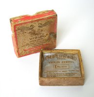 Inman Gallery of Houston was featuring two pieces by native Texan Dario Robleto. I first started following Robleto's work a few years ago and regret that I didn't purchase a piece back then because he's pretty much moved out of my price range since appearing in the 2004 Whitney Biennial.
I especially liked his small piece (at right) from 2003 entitled Fatalism Sutures to a Memory (A Melody). What has always attracted me to Robleto's practice is the way he works as an alchemist--selecting and transforming charged materials in a way that gives them further power. The gallery lists the materials of this piece--a violin string in a box--as follows:
Robleto will be featured in a New York solo show at D'Amelio Terras when they open their new space in May. The work he's preparing for this show is supposed to be more "feminine." I'm curious to see what, exactly, that means.
 DCKT was showing a small piece by Isidro Blasco that caught my eye. The sculpted photo collage of an urban plaza felt right in its combination of form, scale, and subject matter. When I mentioned that I thought it was a piece I could see myself living with, I was told that I was out of luck. It had already been sold.
Fiedler Contemporary from Cologne was showing work of Cologne resident Frank Breuer. Conceptually, Breuer's work is completely derivative of what Bernd and Hilla Becher have spent decades doing, but for some reason that doesn't seem to be a detriment.
Breuer's small, diasec-mounted color images of telephone poles (one untitled example at right) are compelling. The milky, washed out sky behind each of these elements of the suburban landscape gives a dignity to the objects--granting remarkable presence to pieces of infrastructure that appear as nothing but ugly when glimpsed in passing from a moving automobile.
The Armory Show is, well, the gold standard of the New York fairs. (And it knows it.) Scope, while growing and featuring pricier work every year, has kept its funky vibe by pushing its focus on emerging artists. Pulse suffered this year from not looking different enough from the Armory Show and from not generating the buzz on-site that Scope did.
But an afternoon spent there wasn't a complete loss. Pulse provided a chance to catch up with three blogging gallerists (one, two, three), and it gave me a look at work by three interesting artists.
 Inman Gallery of Houston was featuring two pieces by native Texan Dario Robleto. I first started following Robleto's work a few years ago and regret that I didn't purchase a piece back then because he's pretty much moved out of my price range since appearing in the 2004 Whitney Biennial.
I especially liked his small piece (at right) from 2003 entitled Fatalism Sutures to a Memory (A Melody). What has always attracted me to Robleto's practice is the way he works as an alchemist--selecting and transforming charged materials in a way that gives them further power. The gallery lists the materials of this piece--a violin string in a box--as follows:
Box: Cast and carved bone dust from every bone in the body, carbon, sulfur, dirt from battlefields, diatomaceous earth, typesetIt makes me wonder what, exactly, the string would sound like if it were strung and plucked.
Violin string: Cast from re-melted bullet lead salvaged from battlefields of every American war, cold cast zinc, nickel and steel, water extendable resin, wax paper, typeset
Robleto will be featured in a New York solo show at D'Amelio Terras when they open their new space in May. The work he's preparing for this show is supposed to be more "feminine." I'm curious to see what, exactly, that means.
 DCKT was showing a small piece by Isidro Blasco that caught my eye. The sculpted photo collage of an urban plaza felt right in its combination of form, scale, and subject matter. When I mentioned that I thought it was a piece I could see myself living with, I was told that I was out of luck. It had already been sold.
Fiedler Contemporary from Cologne was showing work of Cologne resident Frank Breuer. Conceptually, Breuer's work is completely derivative of what Bernd and Hilla Becher have spent decades doing, but for some reason that doesn't seem to be a detriment.
Breuer's small, diasec-mounted color images of telephone poles (one untitled example at right) are compelling. The milky, washed out sky behind each of these elements of the suburban landscape gives a dignity to the objects--granting remarkable presence to pieces of infrastructure that appear as nothing but ugly when glimpsed in passing from a moving automobile.
Saturday, March 11, 2006
Fair Weekend Weirdness
Three strange but true experiences so far this weekend:
- Watching Andrea Fraser undress herself on a large flatscreen Sony in one room of a collector's home during a cocktail reception. Then walking out of the room and running into a fully-clothed, live-in-the-flesh Andrea Fraser standing in the hallway.
- I never did get a press credential for the Armory Show, but my 12-month-old kid certainly did score. She ended up bringing Rosalee Goldberg's Armory Show VIP card home with her from Scope today. (Rosalee, if you want the card back, drop me a note.)
- Seeing a price listed on a piece that I loaned (at the artist's request) to a gallery showing his work at one of the fairs.
Thursday, March 09, 2006
Scope: 0, FDNY: 100 Pissed Off Writers
And fair weekend is off to a smoking start.
Scope's pre-opening, press-only preview was scheduled for 5:00 PM tonight, but the fire department had something else in mind--something about carbon monoxide levels being too high in the hall after three days of exhibitors driving fork lifts around the unventilated space.
So after being forced to stand around on the street for an hour (breathing in more carbon monoxide from five idling FDNY vehicles than they would have in the hall) people with invites for the event were kindly asked to come back on another day.
Very, very VIPs didn't have the same problem, though. Spotted: uber-collector and John Currin model Dianne Wallace leaving the premises at 4:40 PM carrying a painting that she quickly placed in the trunk of a black Town Car waiting for her in front of the building.
Wednesday, March 08, 2006
Art Fair Overload?
I've been somewhat surprised this week as I've spoken with more than one art world insidery type about this weekend's fairs in New York. People don't seem to be as excited about the upcoming binge as I would have guessed.
Are we seeing the first signs of art world overindulgence? Or have I just been talking with an over-traveled, jaded subset of people? We'll find out tomorrow when all the fun begins.
Are we seeing the first signs of art world overindulgence? Or have I just been talking with an over-traveled, jaded subset of people? We'll find out tomorrow when all the fun begins.
Friday, March 03, 2006
Biennial Haiku
Storm clouds gathered. Day
Becomes night. Howling winds. No
Redemption, no grace.
Related: prose and damning prose.
Becomes night. Howling winds. No
Redemption, no grace.
Related: prose and damning prose.
Thursday, March 02, 2006
I Guess They Didn't Read Yesterday's Post
 From a press release sent out this morning by the Sheldon in Lincoln, NE.
 Subject: Come to Sheldon's Martini Madness and Exhibition Opening FridayLet's hope they keep their Gaston Laichaise, Floating Figure (above right), very well cordoned off during the event. The combination of museums, martinis, and Midwestern men doesn't tend to produce positive results.
"Contemporary Art from the Permanent Collection, 1980 to Present" will focus on artworks that have recently entered the Sheldon Memorial Art Gallery collection. Please plan to join us for the exhibition opening and the Second Annual Martini Madness reception, Friday, March 3, 5-7 p.m. Great art, free admission, delicious appetizers, stimulating conversation, drawings for dinners at downtown restaurants and a cash bar. Bring a friend, and we’ll see you there.
Wednesday, March 01, 2006
Bad Behavior All Around
Mia Fineman profiles Charlie Finch in this week's New York Observer. I've said more than my share already on the recent Finch affair, but I'm going to hit one more point before I drop the topic for good.
It seems that Fineman (writing for the dead-tree media) may have missed what a dozen bloggers didn't. Although she calls Finch's piece on Natalie Frank "mildly lewd," Fineman only mentions Finch's t-shirt comment. None of the bloggers she quotes would have gotten all worked up over Finch mentioning someone working away while wearing a wife beater--even if he did include a little sheen of sweat in his description.
I hadn't wanted to spell out what caused my outrage earlier, but I guess I need to. The offense comes in the combination of the piece's title, "The Seduction of Natalie Frank," and the last paragraph where Finch metaphorically undresses Frank--or, rather, has her undress herself for his pleasure--as he describes a self-portrait she has painted:
Fineman's working around the crux of the issue like this raises an interesting question, actually. Did she really miss the point that got the blogosphere all lathered up, or were editors at the Observer too offended by Finch's piece to even allow Fineman to summarize its most gratuitous aspects?
I did find it interesting, though, to learn about the context for the fight that I saw between Finch and Artnet editor Walter Robinson at the MoMA opening press preview. (The fight actually happened in November, 2004, not last January as Fineman writes.)
Switching gears, now, in other news of bad behavior, ArtsJournal pulled out all the stops yesterday, giving us the following:
It seems that Fineman (writing for the dead-tree media) may have missed what a dozen bloggers didn't. Although she calls Finch's piece on Natalie Frank "mildly lewd," Fineman only mentions Finch's t-shirt comment. None of the bloggers she quotes would have gotten all worked up over Finch mentioning someone working away while wearing a wife beater--even if he did include a little sheen of sweat in his description.
I hadn't wanted to spell out what caused my outrage earlier, but I guess I need to. The offense comes in the combination of the piece's title, "The Seduction of Natalie Frank," and the last paragraph where Finch metaphorically undresses Frank--or, rather, has her undress herself for his pleasure--as he describes a self-portrait she has painted:
The piece shows a quizzical, confused, alarmed Natalie, a naked expose of the artist's ambition and insecurity. It is a masterpiece of self-exposure and a harbinger that, perhaps in the future, Ms. Frank will strip away the kitschey veneer and show herself in all her flawed, ambitious glory.Combine the career promotion, the paternalistic tone, and the fantasized sexualization of the relationship this way and you've got one creepy, exploitative piece.
Fineman's working around the crux of the issue like this raises an interesting question, actually. Did she really miss the point that got the blogosphere all lathered up, or were editors at the Observer too offended by Finch's piece to even allow Fineman to summarize its most gratuitous aspects?
I did find it interesting, though, to learn about the context for the fight that I saw between Finch and Artnet editor Walter Robinson at the MoMA opening press preview. (The fight actually happened in November, 2004, not last January as Fineman writes.)
Switching gears, now, in other news of bad behavior, ArtsJournal pulled out all the stops yesterday, giving us the following:
- Drunken revelers feeling up Gaston Lachaise's Standing Woman in Milwaukee
- A school kid sticking gum to a Helen Frankenthaler painting in Detroit
- Jerry Saltz on the Duchamp urinal attack in Paris
Come on, people. Let's respect one another and treat the art well. Is that too much to ask?