Monday, January 30, 2006
Making Spiral Jetty Even More Tourist Friendly
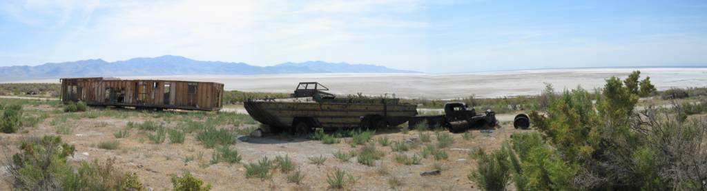
It's not enough that they had to sign the road out to the shore of the Great Salt Lake. Now, Greg reports, the State of Utah has performed a little clean up activity along the final stretch of the one lane dirt track that leads to Spiral Jetty.
Gone is all the detritus formerly located just around the bend from Smithson's earthwork. I've written (here and here) that these decaying remnants of past industrial activity at the site actually contribute to Smithson's work. I guess the State of Utah didn't agree.
The trailer, amphibious transport, and other assorted rust buckets are gone. But they aren't forgotten. Here's a panoramic shot I took of the site back in August of 2004.

With the art market as frothy as it is right now, I bet Utah could have padded its coffers by auctioning this stuff once it had been pulled off the site. There has to be a market for art world memorabilia like this, doesn't there?
Gone is all the detritus formerly located just around the bend from Smithson's earthwork. I've written (here and here) that these decaying remnants of past industrial activity at the site actually contribute to Smithson's work. I guess the State of Utah didn't agree.
The trailer, amphibious transport, and other assorted rust buckets are gone. But they aren't forgotten. Here's a panoramic shot I took of the site back in August of 2004.
With the art market as frothy as it is right now, I bet Utah could have padded its coffers by auctioning this stuff once it had been pulled off the site. There has to be a market for art world memorabilia like this, doesn't there?
Friday, January 27, 2006
With Special Thanks to Me, Myself, and I
 The United States chapter of the International Association of Art Critics (AICA) has announced the winners of its 2005 honors. The awards ceremony will be held Feb. 2 at the Jewish Museum in New York.
I always chuckle when I see the categories for this competition. I love the fact that the organization offers awards for the best shows in New York City and the best shows nationally (i.e., not New York City). (And I couldn't help but notice that this year both first and second place winners in the "best monographic museum show nationally" appeared in New York at the Whitney. So much for the not-New York City angle.) I'm all for New York art world snobbishness, but it seems to me that institutionalizing it like this isn't exactly the most politic thing to do for an organization with national reach.
And, speaking of embarrassing political decisions, this year's list of awardees contains a huge gaffe that ought to raise eyebrows--if not call into question the whole process used for selecting the winners.
In the category of "best art-related programming in a broadcast medium," this year's winner is The Yay/Nay Show's episode from Art Basel Miami Beach. For those not familiar with it, The Yay/Nay Show is a WPS1 production co-hosted by Artforum Scene & Herd contributor Linda "Fabyab" Yablonsky and Carey Lovelace.
This little off-the-cuff piece of gossipy, ephemeral, art-world cronyism beat out all other art-related broadcast programs from the past year, including programs that were actually broadcast and not just streamed over the Internet to 60 people. That includes programs like, say, Art21's season 3 which was shown nationally on PBS, was watched by several million viewers, and which will have an extended impact in classrooms around the country thanks to DVD distribution and a series of innovative educator's guides. (In the interest of full disclosure, I have provided professional services to Art21.)
So, you agree that the award winner in this category was a bad choice and you want to make your opinion known? The best thing to do would be to voice your dissatisfaction to AICA co-president and member of the awards ceremony committee, Carey Lovelace.
Oh, yes, in case you're wondering, that's the same Carey Lovelace who is receiving the award.
I can almost hear her acceptance speech now: "I would like to thank the AICA's stellar leadership team and the hard working members of the awards committee for honoring me in this way...."
Wednesday, January 25, 2006
Sending Me Secret (or Not So Secret) Messages
I've always listed an email address in the right hand column of the site for people who want to contact me. This week, after deciding that email is so 1990s and that it's time for From the Floor to join the twenty-first century, I have added a new method for users to pass information and feedback along to me.
 Taking inspiration from what the British have been doing in Russia, I've embedded a wireless receiver in one of Dia's basalt columns on West 22nd Street in Chelsea. (I figured Joseph Beuys would get a strange kind of kick out of the idea that his work was being used in this manner.)
Now if you want to send From the Floor a press release about the show you are opening next weekend or if you have feedback on a piece published on the site, you can put the message on your wireless handheld device, set the device to transmit, and wander back and forth along 22nd Street between Tenth and Eleventh Avenues until your PDA tells you that your message has been sent.
I'll be picking up my fake rock column and replacing it with a new one every Thursday morning between 2AM and 3AM so that I'm sure to get info on all the openings for the upcoming weekend. Feel free to use the new contact method. Just don't tell the Russians about it.
Taking inspiration from what the British have been doing in Russia, I've embedded a wireless receiver in one of Dia's basalt columns on West 22nd Street in Chelsea. (I figured Joseph Beuys would get a strange kind of kick out of the idea that his work was being used in this manner.)Now if you want to send From the Floor a press release about the show you are opening next weekend or if you have feedback on a piece published on the site, you can put the message on your wireless handheld device, set the device to transmit, and wander back and forth along 22nd Street between Tenth and Eleventh Avenues until your PDA tells you that your message has been sent.
I'll be picking up my fake rock column and replacing it with a new one every Thursday morning between 2AM and 3AM so that I'm sure to get info on all the openings for the upcoming weekend. Feel free to use the new contact method. Just don't tell the Russians about it.
Tuesday, January 24, 2006
Visiting the Homeless Museum's Home
I'm a sucker for pieces of institutional critique. Maybe it's the peek behind the curatorial and education department curtains that I regularly get, but I always enjoy art that sends up contemporary museum practices.
 Last Sunday I paid a visit to the first of two open houses to be hosted by The Homeless Museum. The museum, housed in the fifth floor walkup of the museum's director, boasts its own education department, audio tour, gift shop, cafe (which was serving complimentary mussels, boiled eggs, and whole milk during my visit), and membership program.
I've posted here before about the organization's most recent acquisition, MoMA HMLSS, and it was nice to have a chance to spend some up close and personal time peeking into this museum in a valise.
HoMu will be hosting the second of its two planned open houses next Sunday, January 29, from 11AM - 5PM. Free reservations and location details can be obtained by emailing info@homelessmuseum.org. And if you go, be sure not to miss the sign next to the sink in the curatorial office (a.k.a., the bathroom). There ought to be one of these posted in every museum's staff-only restroom.
Monday, January 23, 2006
Photography Monday
 For some reason, I’ve seen a lot of interesting photography and photography-related items in the last few days.
Daylight Magazine, the journal of documentary photography published by the Daylight Community Arts Foundation, is recently out with its fourth issue which focuses on the Israeli-Palestinian conflict. Featuring work by nine photographers and a short topical essay, the issue provides an unvarnished take on a complex situation with no easy answers.
The View from the Edge of the Universe explains why photography is the most rational (and predictable) segment of the art market.
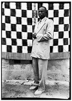
Michael Rips had an interesting piece in yesterday's Times on the photography of Seydou Keïta (above left) that addresses the issues of posthumous prints, artistic intentionality, contemporary practices of interpretation, and the art market—an unholy quartet if I've ever seen one.
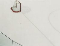 I wandered into Jen Bekman the other day and had a hard time walking out without a couple prints by one of Beckman’s latest finds, the New York-based British photographer James Deavin. Deavin’s face-mounted photographs of empty sports venues—an ice hockey rink, an indoor cricket pitch, a climbing wall, and a velodrome—are unnervingly seductive. (These low resolution reproductions simply don’t do the work justice.) It’s impossible not to fall in love with the milky surface of his abstracted ice rink, broken in its corners by an empty net and a section of Plexiglas safety board (at right).
 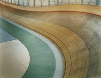 The romance of the wooden track and play of colors in Deavin’s velodrome (at left) provide visual patterns and harmonies that make me want to walk right into the pictorial space and wander through this magical place.
Available in sizes of both 30x38 (an edition of 8) and 16x19 (an edition of 10), these pieces are almost irresistible. I did find myself wondering, though, if I would respect them as much after the infatuation wears off as I did on our first encounter. Not sure that I would be able to answer “yes,” I left without taking the credit card out of my wallet.
And speaking of impulse buys, I just about did it a second time over the weekend when I stopped into my neighborhood branch library to return a few books. Seeing signs posted for an artist’s self-hung exhibition in the library’s basement, I decided to take the stairs down to have a look. Was I ever stunned. I hadn’t expected to see such a large body of interesting work so sensitively installed in a library basement. (Who would have?) But what a pleasant surprise.
Billy Parrott’s exhibition, Objects Like Memories, presents works from at least three different series that all somehow relate to the formation of memory. Using such interesting materials as obsolete children’s encyclopedias, pocket watch casings, found photographs, and layers of photographs printed on glass plates, Parrott’s work creates a nostalgia for an age that passed away before most people living today were born. Of special interest to me was a series of works that sat somewhat outside the emotional tenor of most pieces on display. Six disturbing photographic portrait collages of dolls prove to be simultaneously attractive and repulsive—creating a charged dynamic that the original objects never could.
Update: One late addition comes in this morning—MAN on a private series of photographs that Sally Mann has been creating in recent years.
Daylight Magazine, issue 4, is available for $10 from the foundation’s website.
James Deavin’s work is on view at Jen Bekman (6 Spring Street) through February 4, 2006.
Billy Parrott’s exhibition Objects Like Memories is open Wednesday, Saturdays, and by appointment at the Tompkins Square Library (331 E. 10th St.) through January 28, 2006.
Tuesday, January 17, 2006
Notes on Richard Tuttle at the Whitney
Some random observations on the Richard Tuttle exhibition now at the Whitney:
- If you've already seen the exhibition once, you've haven't seen it yet. This is the exhibition that just won't stand still. There are a couple reasons for this. First, the show was organized by SFMOMA which had more space to give to it than the Whitney does. And, second, for his 1975 show at the Whitney, Tuttle and curator Marcia Tucker designed multiple installations. The exhibition was actually hung and then re-hung three times over the course of its run. As an homage to that exhibition and to give more work a showing in New York, the Whitney made plans to swap certain pieces in and out of this exhibition. The Whitney's own work, Fountain (at right) for example, was recently removed from the show.
- Now that the show has been up and open for a while, this installing and re-installing seems to have taken on a life of its own. Every time I've seen the show over the last month there have been changes. On Sunday when I arrived to give a gallery talk, I noticed that a series of pieces that played a pivotal role in my lecture had disappeared during the previous week. I had five minutes to look for something else that I could call "a surreal Mensa test" because I thought the phrase was cute and didn't want to drop it from my talk. Guess what? I found another surreal Mensa test without any difficulty. Most of Tuttle's series from the mid-1980s, actually, can be called surreal Mensa tests.
- I'm almost expecting, one of these weekends, to walk onto the museum's third floor to find all the temporary walls removed and a single, small work installed on the floor in the middle of an otherwise empty gallery. Won't it be a challenge to try to talk about that for 45 minutes?
- On Sunday I watched a guy walk right into the middle of Tuttle's floor piece Ten Kinds of Memory and Memory Itself which was installed two weeks ago for the first time since (I've been told) 1975. The trespasser finally realized that the guards and I were shouting at him after he had miraculously stepped over several of the string drawings without kicking into any of them. His response: "Sorry. I didn't see anything there." That's always a danger with Tuttle's work, isn't it?
- I recently read Hilton Kramer's famously nasty review of the 1975 show that appeared in the Times when he was art critic for the paper of record, and I'm deeply conflicted about it. (Sorry, I can't find a copy on-line, and I'm not about to retype it here.) On the one hand, it's an incredibly witty, muscular piece of prose that expresses a firm opinion on the show--things we almost never see in art writing today. On the other hand, it's typical Kramer in its writing off of a whole body of work without expending an iota of energy to try to understand something that questions his critical assumptions. I think this is the piece that Saint Peter will pull out some day when Kramer arrives at the Pearly Gates: "Hilton, I've got to tell you. You were given a lot of talent, much more than your share actually, but just look at how you chose to use it...."
- The exhibition has the most beautifully produced catalogue I have seen in recent years. But don't just take my word for it. Find and browse a copy for yourself. You won't be disappointed.
- Update: Browsing the WPS1 archives, I came across this interview (Real Player required) with the show's curator David Kiehl. Jump forward to 21:25 of the stream to hear Kiehl discuss the installation.
Monday, January 16, 2006
Two Chelsea Picks
I spent a good portion of a day recently zigzagging up Chelsea's cross streets, wandering back and forth and back and forth between Tenth and Eleventh Avenue, and I only came across two shows of work that I found interesting enough to want to comment on here.
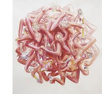 At Caren Golden Fine Art, the Dutch/French artist Serge Onnen is showing a group of drawings and drawing-inspired pieces that comment on consumer culture. His large works on paper of massed, disembodied arms holding various objects (Forks & Cameras, at right) reminds one of the clumps of writhing, mating frogs seen every so often on television nature shows about the rain forest.
Rather than getting off on members of the opposite sex, though, these appendages are holding, stroking, and fondling cameras, cell phones, and other miscellaneous products--giving a new twist to the eroticism with which so many of these items are pitched to the consuming public. Onnen's hand-drawn, low-tech cell animations of hands performing various surreal actions also charm.
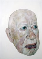 At Stux, recent Columbia MFA graduate Miki Carmi presents a show of very unflattering but totally compelling portraits. Working from photographs of family members, but not reproducing them slavishly, Carmi has created a series of similar yet distinct portraits. All his subjects (Grandpa, at left) are painted in three-quarters view and are rendered without hair--all the better to show Carmi's masterful rendering of aged skin. Each vein, every age spot, each wrinkle all take on a texture and transparency that is unlike any renderings of human skin I have seen recently. What Currin and Yuskavage did for figurative painting in the 1990s, Carmi is doing for the portrait today.
This, his first solo show, is already sold out. If it weren't I would have mortgaged the cat, if need be, to purchase one of his paintings. (No matter that I would have a hard time finding a place to hang one of these large pieces in my small apartment.) I haven't been that charitable in the past to MFA students a year out of school who have been given solo shows (with good reason, I still hold), but Carmi is an exception. While I still have a hard time getting what all the hype is around Dana Schutz's work, Carmi's is the real thing. He's young, talented, producing mature work and definitely one to watch.
At Caren Golden Fine Art, the Dutch/French artist Serge Onnen is showing a group of drawings and drawing-inspired pieces that comment on consumer culture. His large works on paper of massed, disembodied arms holding various objects (Forks & Cameras, at right) reminds one of the clumps of writhing, mating frogs seen every so often on television nature shows about the rain forest.Rather than getting off on members of the opposite sex, though, these appendages are holding, stroking, and fondling cameras, cell phones, and other miscellaneous products--giving a new twist to the eroticism with which so many of these items are pitched to the consuming public. Onnen's hand-drawn, low-tech cell animations of hands performing various surreal actions also charm.
At Stux, recent Columbia MFA graduate Miki Carmi presents a show of very unflattering but totally compelling portraits. Working from photographs of family members, but not reproducing them slavishly, Carmi has created a series of similar yet distinct portraits. All his subjects (Grandpa, at left) are painted in three-quarters view and are rendered without hair--all the better to show Carmi's masterful rendering of aged skin. Each vein, every age spot, each wrinkle all take on a texture and transparency that is unlike any renderings of human skin I have seen recently. What Currin and Yuskavage did for figurative painting in the 1990s, Carmi is doing for the portrait today.This, his first solo show, is already sold out. If it weren't I would have mortgaged the cat, if need be, to purchase one of his paintings. (No matter that I would have a hard time finding a place to hang one of these large pieces in my small apartment.) I haven't been that charitable in the past to MFA students a year out of school who have been given solo shows (with good reason, I still hold), but Carmi is an exception. While I still have a hard time getting what all the hype is around Dana Schutz's work, Carmi's is the real thing. He's young, talented, producing mature work and definitely one to watch.
Tuesday, January 10, 2006
A Big Surprise, Duly Noted
I'm not a big fan of Ed Ruscha's work. Never have been. I even wrote something snarky back in 2004 when it was rumored that Ruscha was the leading contender to represent America at the last Venice Biennale.
So it's come as a surprise to me how much I've been enjoying the current installation of his Biennale contribution, Course of Empire, which is on view at the Whitney through January 29.
Part of my interest in the work is due to the multiple layers of allusion the series carries (between the black and white works from the early 1990s and the more recent color pieces and between this series and the original by Thomas Cole that I have always liked). Another part is due to the installation itself. I don't have an installation view to share, but maybe that's a good thing as it won't ruin the surprise for you if you haven't seen the show yet. I'll just say that I've never seen a Whitney installation that uses Marcel Breuer's architecture in such an interesting way.
Update: Up to the minute with the zeitgeist, I guess. No sooner do I post this and start poking around the web for the first time today than I come across this, and this, and this. The Ruscha installation, I guess, is the topic du jour.
Thursday, January 05, 2006
Blinding Insight into the Turner Prize Jury's Decision Making Process
In this month's issue of The Art Newspaper, Turner Prize panelist Louisa Buck spills all the juicy details about how the jury reached its final decision.
Picking a winner was, therefore no picnic.... Again there were no fireworks behind the closed jury doors, but no easy agreements either and although I believe that we were all comfortable with the final outcome, I for one am glad that you only judge the Turner Prize once in your career.No, wait. Where's the insight?
Tuesday, January 03, 2006
Catalogue of the Week
One of the side effects of the day job is that I have to spend time--sometimes a lot of time--in unusual places. Once in a while that's a perk; more often, though, it's a pain.
A few years ago I spent the better portion of nine months camped out in Lincoln, NE. While I was there, I got to know the collection of the Sheldon Memorial Art Gallery at the University of Nebraska. The Sheldon played no small part in the affection I came to feel for a small city that I never guessed I could like so much.
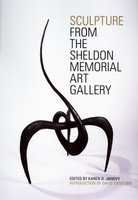 Housed in a Philip Johnson-designed building, the Sheldon has what is among the best public university collections in America. But the collection isn't bounded by Johnson's walls. Over the years, the museum has annexed the whole campus as outdoor sculptures by Mark di Suvero, Richard Serra, Michael Heizer, Claes Oldenburg, and others have been commissioned and installed around the university grounds.
The University of Nebraska Press has recently published a catalogue of the Sheldon's sculpture collection, and it's been a pleasure to browse through it recently--revisiting old friends from the collection and remembering cool summer evenings spent strolling around the campus.
Edited by the Sheldon's curator of education Karen Janovy, Sculpture from the Sheldon Memorial Art Gallery tells how the Sheldon developed its sculpture collection and illustrates many highlights with color photos and short descriptive essays. Presenting work both intimate and monumental, this catalogue shows what a small institution with a single major benefactor and a dedicated curatorial staff can do over time.
A few years ago I spent the better portion of nine months camped out in Lincoln, NE. While I was there, I got to know the collection of the Sheldon Memorial Art Gallery at the University of Nebraska. The Sheldon played no small part in the affection I came to feel for a small city that I never guessed I could like so much.
Housed in a Philip Johnson-designed building, the Sheldon has what is among the best public university collections in America. But the collection isn't bounded by Johnson's walls. Over the years, the museum has annexed the whole campus as outdoor sculptures by Mark di Suvero, Richard Serra, Michael Heizer, Claes Oldenburg, and others have been commissioned and installed around the university grounds.The University of Nebraska Press has recently published a catalogue of the Sheldon's sculpture collection, and it's been a pleasure to browse through it recently--revisiting old friends from the collection and remembering cool summer evenings spent strolling around the campus.
Edited by the Sheldon's curator of education Karen Janovy, Sculpture from the Sheldon Memorial Art Gallery tells how the Sheldon developed its sculpture collection and illustrates many highlights with color photos and short descriptive essays. Presenting work both intimate and monumental, this catalogue shows what a small institution with a single major benefactor and a dedicated curatorial staff can do over time.
Monday, January 02, 2006
Turner Prize Finalists, 2005
I have been meaning to post something on the Turner Prize finalist show at the Tate for a few weeks, but until now I haven't found the time to turn the notes I took into something coherent. Maybe it's better, though, that I don't say too much about the exhibition.
Like last year, what impressed me most about the show was the pedagogical and PR packaging with which the Tate has wrapped up the finalists' work. While I liked some of this year's work better than what I saw in 2004, the show as a whole underwhelmed me.
Maybe that shouldn't be too much of a surprise. The Turner Prize is awarded each year to a British artist under 50. The numbers work out this way. You start with the island that has a population of 60M people. You can assume that only one in 10,000 people is a professional visual artist. You figure 1/4 of those artists are over 50, so you exclude them. Then you figure that of the remaining group, only one in 100 is doing work that's of international caliber. That leaves you with a pool of 45 British artists with an international reputation who might be candidates for the award.
The prize has been given 21 times now, and it's never a good thing to nominate an artist a second or third time for the prize if she didn't win it when she was up the first time. So, basically, the Tate has to pull new nominees out of a barrel that holds fewer and fewer potential recipients for the prize each year. I hesitate to say it, but if you stick with my metaphor here you find that before too long you're scraping the bottom of the barrel.
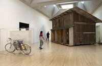 Work by this year's prize recipient, Simon Starling (an installation view of his contribution to the finalists' show is at right), left me feeling cold. Starling identifies and exploits systems of transformation to produce various objects that illustrate the systems used for their own generation--five platinum prints of a platinum mine from which one ton of earth was removed to generate enough metal to make the prints, a shed he disassembled to turn into a boat to float down a river to turn back into a shed in a museum, a homemade hydrogen-fuel-cell-powered moped used to cross a Spanish desert and a watercolor painting of a cactus seen on the trip that was created with the water generated as a waste product by the moped's engine.
I found if interesting, though, that this year's panel went the same direction in their pick as last year's. They didn't give the nod to the video installation or the sculptural environment. Instead, like last year's pick of Jeremy Deller, they went with the artist whose work creates and then explores the nature of systems. I'm wondering if this says something about the nature of contemporary British art as opposed to contemporary American art. Over there, the work getting all the praise and attention is that which is neat, orderly, and systematic. Over here it's the work that's dirty, messy, and unabashedly DIY.
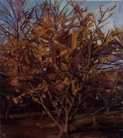 I much preferred the work on display by Darren Almond (a video installation that contains the sweet whiff of nostalgia but that needs interpretative material to fully open up for appreciation) and the young painter Gillian Carnegie. Her painterly undercutting of the illusion of representation (one example, at left) reminds me of what Gerhard Richter was doing in the 1960s. But far from being derivative, Carnegie's work feels fresh and challenging. It's a shame the panel didn't feel as strongly about her work as I did. She would have been a good pick for this year's award. (Installation artist Jim Lambie rounded out this year's short list.)
I hesitate to damn the show with such faint praise because the prize is actually awarded to an artist for a show held elsewhere during the year. This exhibition is intended simply to present select pieces by each finalist. That said, the prize would be more relevant and generate more excitement if the number of potential recipients weren't shrinking so dramatically each year. It might be time, now that the prize is established and the PR machinations are so well refined, to broaden the potential pool of recipients.
Britain used to be good at conquering the world. Why not attempt to own the art world today by turning the Turner into the world's preeminent international art prize--the Nobel of the visual arts? It could work. And it would produce a much more interesting finalists' exhibition, I'm sure.
The Turner Prize Finalist show is on view at Tate Britain through January 22, 2006.
Like last year, what impressed me most about the show was the pedagogical and PR packaging with which the Tate has wrapped up the finalists' work. While I liked some of this year's work better than what I saw in 2004, the show as a whole underwhelmed me.
Maybe that shouldn't be too much of a surprise. The Turner Prize is awarded each year to a British artist under 50. The numbers work out this way. You start with the island that has a population of 60M people. You can assume that only one in 10,000 people is a professional visual artist. You figure 1/4 of those artists are over 50, so you exclude them. Then you figure that of the remaining group, only one in 100 is doing work that's of international caliber. That leaves you with a pool of 45 British artists with an international reputation who might be candidates for the award.
The prize has been given 21 times now, and it's never a good thing to nominate an artist a second or third time for the prize if she didn't win it when she was up the first time. So, basically, the Tate has to pull new nominees out of a barrel that holds fewer and fewer potential recipients for the prize each year. I hesitate to say it, but if you stick with my metaphor here you find that before too long you're scraping the bottom of the barrel.
Work by this year's prize recipient, Simon Starling (an installation view of his contribution to the finalists' show is at right), left me feeling cold. Starling identifies and exploits systems of transformation to produce various objects that illustrate the systems used for their own generation--five platinum prints of a platinum mine from which one ton of earth was removed to generate enough metal to make the prints, a shed he disassembled to turn into a boat to float down a river to turn back into a shed in a museum, a homemade hydrogen-fuel-cell-powered moped used to cross a Spanish desert and a watercolor painting of a cactus seen on the trip that was created with the water generated as a waste product by the moped's engine.I found if interesting, though, that this year's panel went the same direction in their pick as last year's. They didn't give the nod to the video installation or the sculptural environment. Instead, like last year's pick of Jeremy Deller, they went with the artist whose work creates and then explores the nature of systems. I'm wondering if this says something about the nature of contemporary British art as opposed to contemporary American art. Over there, the work getting all the praise and attention is that which is neat, orderly, and systematic. Over here it's the work that's dirty, messy, and unabashedly DIY.
I much preferred the work on display by Darren Almond (a video installation that contains the sweet whiff of nostalgia but that needs interpretative material to fully open up for appreciation) and the young painter Gillian Carnegie. Her painterly undercutting of the illusion of representation (one example, at left) reminds me of what Gerhard Richter was doing in the 1960s. But far from being derivative, Carnegie's work feels fresh and challenging. It's a shame the panel didn't feel as strongly about her work as I did. She would have been a good pick for this year's award. (Installation artist Jim Lambie rounded out this year's short list.)I hesitate to damn the show with such faint praise because the prize is actually awarded to an artist for a show held elsewhere during the year. This exhibition is intended simply to present select pieces by each finalist. That said, the prize would be more relevant and generate more excitement if the number of potential recipients weren't shrinking so dramatically each year. It might be time, now that the prize is established and the PR machinations are so well refined, to broaden the potential pool of recipients.
Britain used to be good at conquering the world. Why not attempt to own the art world today by turning the Turner into the world's preeminent international art prize--the Nobel of the visual arts? It could work. And it would produce a much more interesting finalists' exhibition, I'm sure.
The Turner Prize Finalist show is on view at Tate Britain through January 22, 2006.
![]()