Friday, July 30, 2004
The Brooklyn Biennial
People tend to view their era as the exception to historical norms. Today is always the best or the worst, the first or the last, of something. But, realistically, ever since the city evolved there have been communities of artists and craftspeople living, working, fighting, and drinking together.
Rather than focusing on quantity, we could instead look at quality and ask if work being made in Brooklyn today is as interesting as work done at any point in the past. Open House: Working in Brooklyn (at the Brooklyn Museum of Art through August 15, 2004) makes the case for an affirmative answer to that question.
The show walks silently around its implicit claim that the center of the New York art world has migrated east, under and over the East River, from Manhattan to Brooklyn. Any show like this runs the risk of demeaning artwork by placing it in service of the local chamber of commerce, but Open House avoids that pitfall. While some boosterism is evident in the name and timing of the show (its opening coincided with the Brooklyn Museum’s grand reopening), the work included is too good to be dismissed as propaganda for the borough.
Today’s Brooklyn-based art world is not as homogeneous as Irving Sandler’s Greenwich Village of the 1950s. There is more racial and gender diversity in the community today than there was then. The media that artists are using have also become more diverse as options have expanded beyond painting and sculpture to include video, film, sound, installation, collage, drawing, and photography. Open House makes a point of highlighting both these types of diversity.
The show presents more than 300 works by 200 artists. All pieces have been created since 2000. The curators describe the show as being “eclectic and open-ended,” and it certainly is. I’ve written recently about the inventory approach to curating monster group retrospectives, but in the case of Open House that approach isn’t a hindrance. The exhibition exists to show the panoply of artists and media in play in Brooklyn today, and the curatorial approach reinforces that theme.
The curators have used an interesting method to install the show. Most works are grouped together on two floors in the museum’s Morris A. and Meyer Shapiro Wing. A significant number of pieces, though, are installed throughout the museum’s permanent collection galleries. A map to the museum, showing the location of all Open House works, is provided for viewers.
The curators have chosen works for deployment across the museum wisely. Rob Fischer’s Untitled (Container of Ash) coexists perfectly with the mummies of the museum’s Egyptian collection. Its sarcophagus-like shape, its overtones of death and disintegration, and its focus on purification and rebirth through fire fit conceptually with the ancient Egyptian relics among which it is displayed.
E.V. Day’s G-Force over Brooklyn, several items of women’s underwear coated in resin, zooms high above the floor of the airy gallery housing Rodin’s monumental Burghers of Calais. The color and texture of the garments resonate with Rodin’s bronze, while their lightness and implied movement offer a counterpoint to the sculptures’ massive stability.
The work contained in the main installation galleries holds as much appeal, and interesting affinities appear between works. Su-En Wong’s monumentally sized paintings showing multiple images of herself in strange situations and locales demonstrate the possibilities of painting on a large scale. At two inches by three inches, James Sheehan’s high-relief paintings, Halcyon Days and The Empiricist, show what it’s possible to do with the medium on a completely different scale.
Bill Scanga has taxidermied two pigeons for the show. They stand on a small platform looking at a five by ten inch ornately framed reproduction of Asher B. Durand’s The First Harvest in the Wilderness—a painting commissioned by the museum in 1855 to inaugurate its collection of American art. In its beak one pigeon holds a small Brooklyn Museum of Art shopping bag filled with a tiny poster and even smaller postcards. While we’ve already seen Maurizio Cattelan use taxidermy to make this sort of humorous institutional critique, Scanga’s piece still delights.
The delicateness and humor of Scanga’s sculpture is countered by the size and seriousness of two Katy Grannan photographs. Her portraits of vulnerable, ordinary people who have responded to classified advertisements for photo shoot models have received sustained attention in New York this year with shows at Artemis Greenberg Van Doren and Salon 94 as well as inclusion in the Whitney Biennial. Far from being over shown, her work still packs power here.
Downstairs, in a small separate gallery devoted to Open House works, Oliver Herring is showing three videos. Each of them is interesting, but the one that captured my attention—and the attention of three pre-teens visiting with their dad—is a piece showing people spitting mouthfuls of water. Herring has reversed the video, so we watch great clouds of spray condensing and disappearing into people’s mouths. We also see gravity defied as long streams of water jump up from the bottom of the frame and into other people’s mouths. The video presents simple and banal actions, but by reversing the flow of time and jump cutting from one instance of the action to another to another, Herring gives us a work that fascinates.
Open House: Working in Brooklyn impresses. It doesn’t push the point didactically. But the show does make the case that, with the diversity and quality of art work being produced there today, Brooklyn has become the center of the New York art world.
Poor Richard Lives!
Thursday, July 29, 2004
How Much Would You Pay for Nothing?
I went to the ICA's Big Nothing. I thought about buying a t-shirt, as the logo is cool, but $20 for a "big nothing" seemed a bit steep. And that's the rub on conceptualism, isn't it? What exactly are we paying for?A good point. When it's done well, conceptualism can be powerful, thought provoking, and even fun. But it's even more fun when someone else has footed the bill.
Wednesday, July 28, 2004
The Grotesque in Santa Fe
Blake Gopnik published an extensive review of Site Santa Fe’s fifth biennial in last Sunday’s Washington Post. The show, curated by Robert Storr, is entitled “Disparities and Deformations: Our Grotesque.” Gopnik finds the show to be something of a novelty for a biennial:
The biennial is one of a handful of big contemporary-art surveys held in the United States. Usually these events feel like agglomerations of whatever the art world counts as new and hot, or of some curator’s all-time favorites. Storr’s version, however, comes off as a tightly coherent, almost scholarly affair.It sounds like the show avoids the two major pitfalls of most biennials: an exhibition that is little more than an inventory (sort of an unmanaged, index fund of the current art world) or an exhibition organized by contrived themes that have been arbitrarily layered over works after they were selected for inclusion.
I probably won’t have the opportunity to see this show. If anyone reading the site does, please drop me an e-mail with your thoughts on it.
While I’m on the topic of the Post, I want to give them kudos for their creative use of photo and video features in their arts coverage. Gopnik’s review mentions Jennifer and Kevin McCoy’s digitally manipulated film Horror Chase and Kara Walker’s video Testimony. The article actually has a sidebar with links you can follow to view portions of these videos and to see a slide show of other exhibition highlights.
For a while now, Gopnik has been doing video features for the Post’s arts section, and several of them are also available from a sidebar to last Sunday’s review. Don’t miss his delightful discussion on the National Gallery’s Romare Bearden exhibition with basketball player and collector Grant Hill. (The show will be coming to the Whitney this October.)
Tuesday, July 27, 2004
Irving Sandler and His Push Broom
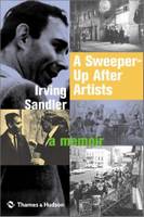 In the typical narrative of art history, we see a small pantheon of notables when we look back to that era—mostly men, mostly painters, mainly abstract expressionists. Sandler’s memoir reminds us, though, that life as it’s lived is never as neat or as simple as its documentation as history.
Reading Sandler, I’ve been surprised to see how diverse the work was that was being done in those years and how much controversy there was within the community that produced it. Aesthetics and ethics fused for many people in Sandler’s circle, and they argued violently and for hours at a time about the rights and wrongs of the artistic choices they were making.
Rather than giving us another history of this period, Sandler shows us what it was like to be there as art history was in the process of being made. His memoir conveys some of the narrative richness and complexity of character that gets washed out of most histories.
If this is what a good sweeper-up does, we should all hope there’s someone walking around the streets of Brooklyn today with a broom the size of Sandler’s.
Sunday, July 25, 2004
Brooklyn is Learning from Las Vegas
 I’ll say this once, and then I’m going to move on because I really don’t want to dwell on it. I actually agree with Hilton Kramer on something.
I finally made it out to the Brooklyn Museum of Art today to see Open House: Working in Brooklyn. I’ll post something about the show later this week, but I have to comment on the building first.
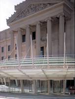
Arriving at the museum, I got my first view of the new entrance designed by Polshek Partnership Architects. It’s all glass and metal and rounded corners. And it’s horribly stuck onto a classical façade in a manner that does nothing for the new, nothing for the old, and less than nothing at the intersection of the two.
Kramer (in his typical ad hominem way) accuses the museum’s director of creating:
what might be called Operation Face Lift: the museum’s glitzy new entrance, a costly postmodern extravaganza of glass and steel that effectively destroys the classical elegance of the building’s original design by McKim, Mead and White. (For his whole diatribe, go here.)But Kramer missed a point that would have allowed him to whip his critical pique into a froth. There are new fountains too. This is from the Museum’s own website:
The public plaza will also contain two water features by WET Design, the designers of the water features at the Bellagio Hotel in Las Vegas and the Winter Olympics Torch in Salt Lake City last year.
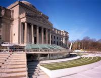 We’ve now seen true cross fertilization between the museum and Las Vegas. First, the casinos took a lesson from the art museums with the Guggenheim Las Vegas and the gallery at the Bellagio. Now the art museums are taking a lesson from the casinos with fountains that do the wave in synchronized spurts of water.
I actually appreciate the mission the Brooklyn Museum has embraced of becoming “the most visitor-friendly of any New York art museum,” and I was impressed today with how they have reinstalled the permanent collection. But by ruining the classical lines of a historic building and dropping in fancy fountains (oh, sorry, “water features” ) for the purpose of creating a “visitor-friendly” experience, the museum has taken pandering (Kramer calls it “dumbing down”) to a new high, or low.
Update: I'm glad to say that the reason for my visit to the Brooklyn Museum of Art, Open House: Working in Brooklyn, didn’t disappoint. Far from being a lowest common denominator show, it presents challenging and interesting work and makes a credible claim that Brooklyn has become the center of the New York art world. My review of the exhibition has now been posted here.
Water Works in Red Hook
Every work in the show is supposed to relate to water in one way or another. For the most part, it’s all oil paintings of tropical beaches at sunset, watercolors of pastoral streams, and photographs of waterfalls.
Of the hundreds of undistinguished pieces in this gigantic group show, works by two painters stand out.
Karen Holt is showing two paintings from her Bathtub Series. These pieces, one titled Landscape the other Tsunami, show parts of a woman’s generously proportioned body protruding above the waterline in a tub. Painted from the reclining woman’s perspective, the images take a moment to resolve visually. They have the same cotton candy haze that Lisa Yuskavage’s best works do, but these are more ambiguous. The body, all thighs and belly, reads representationally but also dissolves into landscape and atmosphere.
Tracy E. Phillips is showing two 12x12 inch paintings titled Lures #1 and Lures #2. In both pieces, disembodied eyeballs float against an abstract, painterly background. Brightly colored fishing lures, with sharply pronged hooks, circulate among the eyes. The paintings are small, detailed, finely worked, mildly surreal, and slightly disturbing to view—all of which make them feel very current. Priced at $650 each, either would make a great purchase.
A Pilgrimage to The Lightning Field (Part 2 of 2)
Pilgrims undertake their journeys for different reasons. For some, religion dictates the behavior. Others make sacrifices to complete the journey as a sign of personal fidelity and devotion. Some look to experience a personal change though undergoing the journey. Still others travel to be able to claim that they have, to check that item of their list of life accomplishments.
All these reasons, to one extent or another, drove my decision to travel to The Lightning Field. Any religious pilgrim hopes to come away from the pilgrimage with new insight or having experienced personal change of some type. I can’t say I was any different. I was hoping for something by going to the high New Mexico desert to spend a day with De Maria’s best known—but least seen—work.
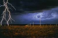 As the title indicates, the work is supposed to engage the atmosphere, drawing down lightning from the sky, creating an interchange between nature and culture. But it doesn’t really work this way. If you go expecting to see lightning strike the field, you may be disappointed. When a bolt of lightning does strike, it chars the pole that it hits, forcing the pole to be replaced. This only happens once every few years.
There was no lightning when I visited, but I did not go away from the experience disappointed.
The set of rules governing how the work is viewed (rules that I referred to somewhat facetiously in my first post) do structure the visit and create a richer experience for those who follow them.
It would not be enough to drive up to a parking lot on the edge of the work, snap a few pictures, get back in the car, and leave. The work unfolds in time and space. By forcing viewers to spend a day with the work and by giving them the freedom to wander around and through it, De Maria has made sure that people who see the work will feel it as well.
Actually spending time with The Lightning Field provides an experience that cannot be captured through photographs or descriptions. As the quality of light changes over the day, the work’s character changes. While the sun is high in the sky from mid-day into late afternoon, the poles almost disappear. They don’t throw a shadow, and the harshness of the light washes out poles more than three or four away from where you stand.
But as the sun drops in the sky when evening approaches, the field becomes different. A shadow grows from the base of each pole, giving it additional definition. The more veiled, angled light of evening begins to reflect off the poles, bringing into view the whole mile-long by kilometer-wide field. Watching this happen, it’s as if your vision suddenly sharpens. The field emerges from the landscape in its totality. If you happen to be there on a night that is not overcast and you get a brilliant orange sunset, the effect is stunning. The poles reflect that light, flashing orange, setting the field ablaze with color.
Part of the benefit of visiting The Lightning Field is getting a sense for the size of the work. In its conception, the work is a marvel of precision. Dia, which administers the piece, describes it this way.
The Lightning Field is comprised of 400 polished stainless steel poles installed in a grid array measuring one mile by one kilometer. The poles, two inches in diameter and averaging 20 feet by 7 1/2 inches in height, are spaced 220 feet apart and have solid pointed tips that define a horizontal plane.Until you actually walk the 3.2 mile perimeter of the work and spend even more time wandering through its middle, you have no sense of the immensity of this construction.
Because the terrain is rough (it’s relatively flat, though, with changes in elevation over the whole piece limited to a few feet), you can’t walk fast. It takes well over an hour of walking under a harsh desert sun to circle the work. This is artwork on a completely different scale than anything you have experienced before. You come away with an appreciation for the grandiosity of De Maria’s vision and with a new touchstone for evaluating artistic scale that will inform your viewing forever. This is sculpture on the scale of nature.
Most pilgrims begin their journeys with the expectation of experiencing transformation. Seeing The Lightning Field did provide a transformation for me. It’s given me a new perspective that informs how I look at art. My sense of evaluating size and scale changed after spending a day with De Maria’s work.
The experience has also made me willing to travel to see other significant earthworks. I’ve just made reservations for another pilgrimage this August. Stay tuned for a report.
Friday, July 23, 2004
A More Rational Art Market
Fernwood is a new hedge fund, run by an experienced investment manager and supported by art market experts. It uses fine art as an alternate asset class to give its investors portfolio exposure outside the traditional stock and bond markets.
Vogel lends the company her byline to describe itself this way to Times readers.
Fernwood bills itself as the "first independent firm to develop a comprehensive suite of art-focused investment, research, advice and financial products," creating "multiple opportunities for sophisticated individuals and institutional investors to participate in the art economy."She goes on to say that the company plans to invest $100 million to $150 million annually in art. Its investments will be made in eight market sectors, covering European old masters to emerging contemporary artists.
I have been seeing a lot of press lately claiming that the art market is overheated and ready for collapse. Is this another sign that the implosion is imminent?
Not necessarily.
Let me start by making a disclosure. I tend by nature to be a bear on financial markets. Maybe it was my Calvinistic upbringing, but I’m always waiting for the other shoe to drop, for the bubble to pop, for the good times to come crashing to an end.
So that’s why I’m surprised to find myself being bullish on the art market.
Some say that there are too many people collecting art and that there’s too much publicity about the market. They see investment funds like Fernwood’s or work done by companies like Art Capital Group as additional evidence that the art market today is akin to the tech stock market of the late 1990s—too many people paying too much money and trying to be too clever about funding things that won’t hold their value over the long term.
I’m not so sure. Until the last decade, the art market was one of the least transparent and most irrational around. Transactions were managed through dealers who operated secretly and withheld current and historical pricing information. The secondary markets did not share transactional information readily with the public and did not make historical pricing information available.
Today with the Internet it’s relatively easy for an individual to research the work of an artist and to find dealers for that work nationwide and even worldwide. Don’t like it that a New York gallery won’t allow you to purchase work by an artist because they’ve allocated all that artist’s work to their special clients? Email a gallery in Dublin that also represents the artist instead. Think your local dealer is asking too much for a print you like? Find another print from the same series offered by someone else at a lower price.
Historical pricing of objects sold on the secondary market is now available free or for relatively low fee through various sources. (See, for example, Sotheby’s Sold Lot Archive Search. Note to Christie’s: why aren’t you giving free access to past auction results too?)
Today dealer and pricing information is more transparent than it has ever been. That’s a key step in making the move from a closed, irrational market to an open and rational one.
Entry into the market by tertiary players, financiers, and others looking to capitalize on the value in art signifies another healthy trend. Over the last few weeks I’ve seen several interesting examples of free-market, entrepreneurial capitalism at work. The Artist Pension Trust is one example. Another is noted in a recent Artnet item about Sharon Louden’s venture capital approach to raising funds for her work by selling shares in it. (Follow this link and scroll down the page to the item entitled “Artist Sells Shares to Fund Work.”)
Of course there are downsides to all this interest and money flooding into the market. The law of supply and demand becomes more true than ever. As individuals look to art as an investment, they will tend to go after name-brand, blue-chip work (the GE’s, P&G’s, and Berkshire Hathaways of the art world), driving up prices at the top end.
But, over the long run, investors will bring transparency and rationality to the market as they demand information, services, and behavior that align with what they receive in the securities markets. This will benefit everyone interested in purchasing art, even those who buy in sectors of the market where supply is high and demand is low.
Thursday, July 22, 2004
Rauschenberg in Hartford
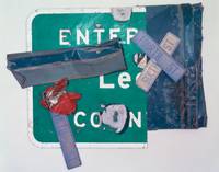 The show presents work from three series: Currents from the 1970s, Gluts from the 1980s, and Scenarios from the last few years.
Several works from Gluts have been hung in a large gallery with a barreled ceiling. The space is perfect for them. The gallery gives them the room they need to breathe and allows their size to work to their advantage. In a smaller space they wouldn't be nearly as effective. It's worth seeing the show for this room alone.
The rest of the show is spotty--at best. I've been working on a piece about Ana Mendieta's move from the landscape into a studio in the early 1980s. Seeing the Rauschenberg show today gave me a new respect for Mendieta's decision to throw out her established working practice to try something new. It also made me wish Rauschenberg would take a risk even half that daring in his work.
Wednesday, July 21, 2004
Sculptors Using Rapid Prototyping Technology
For anyone who speaks to a general audience about contemporary art, it's another piece of information to work into your set of talking points on the artist's role as creator and the original vs. the reproduction.
The article reminded me of some works in the Whitney's BitStreams exhibition back in 2001. The exhibition's curator had included a couple funky Styrofoam sculptures in the show that were made with this equipment. In a walkthrough of the show that he led, he presented these works as a new form of art, saying that the art existed in the data set containing the instructions used by the machine to carve the final object. It struck me at the time that the pieces were simply Gehryesque forms created using a process of industrial fabrication that was common in industry but hadn't yet been accepted widely in the arts. They weren't a new form of art, but rather a traditional form making use of new processes and tools for fabrication.
It turns out that this is how the technology is being embraced as it becomes more accessible. The article includes of photo of Kiki Smith detailing a piece that she has created using the technology.
A Pilgrimage to The Lightning Field (Part 1 of 2)
Like others who have a passion for the arts, I’ve done my share of cultural tourism. One of the main purposes for a trip I made to Scotland, for example, was to see some of Charles Rennie Mackintosh’s work.
I use the fact that I travel frequently for work to view exhibitions I wouldn’t otherwise have the chance to see. As a result, I’ve developed an appreciation for arts venues in such places as San Francisco, Cincinnati, San Diego, Toledo, and even Lincoln, NE, where the locals like to claim that the Sheldon has the best collection of art between Chicago and Denver.
(As far as I know, St. Louis is still located somewhere between the Windy and Mile High cities. But far be it from me to pour cold water on the claims of boosters who take pride in their local art museum, especially when it happens to be a good one.)
But in thinking through all the art that I’ve seen while away from home, one experience comes to mind as being different than the rest.
Over the Fourth of July weekend in 2002 I made the pilgrimage (and I don’t use that word lightly) to the New Mexico desert to see Walter De Maria’s Lightning Field. I say “pilgrimage” because The Lightning Field isn’t just a piece you stop by to see on a lark.
The work’s official website specifies the processes to be followed for reserving a place and traveling to the site. But here’s how it really works.
You make a reservation months in advance. On the scheduled day, you show up at an empty building on the one street of a town so small that it’s not even shown on all maps. By the way, this town happens to be a three-hour drive from the nearest commercial airport. Eventually someone pulls up next to your parked car and asks you if you’re there to go to The Lightning Field.
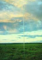 You throw your gear in the back of this person’s truck, and you get driven over one-lane dirt roads for 45 minutes. Eventually 20 foot high stainless steel poles appear outside the right-hand windows. You ride parallel to the poles for almost a mile before you arrive at a shack. This is where you get dropped off. The driver shows you where your dinner can be found, tells you that someone will pick you the next day, and leaves.
You’re stuck.
You want to go home? Don’t bother trying. It will take you more than a day to walk back to your car. And you won’t run into anyone to give you a lift between here and there.
If this all sounds a little cloak and dagger that’s because it is. I don’t think the woman who drove me out and brought me back the next day even told me her name.
Looking at the work cynically, it could be seen as the product of a marketing genius. “So here’s what we’re going to do. We’ll build a site-specific work in a location so remote that people can’t find it without a guide. We’ll force people to apply to see it. We’ll make it difficult for them to get a reservation by limiting the number of viewers to six per day. Then, when we do decide to let people in, we’ll make them feel really grateful that we’ve finally given permission. No, wait, that’s still too easy. It’s not painful enough yet. Oh, I’ve got it! Get this. As a condition of seeing the work, we’ll make people agree to spend a minimum of 19 hours with it.”
Except for the 19 hours bit, more than one restaurant in New York has used the same strategy for making itself the hottest place in town for a few months. Like with a really hot restaurant, because it’s so difficult to get in to see The Lighting Field, no one who gets the chance to see it will ever say a bad thing about it.
And if you do make the trip to see The Lightning Field, you become a minor celebrity in certain circles. Chances are that none of your art-loving friends has actually made the pilgrimage. If you’re art-chatting over cocktails and the topic of earthworks comes up (or any topic that’s remotely close, for that matter) you’re holding the conversational trump card. “Well, when I spent a day recently wandering through The Lightning Field. . . .”
But is the work any good? No one who has made the investment of several hundred dollars and .01% of his life (yes, I just did the calculation, and paying a visit to The Lightning Field can actually be measured as a percentage of your lifespan) will ever admit that the experience was less than sublime. It’s OK to admit that you spent $10 and 90 minutes watching the most recent Will Ferrell movie and that you hated it. No one will think less of you if you admit that. But if you tell someone that you went to The Lightning Field and it really sucked, you look like a dupe.
So what’s it like to visit The Lightning Field? What do you do for 19 hours while you’re waiting to get picked up? Sublime experience, or high brow version of Anchorman? Come back later this week when I post the second part of this piece.
Update: Part 2 has been posted here.
Monday, July 19, 2004
The Something Missing from Nothing
It is a show full of art that appeals to the October subscriber base and anyone else who values an idea more than the execution of that idea into a work of art. The Big Nothing attempts to demonstrate that art need not be visually engaging, that it need not be looked at, that all you have to do is think about it and somehow that in itself will be fulfilling. This is an exhibit that should have been a book.The issue he raises is a good one. What's the point of going to see an exhibition of concept-based works that have no presence as objects of art? Or, at a more removed level, how can and should concept-based work be exhibited when the purpose of an exhibition is to display objects?
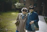 I find Nikki S. Lee's identify-based photography compelling. It's smart, playful, and conceptually and (surprisingly) visually rich. Her Seniors Project, for example, contains layers of meaning that aren't obvious. This photograph from the series was taken in Stuyvesant Town--a housing development in Manhattan that has been declared a Naturally Occurring Retirement Community by New York City. Lee could have done work in this series just about anywhere, but she chose Stuyvesant Town because it allowed her to get that much more deeply into the lives of those whose identify she assumes in her work.
But would I find an exhibition of Lee's work compelling enough to travel to see it? Probably not. Why? Because the objects, the photographic documentation of her assumptions of others' identity, don't gain much in original that they don't have in reproduction. Would I buy one of her works? Again, probably not because I wouldn't feel the return on my investment in an original. I would, however, not hesitate to buy and enjoy her book.
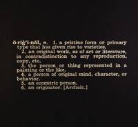 I don't believe that all conceptual art is as good in reproduction as in original, though. I still think about an early text-based work by Joseph Kosuth that I saw a couple years ago at a Sotheby's preview. It was as simple (and reproducible) as a work could be--a dictionary definition spelled out in white text on a black background. But there was something about the work--a true presence--that it loses in reproduction. I guess I wasn't the only person who thought this way. The work ended up selling for three and a half times its pre-sale high estimate.
(As an interesting aside, I was taken enough with the work to talk with a specialist about it. The piece was in rough shape for being only 35 years old. The sides and a corner of the face were severely cracked, and I worried about how well the work would survive into the future. The specialist offered to contact Kosuth's studio for me to see if they could restore the piece. She emailed me back with an answer a couple days later. If I bought the piece, Kosuth's studio said, they would be happy to refabricate it for me.
The irony here is too delicious to pass up uncommented. If I bought the original work, the studio would destroy the piece and make me a copy--a copy of the definition of the word "original." Truly Art as Idea as Idea, not art as unique, hand-made object. In case you're wondering, I didn't end up bidding on the piece.)
So what was it about Kosuth's piece that Nikki S. Lee's work is missing and that, presumably, is missing from Big Nothing? It's not conceptual richness or complexity. It has something to do with how an artist chooses to objectify the concept he or she works with.
Sometimes the object created provides an experience for the viewer that goes beyond the instigating idea for the work. Kosuth's work, with its sharp contrast between the black background and the white text and with its size (these pieces are surprisingly large which you wouldn't guess from reproductions), provides an experience that is akin to that provided by good minimalist art. To be in the presence of the object makes you aware of yourself being in its presence. It tightens your strings just a little bit. It gives you a jolt and makes you more aware.
If a work of conceptual art can't, or doesn't, do this for the viewer, there's not much point in making a trek to see it. It's easier, and almost as satisfying, to read the critical essay about it that will eventually show up in October. But if that something is there, you'll miss it if you write the show off as nothing.
Saturday, July 17, 2004
Welcome to From the Floor
I plan to use this space to write about how people experience the visual arts today. Like others who follow the visual arts closely, I read a good deal of arts journalism and criticism. I’ve noticed, though, that there’s a gap in most media coverage of the subject.
Journalists and critics often write from a desk instead of from the gallery or museum floor. By this I mean that they go somewhere, look at art, and then return to their offices to write about what they’ve seen. In most writing on the visual arts, I get no sense of immediacy—of what happened when the author stood in the presence of the work and experienced it.
That’s the space I want this blog to inhabit.
I plan to write about what happens during those moments of experience when a new work unfolds, when a viewer develops an understanding, and when opinions are formed.
There are a several variables at play in this moment. There is, of course, the work itself. Then there’s the artist who created the work. There’s the viewer’s willingness (or lack of willingness) to engage with the work. There’s the institution that is presenting the work. And there’s a set of strategies the institution deploys for mediating the viewer’s experience of the work. These variables and their intersections will be the subjects of my posts.
Although these topics lean toward the theoretical, I plan to avoid theory for the sake of theory here. This blog will be accessible to anyone who’s interested in the contemporary visual arts.
I’ve always looked to the literary critic Edmund Wilson’s writing from the 1920s as a touchstone. Wilson was one of the first critics to write for a lay audience on such modernist authors as James Joyce and Gertrude Stein. Wilson attempted to explain, without simplifying, their work for his readers. Wilson’s peers accused him of being a “popularizer” for doing work that allowed interested, non-specialists to approach and appreciate the fiction of their day—fiction that was intended to be resistant to the average reader.
Because of Wilson’s work, though, many people came to appreciate, enjoy, and have meaningful engagements with these writers’ work. If this blog can do something similar for people interested in the contemporary visual arts, I’ll proudly wear the mantle of “popularizer” should more academic art critics want to toss it my way. Perhaps the blog can go a step farther by giving viewers strategies for approaching difficult contemporary works. And if it’s somehow able to get them to see how their experiences with these works are managed by the institutions that display them, all the better.
My writing and strategies for approaching art were developed through a training program I completed to become a docent at the Whitney Museum of American Art. Half of the program was spent on the floor of the museum after hours working with the museum’s educators to learn how to talk about art for a general audience while standing in the presence of the works themselves.
I still work as a docent for the Whitney. I’ll be listing a schedule of my gallery talks in the right hand navigation bar on this site. If you’re in New York on one of these days, please join me at the museum.
I want to end with a final note on the geographical bias of this blog. Many of us who live in New York tend to wear blinders (aligning roughly with the Hudson River on the west and Williamsburg, Brooklyn on the east) when it comes to the visual arts. My writing will probably tend to focus most closely on what’s happening in New York. That doesn’t mean that there’s not good, engaging, interesting work being done by artists, curators, and gallerists elsewhere. Fortunately, I do travel nationwide for my day job, and I try to see art when I’m on the road. I’ll be posting occasional observations from some of the more out-of-the way places I visit over time.
Thanks for visiting, and please send your friends.