Sunday, July 25, 2004
Brooklyn is Learning from Las Vegas
 I’ll say this once, and then I’m going to move on because I really don’t want to dwell on it. I actually agree with Hilton Kramer on something.
I finally made it out to the Brooklyn Museum of Art today to see Open House: Working in Brooklyn. I’ll post something about the show later this week, but I have to comment on the building first.
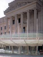
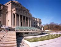
Arriving at the museum, I got my first view of the new entrance designed by Polshek Partnership Architects. It’s all glass and metal and rounded corners. And it’s horribly stuck onto a classical façade in a manner that does nothing for the new, nothing for the old, and less than nothing at the intersection of the two.
Kramer (in his typical ad hominem way) accuses the museum’s director of creating:
what might be called Operation Face Lift: the museum’s glitzy new entrance, a costly postmodern extravaganza of glass and steel that effectively destroys the classical elegance of the building’s original design by McKim, Mead and White. (For his whole diatribe, go here.)But Kramer missed a point that would have allowed him to whip his critical pique into a froth. There are new fountains too. This is from the Museum’s own website:
The public plaza will also contain two water features by WET Design, the designers of the water features at the Bellagio Hotel in Las Vegas and the Winter Olympics Torch in Salt Lake City last year.
 We’ve now seen true cross fertilization between the museum and Las Vegas. First, the casinos took a lesson from the art museums with the Guggenheim Las Vegas and the gallery at the Bellagio. Now the art museums are taking a lesson from the casinos with fountains that do the wave in synchronized spurts of water.
I actually appreciate the mission the Brooklyn Museum has embraced of becoming “the most visitor-friendly of any New York art museum,” and I was impressed today with how they have reinstalled the permanent collection. But by ruining the classical lines of a historic building and dropping in fancy fountains (oh, sorry, “water features” ) for the purpose of creating a “visitor-friendly” experience, the museum has taken pandering (Kramer calls it “dumbing down”) to a new high, or low.
Update: I'm glad to say that the reason for my visit to the Brooklyn Museum of Art, Open House: Working in Brooklyn, didn’t disappoint. Far from being a lowest common denominator show, it presents challenging and interesting work and makes a credible claim that Brooklyn has become the center of the New York art world. My review of the exhibition has now been posted here.