Tuesday, December 27, 2005
Spectacle, But Not Much Else, in the Turbine Hall
For many artists, the chance to do a work for the Tate Modern’s Turbine Hall must be the commission of a lifetime. It also has to be a challenge unlike any they have ever faced. That’s what makes it so interesting to see the resulting works.
The scale of the space almost ensures that anything commissioned for it will partake of spectacle. Anish Kapoor’s 2002 installation Marsyas and Olafur Eliasson’s The Weather Project from 2003 certainly did. Bruce Nauman’s soundscape Raw Materials from last year, on the other hand, did what Nauman does so well by taking a contradictory stance—negating the assumption of visual spectacle to leave viewers with a pure audio experience.
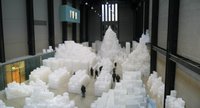 Rachel Whiteread’s current installation in the space, Embankment (at right), achieves a moderate level of success. The element of spectacle is at play in the work to a degree sufficient to make the installation interesting. But Whiteread’s concept and use of materials do not rise to a level that would make the work truly memorable.
Whiteread has filled the Hall with casts of boxes—thousands of them. The installation has the requisite conceptual framework for a major piece of contemporary art. Whiteread has spoken about finding inspiration for the installation in an old box that once belonged to her mother. She layers on top of this personal memory a pop cultural reference by talking about the impression made on her by the final scene in Raiders of the Lost Ark where the Ark of the Covenant is boxed up and placed in a generic warehouse somewhere. She also talks about the process of casting and making a negative and then a positive image of her mother’s old box and the philosophical implications thereof.
It’s all the right talk for a major commission like this, but none of it really matters. The power of the piece comes from the massive assemblage of items Whiteread has created. It doesn’t matter that the stacks she has created are made of casts of casts of objects. It doesn’t matter that the items cast were boxes. The work is all about the stacking—the massing of objects—and the viewer’s experience of walking through them.
If you enter the building from the Thames side, you come in one level above the installation and have the opportunity to view it from a balcony. Seeing it from this vantage point provides a completely different experience than going down to the ground floor and walking through the labyrinth that the Whiteread has made.
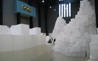 When you walk among the piles (at right), you begin to feel vulnerable. Your body, in comparison to these massive towering piles, feels small. You feel a sense of endangerment as you pass between the stacks.
The piece, in this way, partakes of the what Michael Fried called the theatrical nature of minimalism. It does so, though, to a much greater degree than any piece of minimalist work I know. In a way, walking through this installation feels like walking through one of Richard Serra’s torqued ellipse. You feel like your life could be threatened at any moment by a strong gust of wind or a small tremor of the ground.
Whiteread’s installations takes a shortcut this way. The piece is all show (a great experience) but no tell as it lacks an instigating concept as interesting as the “wow!” experience of walking through the piece. She has tried to provide one, but the concept is weak. It can’t stand up to the impression made by the objects.
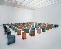 Seeing Whiteread’s installation in the Tate Modern’s Turbine Hall brought back to mind her piece that was installed in the Guggenheim’s rotunda as part of the Singular Forms (Sometimes Repeated) show in 2004. This untitled piece (at left), 100 colored resin casts of the space beneath chairs, is much more subtle and meditative than the Turbine Hall installation. It doesn’t create spectacle in any manner. But to me it it’s the more interesting of the two works.
The meditative feel of the untitled work forces contemplation of the concept in a way that the Turbine Hall installation doesn’t, and the colored resin used for the casts provides more visual interest. The work stands on its own—it speaks for itself—in a way that the Turbine Hall installation doesn’t. The piece doesn’t rely on the shock of spectacle to make its impression.
For this more recent commission, Whiteread has taken the easy way out by falling back on the crutch of spectacle that the massive space provides to her, and she allows spectacle to carry the work rather than creating a piece that uses the space in an interesting way that integrates with and supports the concept and materials she has chosen for the installation.
That said, I would still jump at the chance to spend a half hour walking among Whiteread's boxes if the opportunity presented itself again.
Rachel Whiteread’s Embankment is on display in the Tate Modern’s Turbine Hall through April 2, 2006.
The scale of the space almost ensures that anything commissioned for it will partake of spectacle. Anish Kapoor’s 2002 installation Marsyas and Olafur Eliasson’s The Weather Project from 2003 certainly did. Bruce Nauman’s soundscape Raw Materials from last year, on the other hand, did what Nauman does so well by taking a contradictory stance—negating the assumption of visual spectacle to leave viewers with a pure audio experience.
 Rachel Whiteread’s current installation in the space, Embankment (at right), achieves a moderate level of success. The element of spectacle is at play in the work to a degree sufficient to make the installation interesting. But Whiteread’s concept and use of materials do not rise to a level that would make the work truly memorable.
Whiteread has filled the Hall with casts of boxes—thousands of them. The installation has the requisite conceptual framework for a major piece of contemporary art. Whiteread has spoken about finding inspiration for the installation in an old box that once belonged to her mother. She layers on top of this personal memory a pop cultural reference by talking about the impression made on her by the final scene in Raiders of the Lost Ark where the Ark of the Covenant is boxed up and placed in a generic warehouse somewhere. She also talks about the process of casting and making a negative and then a positive image of her mother’s old box and the philosophical implications thereof.
It’s all the right talk for a major commission like this, but none of it really matters. The power of the piece comes from the massive assemblage of items Whiteread has created. It doesn’t matter that the stacks she has created are made of casts of casts of objects. It doesn’t matter that the items cast were boxes. The work is all about the stacking—the massing of objects—and the viewer’s experience of walking through them.
If you enter the building from the Thames side, you come in one level above the installation and have the opportunity to view it from a balcony. Seeing it from this vantage point provides a completely different experience than going down to the ground floor and walking through the labyrinth that the Whiteread has made.
 When you walk among the piles (at right), you begin to feel vulnerable. Your body, in comparison to these massive towering piles, feels small. You feel a sense of endangerment as you pass between the stacks.
The piece, in this way, partakes of the what Michael Fried called the theatrical nature of minimalism. It does so, though, to a much greater degree than any piece of minimalist work I know. In a way, walking through this installation feels like walking through one of Richard Serra’s torqued ellipse. You feel like your life could be threatened at any moment by a strong gust of wind or a small tremor of the ground.
Whiteread’s installations takes a shortcut this way. The piece is all show (a great experience) but no tell as it lacks an instigating concept as interesting as the “wow!” experience of walking through the piece. She has tried to provide one, but the concept is weak. It can’t stand up to the impression made by the objects.
 Seeing Whiteread’s installation in the Tate Modern’s Turbine Hall brought back to mind her piece that was installed in the Guggenheim’s rotunda as part of the Singular Forms (Sometimes Repeated) show in 2004. This untitled piece (at left), 100 colored resin casts of the space beneath chairs, is much more subtle and meditative than the Turbine Hall installation. It doesn’t create spectacle in any manner. But to me it it’s the more interesting of the two works.
The meditative feel of the untitled work forces contemplation of the concept in a way that the Turbine Hall installation doesn’t, and the colored resin used for the casts provides more visual interest. The work stands on its own—it speaks for itself—in a way that the Turbine Hall installation doesn’t. The piece doesn’t rely on the shock of spectacle to make its impression.
For this more recent commission, Whiteread has taken the easy way out by falling back on the crutch of spectacle that the massive space provides to her, and she allows spectacle to carry the work rather than creating a piece that uses the space in an interesting way that integrates with and supports the concept and materials she has chosen for the installation.
That said, I would still jump at the chance to spend a half hour walking among Whiteread's boxes if the opportunity presented itself again.
Rachel Whiteread’s Embankment is on display in the Tate Modern’s Turbine Hall through April 2, 2006.
Wednesday, December 21, 2005
Martin Parr on the Street in Cambridge
 Just about everywhere you look in New York, construction barriers become a magnet for posters. The first poster gets pasted up over the standard "Post No Bills" stencil, and from then on the site is free game for anyone with paper and some wheat paste. If the site is below Houston St., there's a chance that what goes up overnight will be interesting street art. If the site is above 23rd St., it's probably going to be advertising (if it's not advertising masquerading as street art).
When I stopped in Cambridge last week, I came across an interesting approach to institutionalizing the activity of posting bills on construction barricades.
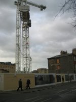
A large building is now going up on a heavily trafficked street (above left) in the center of the city. For some reason (interest in art? civic pride? an attempt to keep graffiti and advertising off their barricade?), the developers have launched an interesting project by commissioning native Brit and Magnum photographer Martin Parr to take "portraits" of the city during the three years that this site will be under development. Over that period they will continually post Parr's work on the fence surrounding the job site.
The project isn't as easy as one might guess for a photographer like Parr who specializes in documenting the real (and unaesthetic) look of contemporary suburban life. Parr writes about the project:
I had not been to Cambridge for many years and was eagerly anticipating rediscovering the city. I was almost overwhelmed by how beautiful the city was and this is almost a disadvantage for a photographer. Everywhere you look you are in danger of photographing a cliche that could become a picture post card.
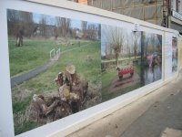 The first several photographs posted (at right) do a fine job of avoiding cliche as they force city residents and visitors to stop for a moment and contemplate scenes that don't present the typical view of this picturesque city.
In upcoming months Parr will continue to visit and document the city, showing new work at this site until the building is complete and the barricades come down in 2008.
Related: Martin Parr's "Mobile Phones" project. (Warning: turn your speakers down before clicking.)
Monday, December 19, 2005
Seen and Not Seen
I'm back on the right (i.e., the left) side of the Atlantic again. After a 16 hour stay at New York's prestigious Hotel Gibson yesterday, I was off again before sunrise this morning for a week in the Midwest.
While part of me wishes I had been able to spend more than a few hours at home over the weekend, I was able to squeeze in viewing of a few shows in England during the time away. Work commitments permitting, I'll have something later this week on the Turner Prize finalist show at the Tate, on the Rachel Whiteread installation in the Turbine Hall at Tate Modern, and on an interesting approach to institutionalizing street art that I came across in Cambridge.
I won't, though, have something on the new installation of the Tate Modern's permanent collection--half of which opens tomorrow--as I had hoped. But that's not for lack of trying. It seems the Tate's press office doesn't quite have this whole blog thing figured out yet. Some museum press offices (the Carnegie, the Whitney) get it. Others (MoMA, the Tate) don't.
Sunday, December 11, 2005
On Hiatus This Week
Due to day job deadlines and extensive travel, From the Floor will be taking a break this week. Back next week (I hope) with some impressions from London.
Thursday, December 08, 2005
Elsewhere Today
A couple pieces worth reviewing around the blogosphere today:
- MAN has a good take on Fisk University's deaccessioning of an O'Keeffe and a Hartley. While I'm never in favor, philosophically, of the practice, I'm much more open than Tyler is to using it strategically. This seems to be a case where it is justified. I'm glad to see that Tyler recognizes the difference between this instance and other recent, high profile cases.
- Interesting thoughts on The View from the Edge of the Universe on artists and their self-defined programs for making art or the "beautiful calculation." Robust conceptual practice or a strategy of building a whole career for a one hit wonder? You decide.
Tuesday, December 06, 2005
Turner (Yawn) Prize Winner Announced
In all the hubbub of Miami post-game analysis and wrap up, the American arts media and blogosphere have overlooked the fact that this year's Turner Prize winner has been announced.
The only reason I know this is that I was in Montreal this morning (Anyone know exactly how cold it is in Montreal right now? It's damn cold.) and I happened to be browsing through The Globe and Mail over breakfast.
Simon Starling has won this year's prize.
As Canada's paper of record, The Globe and Mail did a fine job of not denigrating his work too directly. But the backhanded analysis was all too clear. The story was told with one large photo and a photo caption (that isn't available on line) which I should have saved but didn't. If memory serves me correctly, it went something like this:
OK, so I shouldn't judge until I've seen the work. I didn't think much of last year's Turner Prize nominees, and I don't think I'll think much more of this year's work based on what I've seen on line. But I'll give the work the benefit of the doubt. I've managed to arrange my travel schedule so that I'll get to see the show of nominees' work at the Tate next weekend. I'll have more to say about it then, I'm sure.
The only reason I know this is that I was in Montreal this morning (Anyone know exactly how cold it is in Montreal right now? It's damn cold.) and I happened to be browsing through The Globe and Mail over breakfast.
Simon Starling has won this year's prize.
As Canada's paper of record, The Globe and Mail did a fine job of not denigrating his work too directly. But the backhanded analysis was all too clear. The story was told with one large photo and a photo caption (that isn't available on line) which I should have saved but didn't. If memory serves me correctly, it went something like this:
Artist Simon Starling has been awarded this year's Turner Prize. Starling is pictured with his work Shedboatshed. For this work Starling disassembled a shed, turned it into a boat, and then rebuilt it as a shed.Um, sounds trés compelling, right?
OK, so I shouldn't judge until I've seen the work. I didn't think much of last year's Turner Prize nominees, and I don't think I'll think much more of this year's work based on what I've seen on line. But I'll give the work the benefit of the doubt. I've managed to arrange my travel schedule so that I'll get to see the show of nominees' work at the Tate next weekend. I'll have more to say about it then, I'm sure.