Tuesday, October 05, 2004
Take Two Hirsts and Call Me in the Morning
 On October 18, Sotheby's in London will be auctioning off the remnants of Pharmacy, the Damien Hirst designed bar and restaurant that closed last year. Lots in the sale include examples of most elements from Hirst's visual language: the butterfly paintings, the medicine cabinets, and the faux pharmaceutical packaging. Included, as well, are many of the restaurant's Hirst-designed fixtures (lighting, barstools, tables, etc.).
Most of the time, Hirst's work leaves me feeling apathetic. I just can't work up an interest in it. But the catalogue presents a few of his design elements for the restaurant that I find seductive.
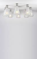
 His Erlenmeyer flask-inspired light fixtures transform an industrial object into functional decor. The flasks survive the transformation intact, the reference to their former function remaining clear, and show Hirst's wit at its best without the pretention of most of his gallery pieces.
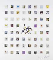
Hirst's collages of the 60 matchbooks he designed for Pharmacy also delight with the simplicity of their imagery, their tweaked and unnatural colors set against a clinically white background.
Browsing through Sotheby's catalogue, I was impressed by what a talented designer Hirst is. He has a knack for creating functional objects that draw a second look, that show an attention to detail, that have a sense of humor, that--frankly--are great design. It's a shame his art doesn't always work that well.