Wednesday, August 31, 2005
Simplify, Simplify
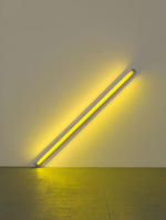 As I walked through the Dan Flavin retrospective at the Museum of Contemporary Art in Chicago last weekend, I couldn’t help but think of what Henry David Thoreau wrote in Walden more than 150 years ago, “Simplicity, simplicity, simplicity! I say, let your affairs be as two or three, and not a hundred or a thousand.... Simplify, simplify.”
The first gallery of the installation dramatically shows what happened when Flavin simplified his approach to art making. As Thoreau suggested, Flavin’s work became a completely different thing, a much better thing, as the complexity was boiled away.
In 1963, Flavin distilled his work down to a single element—light. With the diagonal of May 25, 1963 (to Constantin Brancusi) (at left), Flavin moved from using lit bulbs to enhance monochromatic Masonite panels to presenting the effect made by the bulb as the art object.
Flavin’s move toward radically simplifying a style he had worked to develop reminded me of a similar path Mark Rothko took in 1949—a path that was wonderfully illustrated in the Pace Wildenstein exhibition, Mark Rothko: A Painter’s Progress, The Year 1949. Over 1949 Rothko simplified the compositional field in his work until he finally ended up with what came to be seen as his signature style—two or three simple rectangular bands of color floating on a background.
These two paths toward simplicity should serve as case studies for young artists today. Often it’s finding the essential kernel of the work and paring back everything but that—painfully difficult as it is to do—that leads to the development of a clear, unique, mature style.
Tuesday, August 30, 2005
Embarrassment by Riches
I've stood up for Malcolm Rogers's shenanigans before, thinking that while renting paintings to a commercial gallery in Las Vegas was questionable it didn't cross the line into unethical practice.
Today, though, The Boston Globe has changed my opinion of Rogers's aggressive fundraising tactics with a piece on the MFA's newest exhibition--a vanity show (including yachts!) of money-man William Koch's unfocused collection.
By currying favor with a prominent collector in this way, Rogers has seriously damaged the institution's credibility--essentially turning it into a gallery space for rent. (Ralph Lauren last month. Koch this month. Who's next?) Rogers must know he's on shaky ground here. In the piece he defends the show by comparing it to what the Guggenheim has done lately. Trying to pass off the Guggenheim as the paradigm of integrity? Please.
Neither Rogers nor Koch seems to realize how transparent the driver is behind Rogers's decision to mount the exhibition. Can't either of them see that the courtesan position the MFA has assumed by hosting this show creates a situation that is an embarrassment to both of them personally and to the MFA as an institution?
I wonder if anyone on the MFA's board can see it. I sure hope so. And I hope board members decide to take action. Things have gone too far off course in Boston. It's time for a correction burn. I wasn't convinced of that earlier, but I am now.
Related: Modern Art Notes on this "giant slurp job."
Monday, August 29, 2005
Word of the Day
I'm still officially on the lam, but I had to give a pointer when I came across this beauty of a word on About Last Night:
Cézannepicassosurrealismabexminimalismpop
Cézannepicassosurrealismabexminimalismpop
Tuesday, August 23, 2005
On the Lam
I'll be taking a break from daily posting for the next couple weeks as I squeeze in a short vacation and then start traveling again for the day job. I may check in with an occasional item before Labor Day, but until then why don't you spend some time warming up for September's busy gallery opening season.
Monday, August 22, 2005
Bottling Street Art’s Juice
 There’s always a tension that arises when the art establishment embraces a form of popular expression. Street art (when did it stop being “graffiti”?) serves as an interesting example.
The genre has its roots in non-commercial, rebellious expression. The interesting question here is how the gallery system can create value around an object that is typically given away, around a practice that is anarchic, and around an experience with the object that is by its nature transitory.
As it has gained credibility over the last two decades, street art has been brought into the commercial gallery environment in a variety of ways. Today, gallerists are trying to figure out how to distill the energy of street expression and package it for distribution. As an interesting case study, four different presentations of street art were on view within a block’s radius of each other in SoHo earlier this summer. Each of them bottled the work in a different manner.
Fresh Squeezed: While SoHo gallery spaces opened their doors to taggers this summer, the building across the street from Jeffrey Deitch’s Wooster Street space presents the real, unmediated thing 24x7x365. Completely covered with years of work in various states of decay, the façade of the building is a palimpsest of images and voices, giving the flavor of honest-to-goodness raw, unprocessed street art. (See a photo of the building here.)
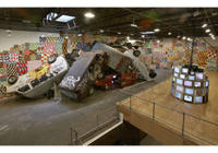 Filtered: In his Wooster Street space earlier this month, Jeffrey Deitch was showcasing the work of Barry McGee (installation view at right). McGee’s installations tried to capture the grit and decay of the urban landscape in a fun-house like environment. While McGee carried some of the feeling of the street into the gallery space, it felt like there was something missing in the presentation. Although it was plenty edgy and grimy, the installation felt just a little too safe. The sharp tang of the fresh squeezed (on view just across the street) had been filtered out.
Pasteurized: Around the corner on Grand Street, the Dactyl Foundation is presenting a group show (which runs into September) of work by members of the AKB Crew, a street collective that formed in Minneapolis-St. Paul in the late 1980s. Most members of the group have “gone straight” by now and are doing commercial art rather than tagging. (The group has gone so mainstream, in fact, that the AKB Crew’s website even has e-commerce capabilities.) This show highlights the results. Definitely street inspired, the show contains paintings, drawings, and collages that aspire to make the transition from the “folk art” of the street to the “fine art” of the gallery. The works retain some of the flavor of street art but none of the raw energy.
Synthetic: Down the block at his other location, Deitch was showing three installations by the street artist known as Swoon. In her work she used the gallery space to create environments reminiscent of the street, without attempting to bring the real thing into the gallery space. (The image at the top right of this post presents a section of one of her installations.) Strangely, though, as removed from the real as these installations were, they felt more right than any of the others. The environments created translated the essence of the street into the gallery environment in a way that was more satisfying that McGee's installations. The critics swooned over the show.
In the case of SoHo street art this summer, the simulacrum trumped the real, tasting better as it went down and making viewers thirsty for more. That doesn't happen too often in an artistic subculture that values authenticity and credibility, does it?
Friday, August 19, 2005
Whatever Puts You in the Mood, I Guess
For some reason this doesn't really do it for me. But if it works for you, that's great. (Intro page here. Via.)
What are You Seeing on Your Summer Vacation?
The Christian Science Monitor runs a piece today asking three museum directors and a curator what they are traveling to see this summer. Should it come as a surprise that Malcolm Rogers is into horse and hound painting?
As for me, I'm just back from a quick trip to Barcelona, but I didn't have a chance to see anything of note. The one day that I had some free time was MACBA's closed day. I'm heading back the week after next, but by then the Francis Alÿs show there will already have closed. Drat.
I am, though, going to get a chance to see the Flavin retrospective in Chicago in a couple weeks. I've been trying to finagle a viewing of that for what feels like a year now, and I've finally been able to make it happen.
Wednesday, August 17, 2005
Discount Shopping at the Met
 I'm not devious by nature, but last Sunday afternoon I couldn't help but think about taking a painting or two home with me from the Met.
As I was wandering through the galleries, I was shocked when an unbidden thought popped into my mind: it would be way too easy to walk a painting out of the Robert Lehman Collection.
Without a guard or security camera in sight to watch over them, the paintings all hang on two thin wires dropped from the crown molding. Most are not attached to the wall, and many (like Jean Hey's Margaret of Austria, ca. 1490, at left) are small enough to fit into a bag the size of the one that I was carrying.
Fifteen seconds of solitude and two snips with a pair of wire cutters would be all it would take for someone to make a painting disappear forever. And with the long-term loan of Italian paintings from Yale on view now in the Lehman galleries, it's not just the Met's own property that is at risk.
I'm really hoping that the Met has some advanced security system in place that is so unobtrusive that I didn't spot it as I was casing the joint. But I doubt it.
Update: Just to be clear, since I've gotten a few email messages on the topic, we're not condoning art theft here--not in any way. Rather, by pointing out the issue, I'm hoping that the Met will realize that this potential vulnerability is amply clear (even to someone who doesn't usually think about these things) and will ensure that they take the necessary steps to close it.
Tuesday, August 16, 2005
A Standard Critical Cop Out
Everyone who writes (for real or for the blogosphere--or, even, for the real blogosphere) has tics, takes shortcuts, and relies on cliches.
I copped out on pushing myself to say something original about an installation that I mentioned recently. In my piece on the Bronx Museum's AIM 25 exhibition, I wrote that Olen Hsu's Anacoluthon "raises more questions than it answers."
While I was writing the piece I knew I was cheating with this phrase, but I didn't fully realize how much I had cheapened my description of Hsu's work until I heard Kurt Andersen use the same shortcut to introduce a piece on Mark Lombardi's drawings for last weekend's edition of Studio 360.
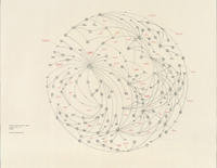 Lombardi's work (at right), with its intricate socio-political mapping of connections and influence, Andersen said, "raises more questions than it even tries to answer." (Listen to Andersen's intro and the rest of the piece via the link above.)
I cringed when I heard him say this for several reasons. It demonstrated just how meaningless the phrase is when it's used to describe an artwork, and it reminded me that I had written the same thing about work that I had really liked. But I especially recoiled because this sort of description so trivializes Lombardi's specific project.
In his drawings Lombardi answered questions that no one else was even asking. He raised the questions, did the research, and documented the results in a surprisingly beautiful way with his data diagrams. (Lombardi would do multiple versions of the same content, each subsequent map becoming more refined and elegant.) If Lombardi's work raises any questions, it's because viewers don't have the same command of the facts that he had. Each piece is a complex, fully documented answer to a simple question: who was connected to whom in a certain particularly complex transaction, and how?
I can't fault Andersen too much, though. It was just a throwaway line in an introduction to a radio piece on Lombardi that was actually quite good. And, besides, I've done the same thing myself. (So have approximately 29,000 other people if this search result is any indication.)
But I can make sure that I don't let myself do it again.
I copped out on pushing myself to say something original about an installation that I mentioned recently. In my piece on the Bronx Museum's AIM 25 exhibition, I wrote that Olen Hsu's Anacoluthon "raises more questions than it answers."
While I was writing the piece I knew I was cheating with this phrase, but I didn't fully realize how much I had cheapened my description of Hsu's work until I heard Kurt Andersen use the same shortcut to introduce a piece on Mark Lombardi's drawings for last weekend's edition of Studio 360.
 Lombardi's work (at right), with its intricate socio-political mapping of connections and influence, Andersen said, "raises more questions than it even tries to answer." (Listen to Andersen's intro and the rest of the piece via the link above.)
I cringed when I heard him say this for several reasons. It demonstrated just how meaningless the phrase is when it's used to describe an artwork, and it reminded me that I had written the same thing about work that I had really liked. But I especially recoiled because this sort of description so trivializes Lombardi's specific project.
In his drawings Lombardi answered questions that no one else was even asking. He raised the questions, did the research, and documented the results in a surprisingly beautiful way with his data diagrams. (Lombardi would do multiple versions of the same content, each subsequent map becoming more refined and elegant.) If Lombardi's work raises any questions, it's because viewers don't have the same command of the facts that he had. Each piece is a complex, fully documented answer to a simple question: who was connected to whom in a certain particularly complex transaction, and how?
I can't fault Andersen too much, though. It was just a throwaway line in an introduction to a radio piece on Lombardi that was actually quite good. And, besides, I've done the same thing myself. (So have approximately 29,000 other people if this search result is any indication.)
But I can make sure that I don't let myself do it again.
Monday, August 15, 2005
Words of the Day
Courtesy of Merriam-Webster:
The kids on the playground had it right, I guess: it takes one to know one.
Related: Not that I really care one way or another about these things, but I wonder how Siegel would attempt to explain away the second sentence of this Cy Twombly profile.
- Vulgarian, noun: a vulgar person
- Vulgar, adjective: 3 a : of or relating to the common people; 4 a : lacking in cultivation, perception, or taste
Rebay was in fact a vulgarian who solemnly and self-seriously hung the Museum of Non-Objective Painting, as the Guggenheim was called until 1952, with gray flannel and piped in Bach and Chopin while, as Robert Hughes put it, "she sat behind the scenes devouring movie magazines." Like a lot of innately vulgar people, she liked to accuse other people of lacking class.Rebay was a vulgarian? Let's see. Who's doing the name calling here? Isn't it the same critic who famously claimed that "You cannot fully understand [Cy] Twombly's art unless you know that he is gay"--a statement that is certainly lacking in cultivation, perception, and taste? And isn't this same person also the TV critic for another publication--a position requiring him to devour hours of entertainment of or relating to the common people?
The kids on the playground had it right, I guess: it takes one to know one.
Related: Not that I really care one way or another about these things, but I wonder how Siegel would attempt to explain away the second sentence of this Cy Twombly profile.
Thursday, August 11, 2005
Why Robert Hughes is Wrong, Once Again
 Earlier this week, ArtsJournal linked to a piece in The Scotsman featuring the-most-important-art-critic-no-one-actually-reads spouting off about the current BBC poll to determine the greatest painting in the land. The voting is stupid, Robert Hughes says, and he’s not even going to discuss the subject.
Yeah, yeah, yeah. In one respect he’s right. A poll like this won’t determine a greatest painting as much as it will a favorite one. It’s a popularity contest, after all. Sound critical judgments are never reached through a nomination process and consensus vote.
But Australia’s most self-assured iconoclast is painfully short sighted when he dismisses the poll as nothing more than a “minor circulation-building exercise.” It’s building circulation not just for the BBC but for his industry as a whole. Hughes’s writing never sparks public discussion about and engagement with painting in the way that this media stunt has. And when in recent memory (apart from vile, repugnant crap like this) has a popular American news program provided such sustained coverage of visual arts topics?
Sure, the televised outcome will be one painting selected as Britain’s “greatest” or “favourite” or whatever. But the real outcome will be people thinking and talking about art who wouldn’t otherwise have done so. And that’s never a bad thing.
Wednesday, August 10, 2005
Amarillo Ramp
Whose blog doesn’t have pictures of a recent visit to Spiral Jetty? It’s almost an art blog requirement these days.
But these are the first blog photos I’ve seen of a recent visit to Smithson’s less well-known earthwork, Amarillo Ramp.
Speaking of Smithson’s work, does anyone know if Spiral Jetty is under water now?
But these are the first blog photos I’ve seen of a recent visit to Smithson’s less well-known earthwork, Amarillo Ramp.
Speaking of Smithson’s work, does anyone know if Spiral Jetty is under water now?
Sketching Greater New York
James Wagner has an interesting call to action posted on his blog right now. If you can sketch and if you can get to P.S.1 before Greater New York closes, you really ought to participate.
I definitely would--if I had any ability to draw at all. Given what I came up with when I contributed to Hope Hilton's recent group drawing project, I'll leave this one to the professionals.
If I were going to sketch something in the show, though, I think it would be Hope Atherton's 87 x 66 inch painting The Watcher. The strongly backlit, dark brooding of the monkey's face combined with the painting's slick acrylic surface grabbed me in a visceral way when it I saw it again a couple weeks ago. But if I were to pick up a pencil I know I wouldn't be able to recreate her strong chiaroscuro, and I can't even imagine how I would translate the work's gorgeous, slippery surface into a drawing.
But someone (someone with much more talent than I have) should give it a try. Please. I can't find an image of the work anywhere else, and I would really like to have one.
Update: Michael Cambre comes through with the goods.
Tuesday, August 09, 2005
Overheard at Deitch Projects Today
A gallery attendant at the Grand Street space on the phone with I don't know whom: "I work at an art gallery. I have an artist who wants to get blank chips to record her own songs on to put in marshmallows. [Long pause] I know it sounds strange, but this is my job right now, and I'm just trying to get it done."
That Sixties Wall
There’s a long tradition in literature of using a small part of something to stand in for the whole. The rhetorical term for this is synecdoche.
Visual artists, for some reason, don’t use this representational strategy as often as writers do. Curators, however, use it all the time. One painting, for example, is used to stand in for the whole body of an artist’s work; a selection of photographs makes the case for a broad, general trend in the history of photography.
There’s a small show on view now at MoMA that (self-consciously or not, I don’t know) plays with the standard curatorial approach of selecting a very limited number of works to represent a historical movement. In the process, it highlights exactly how rich and deep the museum’s collection is.
Drawing from the Modern, 1945-1975 is the second part of a three-part show of drawings from MoMA’s permanent collection. Installed in three small galleries, the exhibition contains more excellent work than any show of this size has the right to.
What stunned me most about the show, though, was the last wall in the galleries. Seeing it was like watching a baseball team, up 11-0 in the ninth inning, bring in the star closer to finish off the game. “We’ve got it,” this wall seems to be saying, “and we’re going to flaunt it.” If the display wasn’t so fabulous, it could be called an act of hubris.
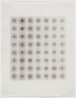 Rather than showcasing a few pieces, this wall has been hung with 30 drawings by 23 artists. All the works were completed between 1960 and 1970. The roster of artists included is a Who’s Who of minimalism and post-minimalism: Andre, Baer, Close, Darboven, Flavin, Hesse (represented by Untitled from 1966, at right), LeWitt, Mangold, Martin, Stella, Tuttle, Sandback, and others.
But that’s not all. There isn’t a weak piece in the 30 drawings included. Each is representative of that artist’s style from the decade of the 1960s. If a disaster were to wipe out Manhattan tomorrow and hundreds of years from now future archeologists were to unearth MoMA and find what’s hanging on this wall, they would have in these 30 small drawings a definitive history of an artistic movement that arose and permutated over the course of a decade.
The works on this wall tell the whole story of the era: the appearance of the grid, the reliance on repetition, the use of algorithm in place of traditional composition, the rise of concept, the eventual softening of the grid’s hard edges, and the application of the grid’s principles to other styles of working. It’s all there. This is especially interesting, remember, because most of these artists were either painters or sculptors. None are known primarily for their drawing.
That’s what makes this particular wall such a showstopper. Rather than needing to use a small selection (say two or three decent drawings) to represent the movement, MoMA’s curators were able to dive into the flat files and pull out enough really good work to make it feel like they have shown the whole movement and all its variations. There’s not the sense of a synecdoche at work here (although there has to be in any curated exhibition) because of the richness and depth of MoMA’s holdings.
It’s that richness and depth that makes curators at every other museum in the world jealous. MoMA’s definitely got it. Why shouldn’t they flaunt it once in a while?
Drawing from the Modern, 1945-1975 is on view at the Museum of Modern Art through August 29, 2005.
Visual artists, for some reason, don’t use this representational strategy as often as writers do. Curators, however, use it all the time. One painting, for example, is used to stand in for the whole body of an artist’s work; a selection of photographs makes the case for a broad, general trend in the history of photography.
There’s a small show on view now at MoMA that (self-consciously or not, I don’t know) plays with the standard curatorial approach of selecting a very limited number of works to represent a historical movement. In the process, it highlights exactly how rich and deep the museum’s collection is.
Drawing from the Modern, 1945-1975 is the second part of a three-part show of drawings from MoMA’s permanent collection. Installed in three small galleries, the exhibition contains more excellent work than any show of this size has the right to.
What stunned me most about the show, though, was the last wall in the galleries. Seeing it was like watching a baseball team, up 11-0 in the ninth inning, bring in the star closer to finish off the game. “We’ve got it,” this wall seems to be saying, “and we’re going to flaunt it.” If the display wasn’t so fabulous, it could be called an act of hubris.
 Rather than showcasing a few pieces, this wall has been hung with 30 drawings by 23 artists. All the works were completed between 1960 and 1970. The roster of artists included is a Who’s Who of minimalism and post-minimalism: Andre, Baer, Close, Darboven, Flavin, Hesse (represented by Untitled from 1966, at right), LeWitt, Mangold, Martin, Stella, Tuttle, Sandback, and others.
But that’s not all. There isn’t a weak piece in the 30 drawings included. Each is representative of that artist’s style from the decade of the 1960s. If a disaster were to wipe out Manhattan tomorrow and hundreds of years from now future archeologists were to unearth MoMA and find what’s hanging on this wall, they would have in these 30 small drawings a definitive history of an artistic movement that arose and permutated over the course of a decade.
The works on this wall tell the whole story of the era: the appearance of the grid, the reliance on repetition, the use of algorithm in place of traditional composition, the rise of concept, the eventual softening of the grid’s hard edges, and the application of the grid’s principles to other styles of working. It’s all there. This is especially interesting, remember, because most of these artists were either painters or sculptors. None are known primarily for their drawing.
That’s what makes this particular wall such a showstopper. Rather than needing to use a small selection (say two or three decent drawings) to represent the movement, MoMA’s curators were able to dive into the flat files and pull out enough really good work to make it feel like they have shown the whole movement and all its variations. There’s not the sense of a synecdoche at work here (although there has to be in any curated exhibition) because of the richness and depth of MoMA’s holdings.
It’s that richness and depth that makes curators at every other museum in the world jealous. MoMA’s definitely got it. Why shouldn’t they flaunt it once in a while?
Drawing from the Modern, 1945-1975 is on view at the Museum of Modern Art through August 29, 2005.
Monday, August 08, 2005
Janet Cardiff, Off with Her Head, Part the Second
 Saturday saw strike two for Janet Cardiff. Well, to be completely accurate, Saturday saw strike two for organizations presenting Cardiff’s work to the public this summer.
A few weeks ago I was frozen out of Pandemonium at Eastern State Penitentiary. On Saturday (since the thermometer said it wasn’t 90 degrees in Central Park for the first day in months), I decided to try Cardiff’s audio walk, Her Long Black Hair.
When I arrived at the Public Art Fund’s kiosk to pick up the gear, I was told to go away and try again some other day. All the portable CD players were checked out, and there was a group with a reservation at 3:00 that would tie up any incoming equipment for the rest of the day. The piece has proven to be so popular, the woman working the booth said, that they usually run out of the CD players in the afternoon.
So no Cardiff for me. Again. Next thing you know, Laura is going to start blocking access to her website for requests coming from my IP addresses.
Related (especially for our friends at the Public Art Fund): The Coby CX-CD111 Slim Personal CD Player (available in a variety of colors) is on sale at Amazon for only $14.88. That’s ten for less than $150. Twenty for under $300.
Friday, August 05, 2005
Everyone Loves a Fake Critic
Sony admitted this week (to the tune of $1.5M) that in advertising five movies it had cited a fake film critic whose reviews supposedly appeared in an obscure publication.
This would never happen in the art world, would it? Why the heck not!
This would never happen in the art world, would it? Why the heck not!

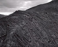
- For Mount St. Helens: Photographs by Frank Gohlke at MoMA, “An eruption of mind-blowing photography!” –Dr. M. A. Federmilch, Ph.D., Geophysical Journal International
- For The Impressionist Landscape from Corot to van Gogh: Masterworks from the Museum of Fine Arts Boston at the Bellagio Hotel and Casino, “A stunning collection of winning hands. Not a pair of deuces in the lot.” –Vinny DeStephino, Gambling Magazine
- For Robert Smithson at the Whitney, “The most novel use of saltpan soil in years!” –Dr. Jaime G. Bockenheimer, Ph.D., Soil Science Society of America Journal
- For Hope and Healing: Painting in Italy in a Time of Plague, 1500-1800 at the Worcester Art Museum, “Plague is never good. But a lot of these paintings are!” –Dr. Stephanie Soderhouse, M.D., Ph.D., The Journal of Infectious Diseases
- For Remote Viewing (Invented Worlds in Recent Painting and Drawing) at the Whitney, “Dude, this show trips so hard you better hold off toking until after you’ve seen it!” –Scooter Kicksome, High Times
- For Robert Mapplethorpe and the Classical Tradition at the Guggenheim, “More beef than Smith & Wollensky! More cake than Veniero’s!” –Zagat Survey
Thursday, August 04, 2005
Why These Things Happen
A day and a half after a URL providing access to all of Artforum.com's site stats made its way around the Internet, what's still the lead item on the site? "Michael Wang on the Dreamland Artist Club."
You would almost think that they wanted to get this kind of traffic.
You would almost think that they wanted to get this kind of traffic.
Book of the Week
 It's been exactly six weeks since I did a book of the week post. We need to be a little more consistent here, don't we?
This week's book arrived yesterday as a gift for the kid from a critic friend. (Yes, she's the same one who doesn't read the blog and who took home the Keith Haring radiant baby bib in exchange, none the wiser for my previous post.)
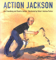
Action Jackson, by Jan Greenberg and Sandra Jordan with illustrations by Robert Andrew Parker, is a children's book that attempts to debunk the assumption that you, generic five-year-old hell raiser, can make one of these things for yourself at home.
The book traces Pollock's process for creating Number One (Lavender Mist) from 1950. If nothing else, the book serves as a nice antidote to Ian Falconer's new classic Olivia with its precocious piglet heroine who asserts "I could do that in about five minutes" while viewing Pollock's Autumn River (Number 30) at the Met. (Note to parents: it's now going to take your kid more than being able to pick out a Pollock to get into Dalton.)
But as interesting as this book is, there are a few things missing. Where is the drinking, the fighting, the pissing in Peggy Guggenheim's fireplace, and all the other general bad behavior--not to mention the car wreck and all that? That's the stuff the kids really want to hear about. Maybe they would have more respect for the man and his work if the life weren't quite so bowdlerized in this treatment.
Wednesday, August 03, 2005
From before the Death of Painting
For several weeks now I’ve been meaning to pay a visit to the New York Historical Society to see their current exhibition, The Hudson River School at the New-York Historical Society: Nature and the American Vision. (How much better the name would be if the subtitle became the title, and vice versa.)
Painting from the Hudson River School piqued a latent interest in art for me when I saw the Frederic Church exhibition at the National Gallery of Art in early 1990. The current exhibition of more than 100 pieces, I can say, is the best show of works from the period that I have seen since then.
Here are some impressions I took away from seeing the exhibition:
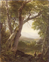

- The salon-style installation in the main gallery is just perfect for the work. It really couldn’t be any better. Not a bit.
- Seeing so many paintings from this period at once makes the tricks of the trade all too evident. Framing the composition by placing a tree, leaning to the right, on the left side of the painting was a crutch that too many of these painters relied on too often.
- No one has painted bark and leaves, though, with as much detail and care as painters from this era.
- Thomas Kinkade may have trademarked the phrase but Cole, Kensett, Durand, Cropsey, Church, Bierstadt, et al. were the original painters of light. And they did it better (much better) than Kinkade does.
- If at first you don’t see the presence of a human taming the sublime landscape, look again. If you see one instance of this, look again. You’ll probably find more.
- Has anyone done a study of the iconography of domesticated animals (e.g., cattle and sheep) in nineteenth-century American painting? If not, there’s enough fruitful material here for a decent masters thesis, at least.
- The New York Historical Society has an extensive collection of paintings by Asher Durand—most of which were given by his daughter in 1907. When the organization went through serious financial difficulties over the last decade (much more serious difficulties than a simple decline in the endowment’s balance due to a general market downturn), it didn’t decide to sell them. Thank goodness.
- Thomas Cole’s five-painting cycle, The Course of Empire, feels much more current today than it did the first time I saw it (in reproduction) in 1989—the same year that Francis Fukuyama was first talking about the end of history.
Tuesday, August 02, 2005
In Today's News
 We circle the globe to bring you items of interest:
- The Getty is back in the news today, and it's not pretty (via).
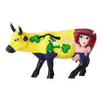
- The International Cow Parade opens in its newest venue this week: Moscow. Will the insanity never end?
- Speaking of insanity, does anyone know why our newly appointed Ambassador to the United Nations insists on wearing a guinea pig under his nose?
- Jessica Yu's film about Henry Darger, In the Realms of the Unreal, screens tonight on the PBS show P.O.V. Check your local listings for stations and times, as they say.
- Finally, the NY Times breaks away from all the serious coverage of British terrorism to report on one terrorist's fashion sense, sort of (original NY Times piece).
Writers Who Look at Art vs. Artists Who Read
Last week I read Michael Ondaatje’s novel Anil’s Ghost. The book contains what has to be the most gratuitous, self-indulgent art reference that I’ve ever seen this side of a Robertson Davies novel.
 The book’s title character has a friend named Leaf who makes an appearance in flashback midway through the book. Leaf decides to leave Arizona where the two characters are living to move to New Mexico. Several chapters later, we get this (sequential sentence fragments and all):
And then there are the factual points. No one who has visited would call the small, ramshackle cabin that sleeps six a “lodge.” The caretaker doesn’t live there. The field doesn’t really draw lightning; that’s a myth. And the first instruction you get when you arrive is that if there does happen to be lightning in the area do not go out into the field. If lighting strikes (which it does once every several years) you’ll be toast--burnt toast-- along with the pole that takes the hit. (When lightning does strike the field, the pole that receives it turns black and is ruined. It has to be replaced with one of the hundred or so extras that De Maria had fabricated and placed in storage when the piece was originally made.)
 But the bigger question is why Ondaatje would think it necessary to include this character and her strange occupation in the novel at all. On the next page, he puts the following words into Leaf’s mouth, referring to the Very Large Array located near The Lightning Field. “Do you think they can hear us? That giant metal ear in the desert. Is it picking us up too? I’m just a detail from the subplot, right.”
Oh so very right. And a completely unnecessary detail at that. A detail that gets dropped in and never really used in a way that justifies its inclusion.
Going in the other direction, though, we have the bookish Dan Flavin, and he pulls off his theft from the literary world much better than Ondaatje does his.
Someone was kind enough yesterday to send me an exhibition brochure from the Flavin retrospective in Chicago. (Thanks Kiki.) The brochure contains this text:
 The book’s title character has a friend named Leaf who makes an appearance in flashback midway through the book. Leaf decides to leave Arizona where the two characters are living to move to New Mexico. Several chapters later, we get this (sequential sentence fragments and all):
When Leaf left Arizona, Anil didn’t hear from her for more than six months. Although during every moment of her farewell she had promised to write. Leaf, who was her closest friend. Once there was just a postcard of a stainless-steel pole. Quemado, New Mexico, the postmark seemed to read, but there was no contact address.If you’re reading this site, you probably get the reference. But it doesn’t stop there. “The next postcard,” Ondaatje continues, “was of a parabolic dish antenna. Again no message or address.” Finally Leaf contacts Anil, and Anil makes arrangements to travel to New Mexico to meet her. Ondaatje picks up:
Originally Leaf had said she had bad asthma, that was they she had moved into the desert for a year, disappearing from Anil’s life. She had got involved with Earthworks and was living at The Lighting Field near Quemado. In 1977, artist Walter De Maria had planted four hundred stainless-steel poles high in the desert on a flat plain a mile long. Leaf’s first job was to be a caretaker of the lodge. Powerful winds swept in from the desert and she got to witness storms, because during the summer the poles drew lighting onto the plain. She stood among them, within the electricity, the thunder simultaneous around here. She had just wanted to be a cowboy. She loved the Southwest.Huh? She wanted to be a cowboy but she ended up tending the lodge at The Lightning Field? What did I miss here?
And then there are the factual points. No one who has visited would call the small, ramshackle cabin that sleeps six a “lodge.” The caretaker doesn’t live there. The field doesn’t really draw lightning; that’s a myth. And the first instruction you get when you arrive is that if there does happen to be lightning in the area do not go out into the field. If lighting strikes (which it does once every several years) you’ll be toast--burnt toast-- along with the pole that takes the hit. (When lightning does strike the field, the pole that receives it turns black and is ruined. It has to be replaced with one of the hundred or so extras that De Maria had fabricated and placed in storage when the piece was originally made.)
 But the bigger question is why Ondaatje would think it necessary to include this character and her strange occupation in the novel at all. On the next page, he puts the following words into Leaf’s mouth, referring to the Very Large Array located near The Lightning Field. “Do you think they can hear us? That giant metal ear in the desert. Is it picking us up too? I’m just a detail from the subplot, right.”
Oh so very right. And a completely unnecessary detail at that. A detail that gets dropped in and never really used in a way that justifies its inclusion.
Going in the other direction, though, we have the bookish Dan Flavin, and he pulls off his theft from the literary world much better than Ondaatje does his.
Someone was kind enough yesterday to send me an exhibition brochure from the Flavin retrospective in Chicago. (Thanks Kiki.) The brochure contains this text:
Flavin usually demurred when asked where he got the idea for working with fluorescent tubes. When artist Carl Andre posed the question, however, Flavin identified a direct source: Ralph Ellison’s Invisible Man. In Ellison’s 1952 novel about race in America, the African-American protagonist combats his “invisibility” by saturating his basement “hole” with light.I’ll admit that I haven’t read very deeply into the Flavin scholarship, but is this common knowledge? Does Flavin really owe his signature style to Ralph Ellison and one of the most important works of African-American fiction? Who would have guessed? If it’s true, it’s a great story.
Monday, August 01, 2005
Practical Jokes, Mechanical GIFs, and Art Data
Last week, with an invitation from friends, I had a chance to see the latest Rhizome-curated exhibition at the New Museum. The show, RHIZOME ArtBase 101, presents 40 works of Internet art from Rhizome’s collection of over 1500 pieces and projects.
Grouping the works according to ten themes, this small exhibition gives a surprisingly complete and compelling overview of the development and current state of the practice.
 Several of the show’s pieces can be enjoyed from any networked computer. Nike Ground, for example, uses modified culture-jamming practices to play a practical joke on the city of Vienna. For this piece, the collective 0100101110101101.org appropriated Nike’s marketing tactics to convince citizens of Vienna that Nike was taking over the Karlsplatz, re-branding it as Nikeplatz. Documentary photographs, conceptual drawings of the large swoosh sculpture planned for the site (right), and video interviews with outraged Vienna residents are available for browsing on the group’s website.
 MTAA’s contribution to the exhibition, One Year Performance Video (screen capture at left), has been bottled for gallery presentation but actually lives best in an interactive fashion on the web. Part of this collective’s Updates Series, the piece re-imagines Sam Hseih’s yearlong imprisonment/performance from 1978-79. But this time the viewers rather than the artists must commit to staying with the work for a year’s duration. Registered visitors to the project’s website have the time they spend running the piece tracked. When the work has been viewed for a year (somewhere north of 31 million seconds), the viewer becomes a collector as MTAA hands over 34 megabytes of unique “art data” that describes a year’s data stream. (To create your own account, log in and start watching here.)
A sculptural installation by Matt Barton and Paper Rad is the one piece in the show that can’t be fully appreciated in the virtual world. The piece, extreme animalz: the movie: part 1 is best described as an homage to the animated GIF—the almost obsolete, pre-Flash method of animating web images. The piece combines screens of Paper Rad’s animated animal GIFs with toy animals and taxidermied animal heads. The installation comes to life when activated by a motion detector—the stuffed animals spinning, twisting, and shimmying manically in a manner than brings into the real world the frantic energy of Paper Rad’s computer animation. When the piece starts and the wall begins to shake with activity, everything else in the gallery stops as it becomes impossible to do anything but stare and smile at such a crazy, controlled spectacle. (Video of the piece in motion is available in a NY1 feature on the show in both high bandwidth and low bandwidth streams (via).)
Far from showcasing tech art by tech artists that can only be appreciated by other techies, this show presents an emerging body of art that sparks thought about new uses for a technology that is mostly deployed for commercial ends. Anyone interested in artistic practice today (Luddites included) will appreciate the current state of the art as shown here.
RHIZOME Artbase 101 is on display at the New Museum of Contemporary Art through September 10, 2005.
Grouping the works according to ten themes, this small exhibition gives a surprisingly complete and compelling overview of the development and current state of the practice.
 Several of the show’s pieces can be enjoyed from any networked computer. Nike Ground, for example, uses modified culture-jamming practices to play a practical joke on the city of Vienna. For this piece, the collective 0100101110101101.org appropriated Nike’s marketing tactics to convince citizens of Vienna that Nike was taking over the Karlsplatz, re-branding it as Nikeplatz. Documentary photographs, conceptual drawings of the large swoosh sculpture planned for the site (right), and video interviews with outraged Vienna residents are available for browsing on the group’s website.
 MTAA’s contribution to the exhibition, One Year Performance Video (screen capture at left), has been bottled for gallery presentation but actually lives best in an interactive fashion on the web. Part of this collective’s Updates Series, the piece re-imagines Sam Hseih’s yearlong imprisonment/performance from 1978-79. But this time the viewers rather than the artists must commit to staying with the work for a year’s duration. Registered visitors to the project’s website have the time they spend running the piece tracked. When the work has been viewed for a year (somewhere north of 31 million seconds), the viewer becomes a collector as MTAA hands over 34 megabytes of unique “art data” that describes a year’s data stream. (To create your own account, log in and start watching here.)
A sculptural installation by Matt Barton and Paper Rad is the one piece in the show that can’t be fully appreciated in the virtual world. The piece, extreme animalz: the movie: part 1 is best described as an homage to the animated GIF—the almost obsolete, pre-Flash method of animating web images. The piece combines screens of Paper Rad’s animated animal GIFs with toy animals and taxidermied animal heads. The installation comes to life when activated by a motion detector—the stuffed animals spinning, twisting, and shimmying manically in a manner than brings into the real world the frantic energy of Paper Rad’s computer animation. When the piece starts and the wall begins to shake with activity, everything else in the gallery stops as it becomes impossible to do anything but stare and smile at such a crazy, controlled spectacle. (Video of the piece in motion is available in a NY1 feature on the show in both high bandwidth and low bandwidth streams (via).)
Far from showcasing tech art by tech artists that can only be appreciated by other techies, this show presents an emerging body of art that sparks thought about new uses for a technology that is mostly deployed for commercial ends. Anyone interested in artistic practice today (Luddites included) will appreciate the current state of the art as shown here.
RHIZOME Artbase 101 is on display at the New Museum of Contemporary Art through September 10, 2005.