Monday, November 29, 2004
Welcome to From the Floor
From the Floor focuses on the contemporary visual arts. Here's a post from the archives that gives an idea of what I try to do with the site. I usually publish at least one post per day. Right now, however, I'm in the middle of a little vacation, so the site will be thin on new content until later in the week. Until then, feel free to browse through the archives. And be sure to come back again soon.
When I return to regular posting, I will have fresh material on the Turner Prize finalists on view now at Tate Britain, the Bernd and Hilla Becher retrospective at the Centre Pompidou, and a few other features as well.
Friday, November 19, 2004
Give Me a Break
I'll be back on December 1.
The Modern Museum vs. the Museum of Modernism
No organization has done more to institutionalize the twentieth-century avant-garde than the Museum of Modern Art. With the debut of its new home this week, MoMA has announced how it, as an institution, plans to move itself out of the twentieth century and into the twenty-first.
 Visitors will notice immediately that with this building MoMA has made the decision to play to its greatest strength: its collection. Members of the board put egos aside to raise $850M for this expansion, of which $725M is already in hand. With their money, they have bought a marvelous machine, a marvelously designed machine, for viewing modern art.
Architect Yoshio Taniguchi has said that he wanted to “create a total environment for people and art, not a style of architecture.” The light, the views, the galleries, the public spaces, the restaurants available on the premises—everything works to create an environment where outside distractions are removed, visitors are made comfortable, and attention is focused on the art.
 The museum has become, in effect, Alfred Barr’s white cube writ large. The building’s design philosophy acknowledges the city while removing its distractions. It provides a luxurious (but not intrusively opulent) environment where art can be experienced with clarity and focus.
That’s what the board wanted, and that’s what it has received. Evaluating the success of the project against its objectives leads to a judgment that simply can’t be argued: the new MoMA is an exceptional accomplishment.
Wags, however, have begun referring to the institution this week as the “Metropolitan Museum of Modern Art.” The epithet carries more than a kernel of truth.
 With the new building MoMA has taken a giant step towards making modernism academic. All the drive, the edge, the rawness, and the grit that have been characteristic of twentieth century art have been washed away with this exceptionally clean, well lit, and sleek space.
Gordon Matta-Clark’s handiwork with a chainsaw, for example, has been made silent, clean, and sterile by its presentation in the new contemporary art galleries. Viewers of this piece will not think about the violence, noise, and destruction that occurred to create the artifact on exhibit in this most impressive of spaces. Instead, they will marvel that the gallery is large enough to hold pieces of a whole other building.
One wonders how the new MoMA would differ if its funders and designers had made a different strategic decision early on in the project. What would MoMA be like if they had tried not to display comfortably the work of a century of avant-garde artists but if they had instead tried to create a new museum-going experience or a new way of interacting with and exploring art for our new century—if they had, essentially, taken Pound’s modernist dictate to heart and had decided to “make the museum new”?
MoMA chose not to embrace new thinking about the museum’s function with this expansion; rather, it chose to build a monument to twentieth-century modernism. It’s a wonderful monument, and anyone would be hard pressed to argue that it’s not. But it’s just that: a monument. Monuments are made for memorializing events of the past. Not for celebrating activities of the present. And not for enabling innovation in the future.
Thursday, November 18, 2004
Additional MoMA Notes
In the interim, I thought I would share some random notes that I now know won’t make it into the longer piece I’ll run.
It would be really easy for someone to do a classic deconstructive critique of the opening comments at the press preview, reading what was said against the backdrop used. Because I’ve shown my critical hand already, I can’t let myself do it.
In his opening remarks director Glenn Lowry said that this new addition has “exploded the museum open to the city and made it an integral part of the city in which we exist.” Sure it’s a great building, but (sorry) I don’t see it the way he does.
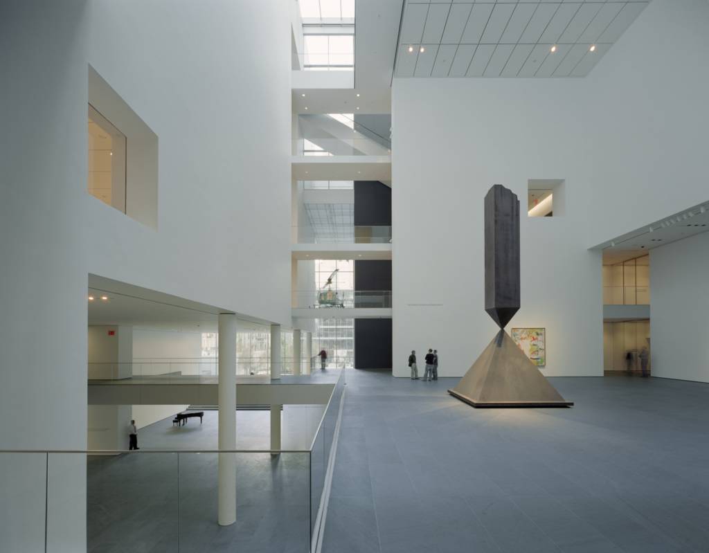
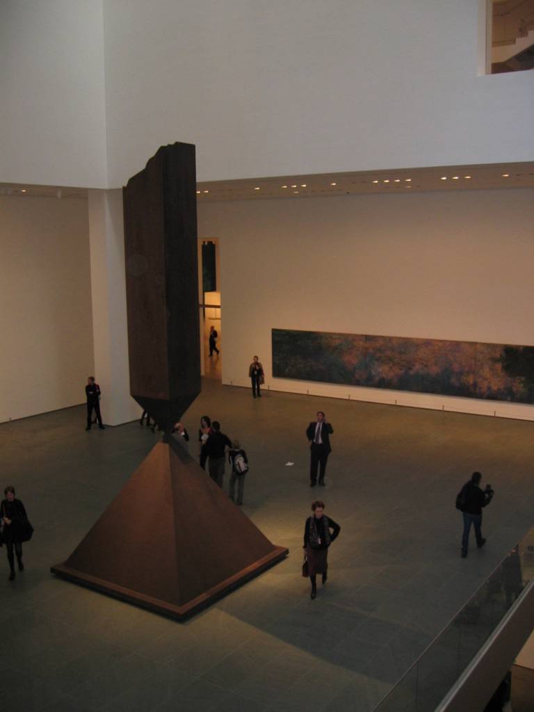
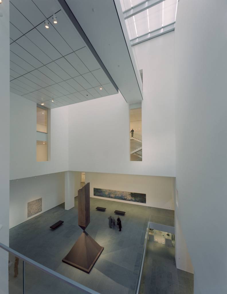 I heard Chief Curator John Elderfield describe the concept used for the atrium installation. Once Barnett Newman’s Broken Obelisk was selected for the space (it’s a great choice, by the way), he wanted to highlight late works by other artists that show the range of the museum’s collection. Paintings hung in the space include Monet’s Water Lilies (given a much longer title on the wall text) c. 1920, a de Kooning from 1981, a 1992-95 Jasper Johns, and a Brice Marden from 1992-93. Elderfield said the concept was working well until he realized that he wanted to hang the Marden with the other works. That’s when he decided to break his own rule. He added that he’s not totally happy with the Monet hanging yet. Expect to see it get raised a couple inches in the near future.
The contemporary galleries feel like they have been installed with a hodge podge of work—almost all of it large. Other than the Cy Twombly, I wasn’t overwhelmed with the work or with the installation. But I’ll cut MoMA some slack here. They have never had a space like that to install, and Elderfield admits that it will take them some time to get the feel for how to use it. I will be interested to see what they do in the future so that small, intimate works don’t get lost in the space like a few do now. Lowry mentioned separately that they plan to reinstall these galleries every year.
Benches. Yeah, yeah, everyone is carping about it, but MoMA really needs to put two in the video gallery. They are currently screening Eve Sussman’s 12 minute looped video 89 Seconds at Alcázar and Rodney Graham’s nine minute looped video Vexation Island. No one, and I mean no one, is going to stand through both those pieces. And that’s a shame because the Sussman is great. I don’t know about the Graham. I couldn’t stand there long enough to watch it.
Wednesday, November 17, 2004
The MoMA Annual Artist Pass
MoMA does not publicize this membership category (so you won't find it on the website), but my informant writes that the museum will grant an artist an annual membership for only $35.
This rate happens to be an increase from the $20 charged at MoMA QNS, but it's still the bargain of the season. Artnet ran a short notice on the $20 artist pass after MoMA QNS opened. ( To read it, go here and scroll 2/3 of the way down the page.)
If you want to take advantage of this offer, you may need to supply the museum with credentials proving your status. I've also heard that the pass is only available for purchase in person at the museum.
I tried to validate this information and get more specifics, but there are no membership or communications staff members in their offices at MoMA this morning. (And due to other commitments, I won't be able to spend time chasing down an answer for the next couple weeks.) If you're a New York-based working artist, contact the museum for full information and application instructions (phone number available via the website link above). And let me know the details when you get them.
Tuesday, November 16, 2004
MoMA Impressions
 I've outlined a piece about MoMA's new home that I plan to write as time allows this week. But here are some preliminary impressions.
The first installation isn't perfect, but there's a lot to like--not the least of which is Chief Curator John Elderfield's willingness to admit that it will take some time for the staff to get used to the space. That said, he has nothing to apologize for. While attendees at today's press preview will all find nits to pick, it's hard to find anything serious to fault.
So, to get this out of the way, here are my two.
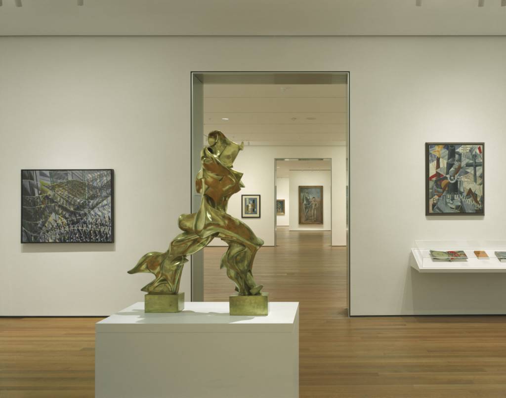
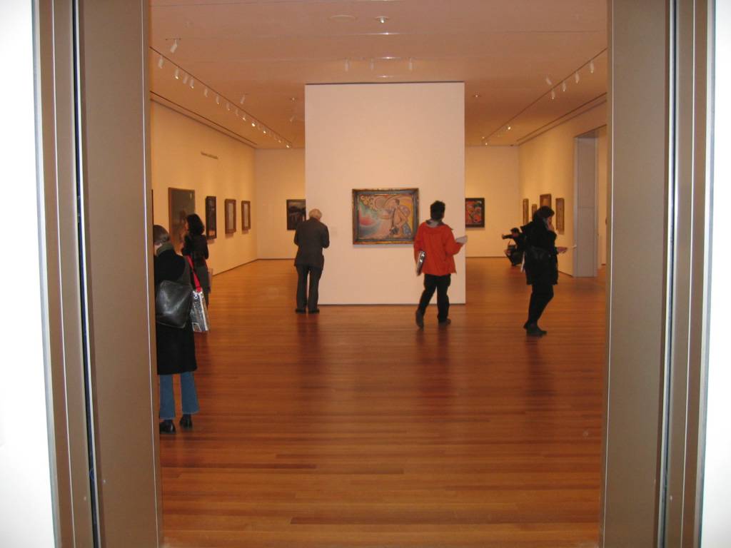 Cezanne's The Bather didn't have to open the painting and sculpture galleries, but if Paul Signac's Portrait of M. Félix Fénéon requires a Met-sized wall text to explain its significance, it's probably not the right piece for the job. (View into the first gallery at right.)
Monet's Reflection of Clouds on Water-Lily Pond doesn't show nearly as well in the atrium as it did in its old home. Phrases I overheard people use to describe it included "cold," "poorly lit," and "not intimate enough." It gets overwhelmed by the space instead of overwhelming the viewer with its presence. (See photo above left.)
But enough of that. It's MoMA's week, and there's plenty to celebrate. Here are a few highlights.
A monumental Cy Twombly chalkboard painting that has more than enough space to breathe in the massive contemporary galleries. (Seeing this piece in this space is worth $20 by itself.)

A sculpture garden that is looking better than ever.

Having a chance to see old friends again.

 But it's not just old friends on display. MoMA has made a massive number of new acquisitions in conjunction with the building campaign (upwards of 1000 pieces, the word is), and several of them are on display for the first time, including two works that were hits of this year's Whitney Biennial--Julie Mehretu's Empirical Construction, Istanbul (at right) and Eve Sussman's video work 89 Seconds at Alcázar. (Headline: "MoMA Eats Whitney's Lunch.")
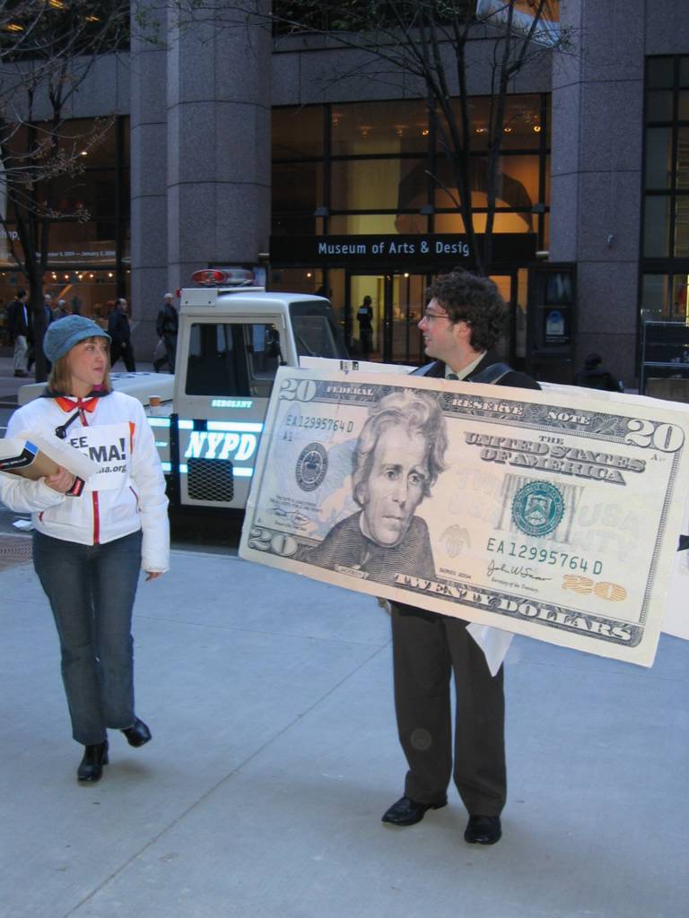 But the day wasn't a total MoMA love fest. Our friends from FrEE MoMA were out on 53rd St. dressed as the museum's admission fee. Tyler Green from MAN, first with the scoop both in the blogosphere and in the real-time world of live action museum protesting, pulled me out of the atrium to get a snapshot shortly after the cops arrived. Cell phone calls to lawyers and radio contact with the precinct ensued. FrEE MoMA stayed put for the day, but so did the cops. (Update: If you're either just curious or you're affiliated with MoMA and are building a black list, Barry names names.)
The stunt got a lot of play, including a live interview on WNYC. Upstairs, journalists grilled MoMA director Glenn Lowry on the $20 admission. I sat in on portions of three group interviews with Lowry, and in each one the topic of the admission fee generated several questions and passionate follow up. (And, no, it wasn't me asking the same questions each time.)
And, by the way Tyler, the quote from Target was better than you remembered it. I made sure to get it down verbatim because it was such a groaner. What the Target VP actually said from the podium was, "Design is a huge part of Target's DNA." But because Target is funding four years of free Fridays, we'll let this one slide, right?
Monday, November 15, 2004
The Museum as a Laboratory
In his opening comments this morning, director Glenn Lowry referred to Alfred Barr's notion of the museum as a laboratory where the public can participate in creating the narrative of art history. Well, if they want the blogging public to participate, they're going to have to do better than this weak-ass wi-fi access point that I'm hacking into to upload this post. Also (and this one is really simple) when a cheese plate featuring a selection of soft cheeses gets put out, there needs to be crackers too. Bloggers can't grouse on an empty stomach--or with brie all over their fingers.
OK, so I'm struggling hard to find something to harp on. It's good here. Really good. I'll post about that later, with photos.
Highlight of the day so far: seeing Artnet editor Walter Robinson and his columnist Charlie Finch get into a serious raised-voice argument near the escalators. No punches were thrown, I'm sad to report.
Update: I guess Finch was even more grumpy than he usually is today.
Send in the Bloggers
Good for me. Good for you.
Believe it or not (I still don’t), MoMA has actually credentialed FtF for today’s press preview. A full report on the festivities will follow.
Well, how “full” the report is will depend. If MoMA’s bloggers get the same access the convention bloggers got, I’ll have an in-depth piece later today on the one new gallery devoted to the Russian Constructivists.
If you’re a Vladimir Tatlin fan, you’ll definitely want to stop back later. If you’re not, stop back later anyway. But plan on buying a copy of tomorrow’s Times too.
Friday, November 12, 2004
A Streaming Neck Kink
Now I'm Confused Again
I thought that I had discovered the perfect way to tell the two magazines apart when I made the observation recently that articles in Vogue were too dumb while articles in Artforum were too smart. Now I’m not so sure I got that right.
The October Vogue runs Dodie Kazanjian’s interesting, intelligent, and well-written profile of Elizabeth Peyton.
The November Artforum runs two interesting, intelligent, and well-written pieces on Isamu Noguchi by Anne Wagner and Josiah McElheny.
These publications both need to step away from the middle and get back to their bases. If what they’ve been doing this fall continues, there won’t be any way to tell them apart.
If this keeps up, we’ll soon have fashion design assistants reading Artforum and selling their personals on eBay to fund visits to MoMA. And we’ll have art history grad students reading Vogue and burning their Birkenstocks and college sweatshirts. That’s a fundamental disruption to the natural order. It’s just not right.
Payback
She must have been feeling generous because she stopped well short of a public strip search.Man wearing sports coat, tie, and fancy cowboy boots: “Do the boots have to come off today?”
Female TSA screener: “Yes. Especially if you’re my ex-husband’s attorney.”
Thursday, November 11, 2004
An Open Letter to Greg Allen
I love it when you get all riled up. It makes for great reading. One of my faves is your post about going off on the Pakistani ambassador to Japan while you were in Hiroshima. That’s fabulous stuff.
I can’t help but think, though, that part of your rant last night was aimed at me. That’s why I’m writing.
Well, that’s half the reason I’m writing. The other half is this: I want all ten of the MoMA passes you’re making available. But I’ll get to that in a minute.
I started grousing about a $20 MoMA admission on From the Floor when it was announced, and I’ve taken more than my share of potshots in the interim. I was also the one who leaked the existence of FrEE MoMA to the blogosphere this week.
I’m not ashamed to admit this: my blog is a self-indulgence. Most of the time it’s all about me in one tangential way or another. That’s what blogs are by nature, right? But this topic is different.
Here’s a secret most people don’t know. Art museums comp other museums’ employees. The pro bono work I do for the Whitney has gotten me an employee ID. That means I don’t have to pay to get into MoMA. I haven’t paid an admission there since 2001, and I won’t have to pay when the museum opens next weekend. Personally, it makes no difference to me if MoMA charges $2 or $20 because it’s always free for me and my guests.
Unlike almost everything else I do on the blog, I’ve continued to kvetch about this issue for reasons other than self-interest.
Although I may look like a self-centered metrosexual if you run into me on the street, underneath that surface I’m actually a bit of an old-fashioned hirsute lefty. I believe that as a society, as a community, we’re all in this together. I believe that those of us who are fortunate enough to have benefited from the system the Founding Fathers established have a duty to help those who haven’t benefited as much.
Because I don’t want to pay this idea lip service, I make a point of putting my money and my time where my mouth is. I take the $10 I don’t spend every day at Starbucks (and the other $10 I don’t spend on cabs because I walk or take the subway) and give it to mission-driven organizations that work in our community and internationally to make the world a better place—organizations like WNYC, the New York Public Library, City Meals on Wheels, City Harvest, Habitat for Humanity, CARE, and Doctors Without Borders. In the last year I’ve also given my academic and professional expertise to the Whitney, the Lucy Moses School, and NYFA on a pro bono basis.
I’ve been pushing the MoMA admission issue because with the blog I have a forum (a limited forum, granted) that I can use to try to make a difference. I haven’t been doing this out of self-interest or “idealism and condescending romanticism towards some amorphous Common Man.” Unlike you (I guess) I know people—real people—who have been priced out of a visit to MoMA. I’ve been doing what I can to open and sustain discussion of this issue on their behalf.
Our city is filled with people who are either struggling to climb into the middle class or are struggling to keep their place there. These are the people hurt most by MoMA’s new fee. Today’s emerging artists are one subset of this group. Ironically, the artists whose work MoMA will collect in the 2010s and 2020s will struggle to visit MoMA today.
Your offer of ten admissions to MoMA is really generous. I hope this doesn’t sound greedy, but I want to step forward to request all ten of the passes you’re making available.
These passes aren’t for me since I don’t need them. They are for ten real New Yorkers I know who probably won’t be able to go to MoMA this year without them. If you give me your ten passes, I will pass them along to the following people.
Two of my wife’s friends: Mrs. FtF got a call a while ago from a recent graduate of her college who had just moved to New York and was looking to establish a local network. This woman and her husband are both waiting tables at a TGI Friday’s while they look for entry-level jobs that will let them start their careers. A day for two at MoMA would cost a good portion of a shift’s tips which they need for rent on their Times Square walkup and to pay back student loans.
Our upstairs neighbor and her three kids: She’s a single mom raising her kids on a New York City cop’s salary. Things are kind of tight for her right now because she recently moved her family out of the one bedroom apartment they were sharing into a two bedroom apartment that opened up in the building. The rent’s a few hundred dollars a month higher now, and a day at MoMA with the family isn’t even close to being a priority when the monthly budget gets made.
Two friends of mine: She’s a sculptor. He’s an architect. They are both a year out of school and are both really talented. She’s doing her own work and is working as a studio assistant to an artist who has work in MoMA’s collection. He’s in his first year with an important firm. They are both going places quickly, but with other financial commitments they have right now, $40 for a day at MoMA is a luxury. Job demands make it difficult to get up to W. 53rd St. during a limited number of hours on Friday afternoons.
Another two friends of my wife: Mrs. FtF knows this recently married couple. He’s a painter. She’s a musician—a singer/song-writer. I make a point of going to her shows when she plays in the Village because she’s really good. In order to have the flexibility they need to continue to develop their craft, they’ve both taken low-paying day jobs. Finances are tight as a result, and she’s had some health problems in recent years. Other things come before a day at MoMA.
Let’s start here. Send me the ten passes you have on offer, and I’ll make sure these people get them. If you’re willing to go back to the well for another ten next week, let me know. I’ve got another group of people I want to tell you about.
Best,
Todd
Wednesday, November 10, 2004
Ezra Stoller, Chronicler of Modern Architecture
I've been looking at Stoller's work in recent weeks, and I've developed a new appreciation for it and its creator.
Most of us know site-specific art like the major earthworks through documentation rather than through direct experience. As I mentioned in a post after my visit to Spiral Jetty, documentation often obscures or frames out facets of the work. These aspects subsequently disappear from scholarly and critical discussions.
Although we don't often think of it as being akin to earthwork, architecture is similar in this way. Most scholars and critics come to know important buildings through photographic documentation rather than through spending time in and around the buildings themselves. Architects know this and understand that reputations are built as much on the documentation and representation of their work as on the work itself.
That's why every major American modernist architect relied on Ezra Stoller to photograph his buildings.
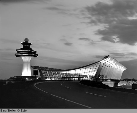 Stoller trained as an architect himself, but he built a successful career by photographing buildings rather than designing them. (His photograph of Dulles Airport is at right.) Stoller also built and ran Esto, an agency devoted to architectural photography. Esto's site contains a small gallery of his work, as does the Morehouse Gallery site. Looking at the images on these pages will convince modern architecture aficionados that their understanding of the era's major work has been mediated by Stoller's camera.
In a certain respect, Stoller played the role of an architectural critic, but he was a critic who worked in images rather than words. He presented his clients' work to a broad audience and framed the discussion that would emerge around it.
Stoller was the sort of critic any creator would want. He spent time understanding the architect's intentions, and then he did whatever was necessary to translate the essence of those intentions into his own medium of communication--most often a black-and-white, two-dimensional medium.
I had the opportunity last week to spend a few hours using Skidmore, Owings, and Merrill's archives to research an endangered Gordon Bunshaft building from the late-1950s. The files on the building were filled with Stoller photos, and the office's walls were covered with his work.
Some buildings in the Stoller photographs hanging in SOM's hallways have now been destroyed. (The Emhart Building is one example.) Now, only Stoller's images of these works survive.
While Stoller may have thought he was simply fulfilling his architect clients' requests for flattering photographs of their work, he did much more than that. He left us with an extensive and definitive record of a moment in time that saw great architectural experimentation and optimism--a moment that, ironically, contained the seed of its own demise in its infatuation with cutting-edge technology and all things new.
Sadly, these great buildings may not survive the next generation of developers hungry to flip valuable real estate at the top of an inflated market. But we're left with Stoller's photographs of the buildings. And that's better than nothing. Much better.
Tuesday, November 09, 2004
Links and Such
- The Whitney unveils its expansion plans
- Photography is hot
- Marlene Dumas is not
- Tyler Green with MOCA's Ann Goldstein on Minimalism breaking out all over
- What happens when curatorial departments don't talk
- John Updike visits MoMA
- Miguel Sanchez visits the MFA
- Pictures of penguins
- Ruscha? We'll see....
- The best theater I've seen in ages
“Backpack, Give Me a Neck Kink”
Most artists just don't have much of a sense of humor. Sure, you can come up with counter-examples. But for every Maurizio Cattelan, there are a hundred hard working, competent artists who take themselves and their work way too seriously.
A couple weekends ago, I attended the Elizabeth Foundation for the Arts open studios event. Most of the studios I visited belonged to hard working, competent artists. There was one studio, though, where I found work that made me laugh. Not polite little chuckles either. These were good hearty belly laughs.
Noah Klersfeld's (website) thirteen-minute-long video project Pay Roll (on display in his studio that day and screened at Spark Contemporary Art Space in Syracuse on November 6) is funny. Damn funny. But it's much more than funny.
 As the video opens you realize that you're watching raw footage from a complex action sequence. Three cameras focus on the intersection of Broadway and Fulton Street in downtown Manhattan: one at ground level on the northeast corner, one on the southwest corner, and one on a building high overhead (see the still at right).
There's a voice--or maybe two--providing direction to the pedestrians and vehicles in the frame and instructing the editing booth to switch between the three cameras. The voice tells police cars where to go, taxi cabs which lanes to use, pedestrians when to move into the crosswalk, and traffic lights to change from red to green and back again.
There's a hint of narrative to the video but only in the way that there's a hint of vermouth in a good martini. It's there and makes the thing better, but it's not what the thing is all about.
The work's narrative aspect unfolds as the director's commands make clear that this tightly choreographed, complex shot is building to a crash scene. When the actors miss their marks, the director has to call in a "slow man" to meander through the intersection to buy some time to get everything synched up again. He's only got a limited number of slow men to use, and he gets pissy when he has to call one out.
You buy the concept for a while, but then you make a realization. This work isn't what it led you to believe it is.
The voiceover, you begin to see, was laid down after the video was shot, and the video is classic Warhol. It's nothing more than three cameras pointed at a street corner and turned on to capture the flow of time. You realize you've been taken. You're not getting a behind-the-scenes view into how a complex action scene is set up. You've been suckered into getting excited about watching the banality of everyday life play out on screen in real time.
This is when the piece becomes funny. You start noticing the details the director is calling out and you start looking at the footage as an anthropologist would. At one point the director instructs a pedestrian to adjust his belt pack. What the heck is a belt pack anyway? Where did the idea come from to stick a little bag on a belt? When did people start using these things? How does their use mark the wearer? (You'll never see a guy in a well-cut suit wearing a belt pack, right?) What does this guy have inside his?
Pay Roll makes you take a fresh look at the world around you--at the things that you look at everyday but never notice as you walk the streets. The work is powerfully life affirming in this way. It shows the novelty, beauty, intrigue, and interest that surround us everyday but that we look right through as we rush back to the office after grabbing a quick lunch.
But then things start to get weird. While you're reveling in the detail of life that you typically overlook, you start to question the difference between the real and the artificial. Klersfeld's work is all reality to a painful degree, but at the same time what's causing you to look at the real with heightened awareness is the artificiality of the voiceover that is trying to turn mundane footage into something as glamorous as a major Hollywood production.
The piece also raises issues of power, control, and human agency. These people may think they are living their lives according to their own plan, but the director makes clear that he's really the one in control. His voiceover, in a sense, is the soundtrack to God's or Fate's direction of human action--direction that is provided down to the smallest detail. Why, other than the fact that the director has said, "Backpack, give me a neck kink," would that guy carrying the backpack make such a weird motion with his neck? He couldn't possibly have chosen to do something that strange of his own free will, could he?
Pay Roll is a serious work of art built up from the mundane experience of everyday life as it is lived in real time. Or maybe it's not. Maybe it's just a good joke on the viewer, designed to get a self-deprecating laugh. It certainly got one from me. But after seeing it, I'm looking at life on the streets around me with a fresh eye. And I'm not laughing anymore.
Monday, November 08, 2004
A Site Worth Watching This Week
Treat the Work with Some Respect, Please
An interview with the artist conducted by Marguerite Feitlowitz provides a good description of works from the series.
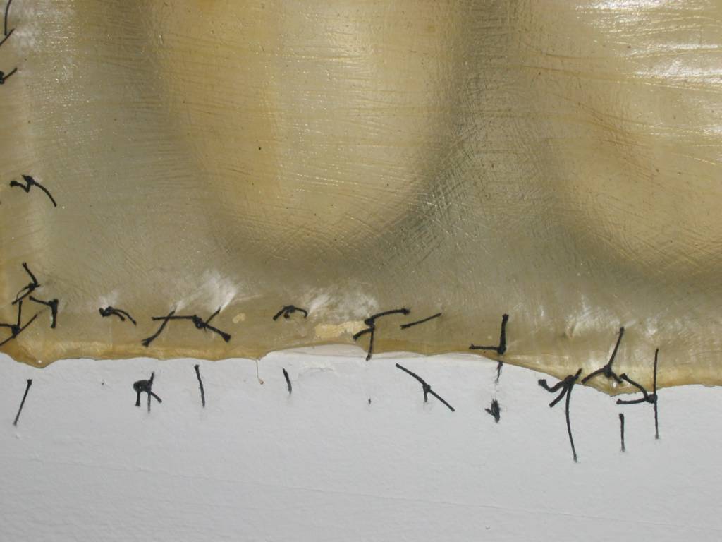
Salcedo’s work functions as both art and memorial. Looking at these shoes (shoes either found at mass grave sites or donated by relatives of the disappeared) raises strong feelings—feelings that neither art nor large-scale memorials typically raise on their own.MF: Shoes are a dominant element in the series you call Atrabiliarios, an archaic Spanish word whose Latin roots, atra bilis, combine profound mourning with bile, or rage. You 'buried' the shoes, many of which lack their mate, in wall niches, which you then covered with translucent animal fiber and closed with surgical thread. The process itself, one of humble care and profound homage, calls up ancient customs; the effect on the viewer is one of searing loss. The shoes are at once homely and familiar, but because they are sealed off and their outlines are indistinct, they seem to be fading before our eyes into another realm.
DS: It is more and more difficult to find the diffuse boundary between the intimate and the political. The grief of the relatives of desaparecidos—like all grief—is of an intimate nature, but when the essence of these events is political, I believe the society must acknowledge it. I am interested in showing that social injury, its collective character.
This week Sotheby’s will be selling a small work from the series while Phillips offers a larger piece. Here are the catalogue photos of both. The Sotheby’s piece is on the left.
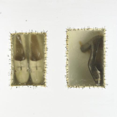

These two pieces, sadly, provide case studies for collectors who buy works at auction. They demonstrate why it’s crucial to examine any piece in person rather than relying on a catalogue photo and an auction house condition report.
I had looked at the Sotheby’s photo a couple times last week without noticing an important detail that I saw right away when inspecting the piece at the preview last weekend. The sutures on the left niche are broken. Someone, at some point along the way, put a hand through the animal skin and tore it away from the mounting.
I was surprised by the extent of damage to the piece and by the fact that the owner would put such a compromised work up for sale. Curious about how the auction house was dealing with the situation, I asked a specialist for the condition report on the piece. The condition Sotheby’s was reporting: “generally good.” Judge for yourself. Here are some close-up shots of the damage. (Click on the photos for enlargements.)

The work for sale at Phillips also has serious condition problems. It appears that the owner of the work decided, at some point, to repaint the wall in which the work was mounted. Here are the results.
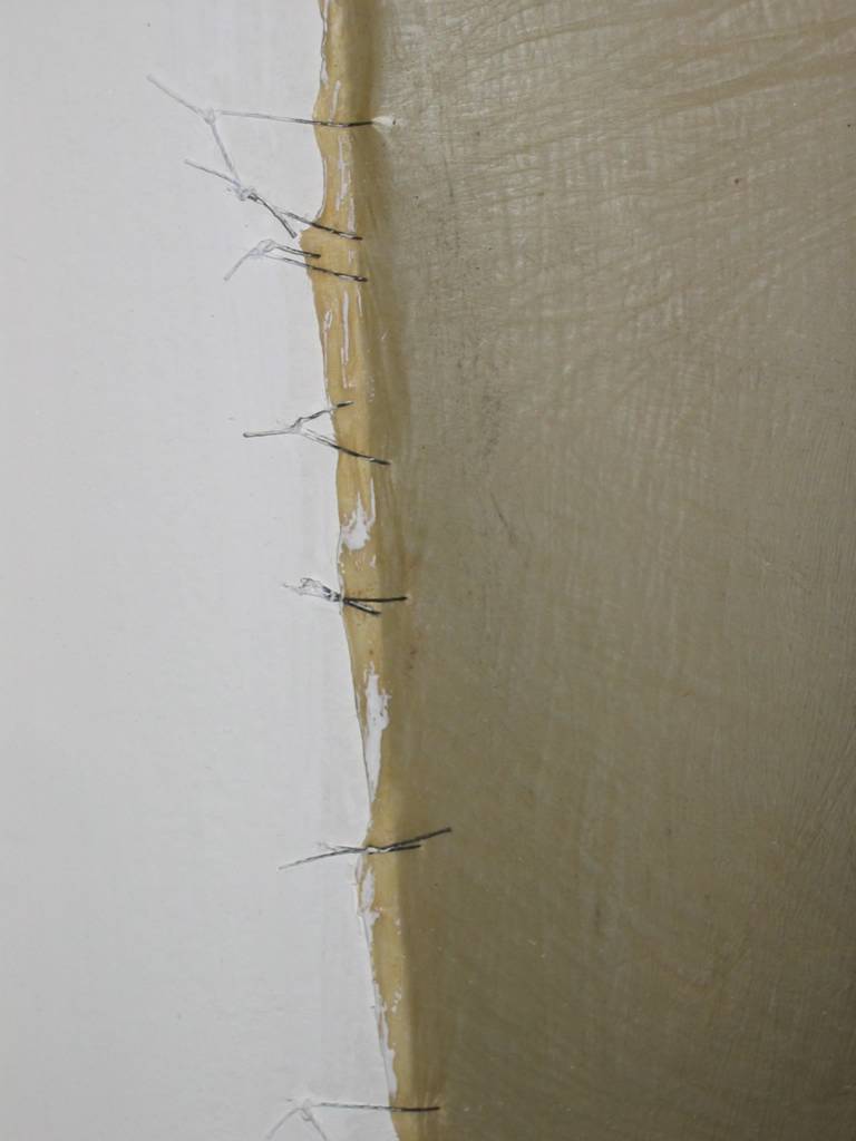
While the damage here is not as extensive as that done to the work at Sotheby’s, this piece may actually prove more difficult to restore. Because it has been painted, the original surgical thread has lost its integrity and cannot be reused, and the organic material will need to be treated with a chemical solvent to remove the paint that now mars it.
I was disappointed to see the damage suffered by both these works and the lack of care given to them by their owners. Works of art—especially powerful works of memorial art like these—deserve to be treated much better.
Sunday, November 07, 2004
Bearden Trivia
According to friend and collaborator Albert Murray, Bearden's name was pronounced with three syllables, not two, with a strong accent on the first and a weak accent on the last. Phonetically: Roe-muh-ree.
Before Bearden was born, his mother had a neighbor whose name she liked--a man named Mr. Romare.
Saturday, November 06, 2004
Picks and Pans
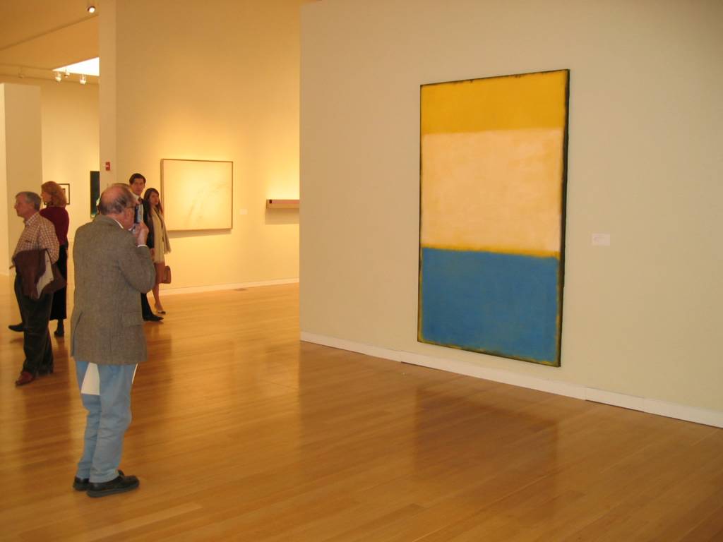 I wasn't disappointed with any of the items I mentioned on Thursday. (There were serious condition problems with the Doris Salcedo work, but I'm planning to write a separate post on that later.) The Rothko was the star of the show--totally stunning.
Joan Mitchell's King of Spades is as good as Mitchell's work from the late-1950s gets. The work was bought in at Christie's when it went on the block in 1999. But with Mitchell's reputation on the upswing after the recent traveling retrospective and with the market continuing to strengthen, I'll be surprised if the work doesn't break the $1M barrier. This is a work that ought to find a home with a good, regional museum. It would be a shame if it ends up being bought by an individual and disappearing from view.
Several pieces stood out at the preview that didn't in the catalogue:
Alexander Calder, Untitled, 1946
Joseph Cornell, Untitled (Penny Arcade Series: Eden Musee Waxworks Childhood), c. 1960
Wayne Thiebaud, Various Pastels, 1972
Felix Gonzalez-Torres, Untitled, 1991
Dan Flavin, Untitled (To Greta Garbo), 1993
 Once you get beyond the marquee works, auction previews tend to feel like rummage sales--really expensive rummage sales. I can't help but wonder who in the world would pay in the estimated price range for works like these:
Tom Wesselmann, Great American Nude, 1965
Andy Warhol, Ladies and Gentlemen, 1975
Andy Warhol, Diamond Dust Shoes, 1980-81
Robert Rauschenberg, Esplanade
Willem deKooning, Untitled XII, 1985
Oh, wait. I know who buys this stuff.
Finally, make sure not to miss what passes for humor in the auction world. Here's the final lot of the three auctions, a Ryan McGinley photograph. When this piece goes, it means all the fun is over.
Friday, November 05, 2004
Discussion with David Kiehl on Memorials of War
This fall has seen a host of war-themed shows in Chelsea. Most of them have tended toward the didactic or the shrill. While also focused on the topic of war, Memorials of War has a completely different tone. What did you want to do with the show, and how did you approach the topic to give it the tone that it has?
I didn’t want the show to be about protest because that is shrill and didactic. I didn’t want the show to be strident. I wanted it to be respectful—respectful of those who fought in Vietnam, of those whose fathers, brothers, and cousins were killed in the war. I believe the show does do that, but it also opens up issues of rethinking what the war was all about. I think we have forgotten that in the intervening years. It’s time to remember since we’re dealing with similar issues all over again.
What does looking at the topic of war through a historical lens give that more recent work doesn’t?
I wanted to talk about the parallels between something that was in the past and what is happening today. For me, having grown up in the 1960s, the parallels between the Vietnam War and the latest Iraq war are strong.
I was really interested not in the war as fought, but in the war as memory because Vietnam marked a big change in how we “memory” war. After World War II, we were used to statues, memorial plazas, cenotaphs, and community centers as ways of memorializing. That all changed with Vietnam.
The images of the war from Life Magazine became the inspiration for what I wanted to do. We don’t always remember specific dates and battles. We don’t always remember the political discussions. But we remember images, especially in today’s world. I wanted to raise the issue of how Vietnam is looked at, how Vietnam is remembered.
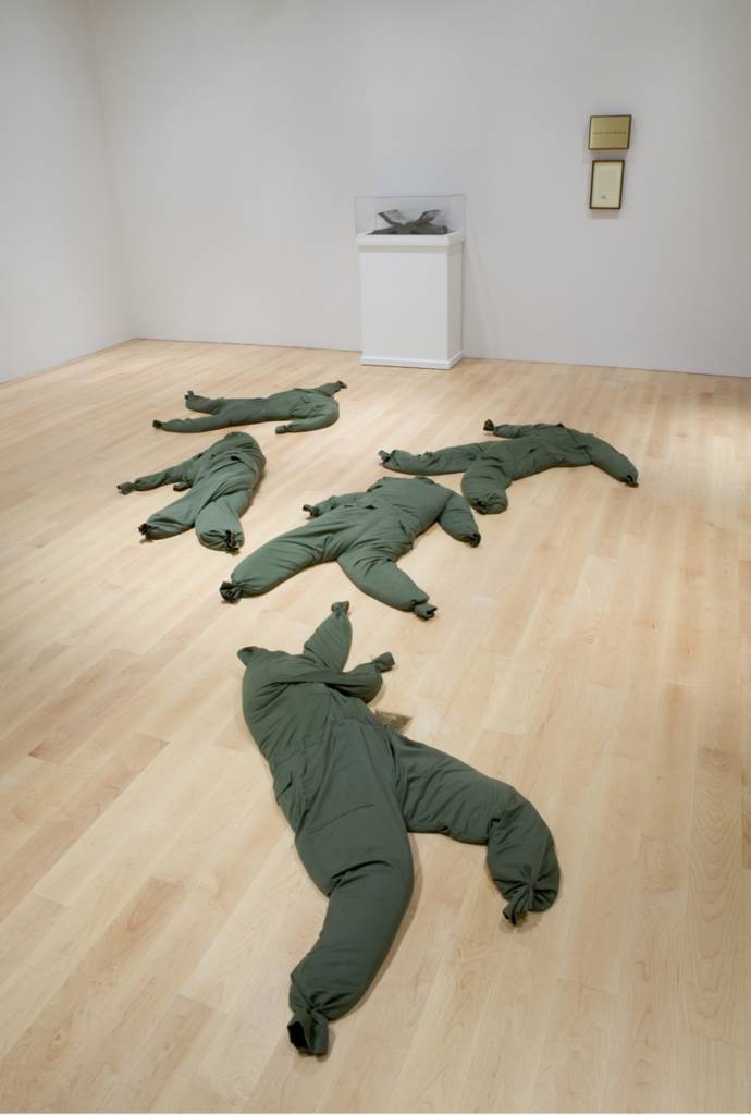
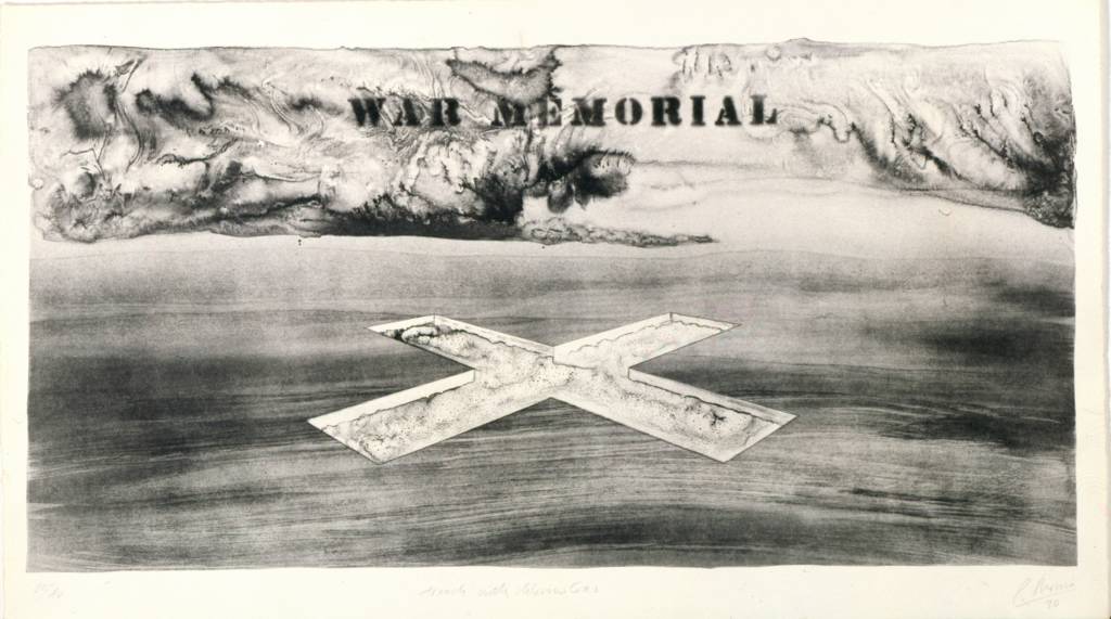 Two key elements in the show are the proposals for war memorials. We bought the Robert Morris set of prints two years ago—the lithographs proposing a planned destruction of the American landscape as a memory of war. (At right: Robert Morris, Trench with Chlorine Gas, 1970, from the series Five War Memorials.) And in 2003, Nancy Kienholz gave the museum The Non-War Memorial. That memorial was originally intended to be on 75 acres that had been totally voided of any living thing. The Vietnam uniforms were intended to be filled with dirt and seeds to rejuvenate the land. Both works invoke death through the destruction of land, as a metaphor of what we did in Vietnam.
So I really wanted to set up a parallel. This is how we remember something in the past, something that a lot of us grew up with. I wanted viewers to see this work and then draw their own conclusions. I really wanted people to think, to stop in their tracks. If they cried that was fine. If they got angry that was fine. I wanted them to think about what went on in the past, about what’s going on today, and how we can strive to make the future different.
 It takes guts for an institution to present a show that invites free and open discussion of these issues when that discussion is viewed as contentious in some circles. How has the general public received Memorials of War since it was installed?
I have been happy because the show has been well-attended. I go up to watch people in the gallery to see how they move through the show. Kienholz’s body bags are in the center of the gallery, and you have to walk through them. (At right: installation view of Edward Kienholz, The Non-War Memorial, 1970.) People are not kicking them. There is no destruction. There is a lot of respect. I wanted the idea of walking through corpses. In a way, it’s like walking a labyrinth in a medieval cathedral. As you do it, you think.
I’m hearing from the guards that people are asking for the show. There have been a lot of requests for information from school kids. Vietnam isn’t taught in many schools, but children are being assigned to go look at this show.
 As well received as the show has been, there’s still one thing I wish I had been able to do. I left a hole in the installation; there’s a wall that has a space on it. I left the space because I’m still looking for the Art Workers Coalition’s Q: And Babies? A: And Babies. poster (at right). That’s the poster that I had in my college dormitory. I know that it exists. I know that it’s out there. I just haven’t found it. I would love to get it some day for the museum. I would love to put it into its space on the wall.
Memorials of War remains on view in the Whitney’s fifth floor Ames Family Gallery through November 28.
Thursday, November 04, 2004
Price Transparency and a Few Fall Auction Picks
I've written before about how increasing price transparency in the market is a good thing for all participants. With the fall sales, these three brokers are taking quite different positions on the issue.
Phillips has not even bothered to produce an on-line catalogue for this sale--something that has become a required-to-play item in the business. Transparency can't exist if such basic information as what's on offer needs to be purchased through a catalogue subscription (price, $140 annually). (Update: Better late than never. Phillips has, finally, come through with an on-line catalogue--evening sale, day sale.)
Christie's does make its catalogue available on-line prior to the sale (along with specialist commentary on select items) but does not provide on-line, searchable access to sale prices for works sold more than 30 days in the past. Historical sale prices are available through the website, but items are only identified by sale and lot number--again, requiring purchase of a catalogue subscription to match items with prices.
Sotheby's has held the lead in price transparency by making access to historical pricing available with its Sold Lot Archive search. This feature provides complete transactional information for all works sold through the firm since 1998. This fall Sotheby's extends its lead by making complimentary access to Artnet's pricing database available for works going on the block. (Free registration is required to access Artnet data.) Sotheby's still has work to do to wash away the stain of sins of the past, but they are making much more progress in that area than their competitors.
Earlier this week I paged through the three Sotheby's catalogues and pulled out a few totally subjective picks that I'll make a point of seeing there on Saturday.
 Evening Sale (November 9)
Mark Rothko, No. 6 (Yellow, White, Blue Over Yellow on Gray), 1954
Joan Mitchell, King of Spades, 1956
Morning Sale (November 10)
Wayne Thiebaud, Avocado Salad, 1962
Afternoon Sale (November 10)
Annette Messager, Untitled (From the Mes Voeux (My Wishes) Series), 1989
Doris Salcedo, Atrabiliarios, 1993
Tim Rollins and K.O.S., The Red Badge of Courage V, 1986-87
I don't plan to do any bidding next week, but I've mentioned before how I would love to own a Doris Salcedo from the Atrabiliarios series. I'll be happy to provide a shipping address to any generous reader who is interested in the fact that I have a birthday coming up soon.
Wednesday, November 03, 2004
Artwork of the Day

(We're easing back into our regular programming slowly today.)
New York's Currently:
Working through Kubler-Ross’s five stages.
Bracing for the next attack.
Curious as to why Ohio gets to decide its fate.
Writing out checks to support the ACLU’s fight against the Patriot Act.
Regretting that it wasn’t nicer to the fly-over states.
Wanting to see ANWR before the drilling starts.
Wondering what the hell is wrong with the 18-24 year olds.
Looking for a job overseas.
Planning on not having any more gay friends’ weddings to attend.
Concerned that Iran comes next.
Hoping that its children and grandchildren will be able to pay off this debt.
Pondering whether it too can create its own reality.
Preparing for the appointment of four more Scalias to the Supreme Court.
Resigning itself to seeing its parents fade away with Alzheimer’s and Parkinson’s Disease.
Trying to figure out what exactly this Medicare drug benefit provides.
Wishing it earned its income from dividends, not wages.
Questioning whether “ownership society” is an oxymoron.
Watching the safety net unravel.
Thinking about secession.
(Inspiration from The Morning News. And, now, we return to our regular programming schedule.)
Discussion with Robert Lazzarini: Part 5 of 5
A lot of your work seems to be held together at a level beneath the formal distortions of the surface. There seems to be a mood, a tone, a feeling that a lot of the work shares. All of the work is sort of sad, sort of unsettling.
Do you get that from the work?
 I do. In all the work, the distortions make me as viewer kind of uncomfortable. It’s not the world I live in. It’s a place I can’t control.
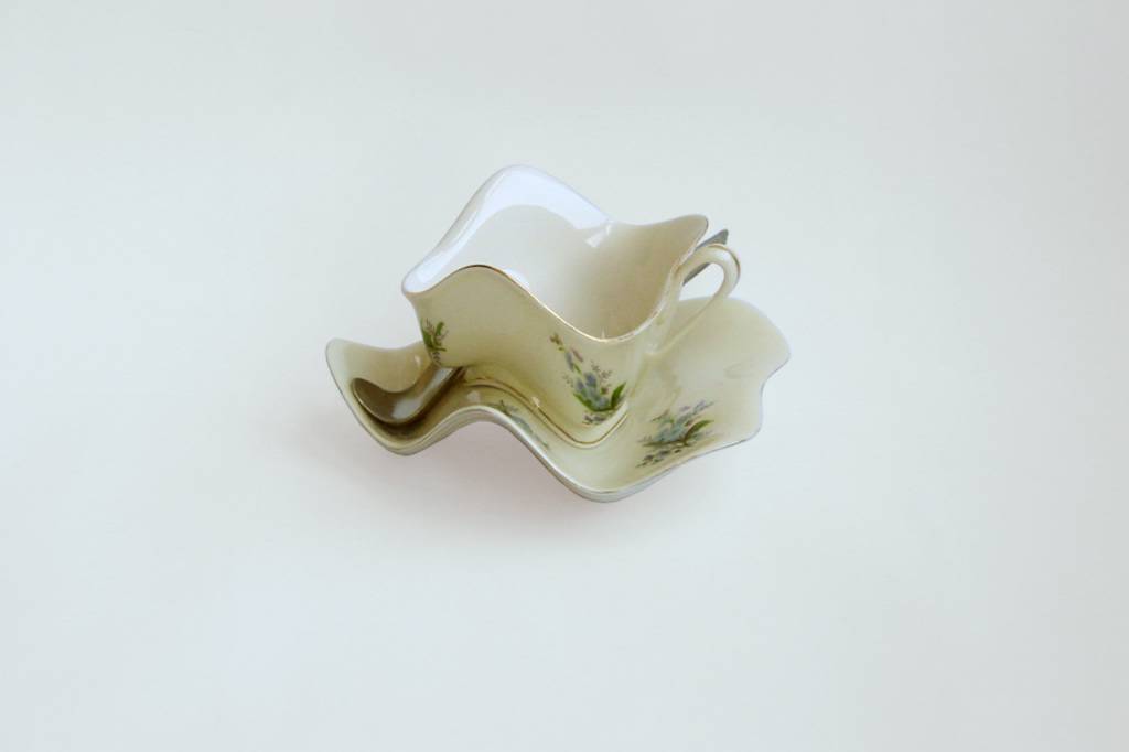
If there is a general mood or psychology of the objects, I’m interested in subjects or themes related to finality. The notion of memento mori is a genre within still life that I think these objects refer to. For instance, the teacup that I did for the Peter Norton Family Christmas project had forget-me-not flowers on it, which is a medieval signifier of remembrance. There was a chip sculpted into the cup itself and slightly worn gilding. In the color, I wanted to present a cup that looked like it had a slight patina of many teas and coffees. Those are the things I’m thinking about—giving the object a history of use.
So if there is a mood, I would say that hopefully it is melancholia. I think the goal is to embed those things into the work without it being overt or illustrative. That’s one of the most difficult things in developing the work.
When we think of melancholia or mourning, we typically go conceptually to a place of narrative—why is that the state, what led up to it, what has caused it? But your works don’t seem to function in a narrative manner. We as viewers don’t want to engage with them and ask “Why?” or “How?” or “What happened?”
That’s an important idea for me—to eliminate narrative from the work. It’s something I’m always thinking about because sometimes narrative does present itself in a slightly abstract way, and it’s something I’m always trying to push out of the work. I find that there’s something about a matter-of-fact quality that I’m very interested in. I don’t know whether that has something to do with my interest in the notion of anonymity. The idea that something can be presented without any kind of opinion or overt voice is compelling. It’s something that lends itself to the idea of the contemplative object—a kind of void for the viewer to fall into. That’s the kind of interaction I’m interested in creating between the viewer and the object.
 You’ve talked about some of the practical constraints you face when you’re making new work—the cost of rapid prototyping, the cost of materials. But I don’t know if most people know that your work is done in multiples and that cost is one of the considerations in your decision to work in this manner.
That’s true. For the most part, my edition number for a standard-sized object is a multiple of six with one or two artist proofs. For a larger piece, it’s an edition of three with one artist proof. A couple of pieces I’ve made in an edition of ten with one artist proof.
There are really two reasons for that. One of them is a practical function. Because the expense is so great in the initial design and production, I need to spread that cost out to make the works affordable.
The second reason, maybe this is also practical, is that I like the idea of there being several versions in various places, instead of just one. Over time things get lost or broken or destroyed. Maybe this goes back to my years at the Met, when I was looking at what’s around, what’s not around, what’s missing. It’s having a sense of how things live in our world and get lost and don’t exist anymore. So to have six increases the chances that one will still be around in 500 years.
Speaking of work entering the marketplace, you have your first exhibition coming up at Deitch Projects. What are you planning to show?
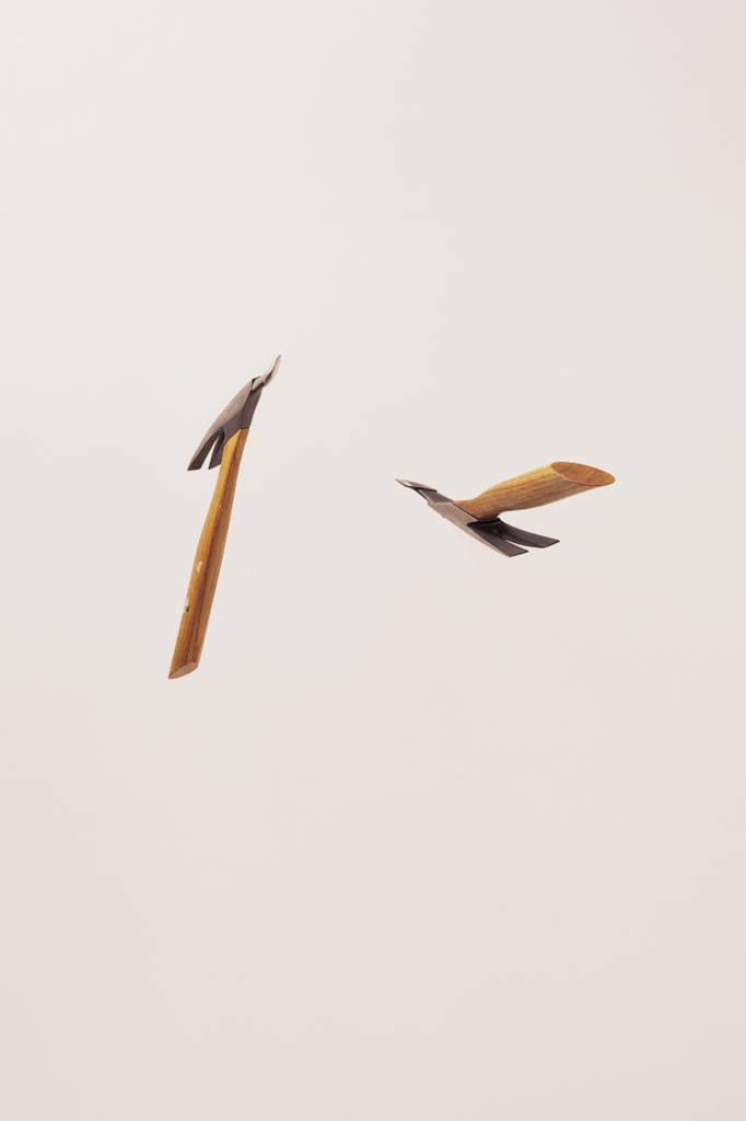
The works that we’re planning for that show are a series of four guns, based on .38 Smith & Wessons, a cluster of kitchen knives, and then quite a large sculpture that’s in the initial design stage that’s based on a section of subway track. The show will be in the fall of 2005, exact date to be determined.
Besides the Deitch show, how full is the work pipeline right now?
It’s pretty full. I was offered my second museum show by the Mint Museum in Charlotte, NC, for July 2005 where I’ll be working with curator Carla Hanzal. As envisioned now, it will be a survey of sculpture with some new work. And I will be having a solo works on paper show at Davidson College, working with director and curator Brad Thomas. That will be in January 2006.
Tuesday, November 02, 2004
Update on Artist Pension Trust
By the way, you've already voted today, right? Good. I thought so.
Discussion with Robert Lazzarini: Part 4 of 5
You’ve said that your sculptures are “items that slip toward their own demise.” It’s a poetic quote, but what exactly does that mean?
What I think that refers to is basically the temporality of the object which is something I deal with in slightly oblique ways conceptually. I’m thinking about the object as a still life object. I’m thinking about the object as having a used or worn surface. That brings up the idea of the historicity of the object which in turn suggests a finite lifespan of the object. Also I think physically what’s happening with the sculpture is that it becomes almost like a specter of the original object. That too suggests an elusiveness, temporality, or transiency. It’s oblique, but that’s what I’m talking about—the temporality of the object, and in some cases its obsolescence.
In many cases I don’t use objects that are brand new objects—like the rotary phone. The idea of choosing something that is a little dated is a way for me to be a little removed from the object, to have a little distance from it. Other than that, what it does is mark a specific time. From that point in time, we move on. But the object stays suspended in that time. There is the notion of obsolescence that comes up in the work—the rotary phone, the payphone, the .38 Smith & Wessons which were the guns of the police force for a hundred years but which are pretty much outmoded at this point.
 Do you pick objects from specific points in time when you are designing?
There are certain things I am trying to stay away from. I try to stay away from nostalgia, but I do like the fact that things have a certain patina of time on them. There’s also a similarity between the rotary phone and the .38 Smith & Wesson in that they were produced in such mass numbers that there is something ubiquitous about them. I’m also interested in the idea that something can be ever present. People stop seeing ubiquitous things – they are everywhere and nowhere at the same time.
But to go back to the idea of slippage, not only is it the temporality of the objects, but I’m also thinking about how the objects slip in relationship to the wall and also how the viewer slips in relationship to the object. That brings up issues of phenomenology and physical reactions to what I’m doing. That’s another sense of slippage.
Your work seems to be powered by a good deal of theory and philosophy from the second half of the twentieth century—issues of phenomenology, issues of the gaze, issues of simulacra, issues of perception. Is that a background that you’re bringing deliberately to your work and using to fuel your practice, or is it more the case that you’re part of your time and this is in the air that you’re breathing?
As far as the viewer is concerned, I want the work to be concerned with things that are of interest in our time. The theory, philosophy, and the science may be part of my investigation, but I’m more interested in the immediate relationship the viewer has with my objects, not with texts or sources. If those things are there, I’m interested in their larger meanings, not their specific references. I’m interested in how those ideas manifest themselves, not just the ideas for ideas’ sake.
Are you going out and deliberately grazing in the field of theory?
I would say similarly to the way that I use these three-dimensional CAD programs. I use them in a very superficial way and to my specific ends. I basically go out and hunt down what I need to find out in order to understand the things that I’m dealing with at any given moment. I don’t go beyond that.
It’s interesting that you draw the analogy to your use of CAD software. So many artists who use technology like this, or artists who deliberately use theory, produce work that becomes about the technology or about the theory. How do you end up getting beyond that? You take it in, but you don’t spit it back out.
My work is about transformation. I’m not illustrating any of these specific ideas. It’s in my best interest for this work to be layered in a very complex way so that it’s something that is consumable over a long period of time. For something to radiate out in many directions instead of in one direction is of much more interest to me.
I prefer the subtlety of that. I’m not interested in too linear connections to a specific source. It’s also a way of putting a lot of things into the work and then reducing it down. It’s a way for me to digest the world at large—from my experience living in New York, to larger questions of philosophy, to questions about optics, or science, or mathematics, or art history—and to compress it into this one thing.
Tomorrow we conclude the conversation by discussing the role of melancholia in Lazzarini’s work as well as some of the more mundane daily constraints that exert an influence on his craft.
Monday, November 01, 2004
Discussion with Robert Lazzarini: Part 3 of 5
.jpg) Let’s take a look at the skull you’ve brought with you today. What interests me about your work is that it’s recognizable, you can tell what the object is, but the objects resist the attempt to parse them visually. I can see that the object is distorted, but it gives me a sense of vertigo. I can’t grab and retain a focal point that will allow me to see how the distortion has been done. It all kind of slips away. I’m wondering if you can walk me through this skull, in a bit more analytical way, to show me how you’ve put it together.
Let’s take a look at the skull you’ve brought with you today. What interests me about your work is that it’s recognizable, you can tell what the object is, but the objects resist the attempt to parse them visually. I can see that the object is distorted, but it gives me a sense of vertigo. I can’t grab and retain a focal point that will allow me to see how the distortion has been done. It all kind of slips away. I’m wondering if you can walk me through this skull, in a bit more analytical way, to show me how you’ve put it together.
This is one of four skulls. Even though there’s no sequence to my series—there’s no progression—this is the second distortion. That’s how I identify it. This distortion is primarily a vertical distortion. People are familiar with the idea of anamorphism and accelerated perspective, but these are actually compound distortions. In X-Y-Z coordinates, there could be any number of things going on.
For instance, in this piece, in the Z coordinate there is an accelerated perspective tapering toward the top and a slight scale shift from front to back and then a slight skew with the front face heading down. And that’s just in the Z coordinate. There are several distortions through the X and Y coordinates as well.
So it’s not a single, consistent distortion across the whole object.
No. Well, it is a consistent distortion across the whole object. But those distortions are projected along different axes in the object, and they may be multiple. But it is always across the whole object. And that is the aesthetic of mathematical distortion where all the parts are relative to the whole. There is no distorting the jaw with any one single distortion without it effecting the very top of the cranium. But there may be eight distortions projected through the entire object.
But even though the works are all distorted, you’re actually using real materials, the exact materials of the original object.
Yes, as close as possible. I see the work as a certain type of realism. I see it as a fidelity to the actual object. The skulls are cast bone; they’re not carved from skulls. So there is a slight departure there. But for the most part I try to have the fidelity to the original material for the presence of the piece. I need a certain “realness” to exist in order to make the departures that I make in terms of the deformities.
There’s a contradiction in there. Your work is so much about artifice, but yet it’s so true to its materials.
Yes. And therein, hopefully, lies an oscillation. That gap—and it varies from piece to piece—is the thing that creates this kind of “activity” in the piece and, hopefully, draws the viewer in. It’s one of the mechanisms I use to give the piece a vitality.
Is that what you’re looking to do—create something that’s activated or vital that will engage the viewer?
Absolutely. I think the worst thing that could happen would be if someone would go into a room with one of my sculptures and just walk by it and not even acknowledge it. The piece needs to have a certain generosity in order to engage the viewer. There are a lot of things that I think about to make that happen, to draw in the viewer.
I’ve noticed that when your work is presented you’re often very controlling of the environment in which it is shown. What are you doing there?
Whether I call it an installation or not, it is an installation—either I’m putting my sculpture up on the wall and that’s it or I’m considering all the elements related to it. For me, it is imperative that I consider those elements because they are part of the environment in which the sculpture is being shown.
But there’s a difference between considering the environment—making sure the wall is clean and the work is lit—and doing some of the things that you’re doing. What are you doing when you’re designing an environment for your work to be shown?
I’m doing several things. It’s not dissimilar from making sure the wall is clean and making sure there is specific lighting. In my case the lighting is a whole other aspect of the work that I am pursuing—the notion of shadowless lighting and a certain foot-candle at a certain temperature.
All the decisions are deliberate decisions to control the experience. In many cases the decision is just to make sure that things are negated enough so that they are not competing with what’s going on in the sculpture. If the skulls are a study in white-on-white where there is a warm white skull on a cool white ground, to have a warm wooden floor is going to be a little bit of a problem.
The installation is really a tool to present the works. In a way it’s like trying to create a non-environment where everything else is essentially a backdrop to the sculpture.
Tomorrow we continue the discussion by taking a more theoretical turn.
![]()