Friday, October 29, 2004
Discussion with Robert Lazzarini: Part 2 of 5
Help me understand what happens between a couple of those steps. You’re working 2-D in Photoshop doing some distortion. You take the 3-D geometry of the object into the computer, and then do you try to reproduce the distortion you’ve made in 2-D in three dimensions?
Basically. But it becomes more complex by virtue of the fact that I’m no longer dealing with X-Y coordinates. I’m dealing with X-Y-Z coordinates. Now, dealing with geometry that occupies space, or that’s projected into space instead of a distortion that’s just linear, is much more complex. I approximate what I’ve achieved in the 2-D distortion, but it needs to go beyond that in its complexity.
So the Photoshop work is more of a sketch for what you eventually make.
Exactly. Also there’s something much more immediate about it. If I’m dealing with a series, I can do hundreds of designs. And that allows me to get a lot closer to where I’m heading with a particular image than if I was dealing directly with 3-D right from the start.
Once you’ve got the 3-D coordinates in the computer and you’ve distorted those in virtual space, how do you make the transition back to a physical space?
The process I use is called rapid prototyping or computer generated model-making. I work with different service bureaus that create physical models based on 3-D data. Some are reductive processes and others are additive processes. They either mill away at a block of material or they build it line by line in successive passes to create a geometry.
 And then how do you fabricate the object once you have the prototype complete?
Every object is different, and each object is a new material. Even when it’s the same material, it’s a different handling of it. They all have their complexities. With table, notebook, and pencil, some of the parts are milled but some of the parts are clamped-over tool parts which are rigid mold parts. I’m using a product called Compwood where they actually compress the wood so that the atoms fold over to give the wood a certain plasticity.
How do you find fabricators to work with all the different materials you use?
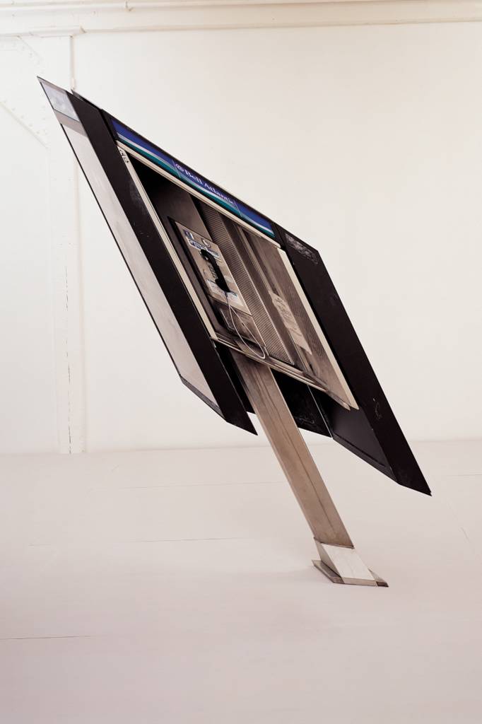
It’s an ongoing pursuit. And sometimes there are quite a few. In the case of payphone, I worked with about 45 different fabricators—from chromers and acid engravers to graphic designers, silk screeners, metal workers of varying types, anodizers, and a host of other people.
What’s that relationship like? When I think of industrial fabrication, I think of Donald Judd. He had his people who knew his vision, and they were able to execute.
It would be incredible to have a group of people realizing your vision. I’m not at that point. At the moment I have to be very hands on, from production to final finish.
But could you even work within that model if you’re using so many different fabricators for so many different kinds of materials?
Well, the thing to do is to have a studio manager who is so facile with such a range of materials and fabrication that he or she is able to access whatever specialties are needed at any given moment. But right now I need to understand all those things myself.
 Are you the one who puts all these components together at the end?
Yes. In many cases that’s the essence of it because I’m getting different parts made at different places. On something like payphone, I’ll work with someone specifically on the connectivity of those parts, but those are things that I’m overseeing. Although I would like to, I never hand something over to someone and ask them to take care of it based on a set of drawings. Inevitably, things come back to the studio to be finished. That is that handmade aspect of the process.
In the next installment, we take a close look at one of Lazzarini’s skulls to see exactly how the specific distortions were made.
Thursday, October 28, 2004
Discussion with Robert Lazzarini: Part 1 of 5
 Let’s start by talking about how your unique visual language developed. Your work reminds me of Warhol’s sculpture on acid. It’s very much the common object—it is what it is—but it’s melted or twisted or distorted. How did that approach develop?
Like many artists, the work developed over a long period of time from a lot of ideas, both formal and conceptual. To answer that question, I would really have to go back to where my first mature sculpture, violin, came from.
I started working on it in 1995-96 and completed it in 1997. At that time I was working at the Metropolitan Museum of Art. On my breaks and after work hours, I was going into the galleries and really trying to study the collection. For example I would spend six months in the medieval section or six months in the Rodin and nineteenth-century sculpture section, as well as other galleries. I was really trying to study the collection in depth.
One of the ways I was doing that was by bringing clay with me into the galleries and actually sculpting objects from the permanent collection. At the end of my lunch break I would have a handful of sculptures. It was a way for me to synthesize a lot of historical styles. At that point in my work I was developing this free-form distortion, and back in the studio, working back and forth between drawing and sculpture, I started to develop more of a mathematical distortion.
But where did the idea of distortion come from? How did you go from sculpting objects in the Met’s collection to distorting them?
There are two places where that came from—one formal, the other conceptual. Formally, I was bringing the things I had sculpted back to the studio, and it felt like I needed to transform them in some way. So I was making molds of them. Then I would tie up the molds in ways that would constrict them and then cast them. I was getting free-form distortions in the casts, and I would make variations based on the same mold. It was a way for me to develop a specific vocabulary.
Conceptually, and maybe this is a stretch, it was a way for me to synthesize all these historical styles. If you go along with the notion that all art is artifice, then it follows that all art movements are a type of distortion. Impressionism, for example, is a type of distortion. Mannerism is a more overt distortion, as is medieval art with its distended figures. Distortion was how I was working through all these different periods of art and seeing each style as a variation on the way that things actually are.
 You’ve just started talking about process. Let’s go with that. Take us down the path. Where does the idea for a new work come from, and what happens between that point and the point at which you have a finished product?
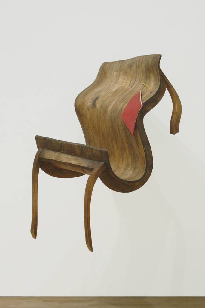
The idea can come from different places. I’ll give you an example. One of the subjects I work with is the genre of still life. When I did the series that I call studio objects—a chair, a rotary phone, and a set of hammers, all from my studio—I was approaching the idea of the studio thematically. I was interested in representing the studio as this place of prolonged isolation, where the objects become a projection of that isolation.
Once I choose the specific object, I begin the process which tends to vary from piece to piece.
I think of my work as a dense process. It involves a digital aspect, an industrial aspect, and a handmade aspect. In very abbreviated terms, there’s an initial design stage that starts off 2-D where I work in Photoshop and try to really exhaust the possibilities, at least at that stage, of what I’m trying to do with the object. If I’m working in a series such as the skulls, where I’m making variations on a specific object in a group of four, I’m thinking about a lot of different things: object as mark making, the expansion and contraction of the object, whether this is a representation of the object in the round. I try to exhaust those ideas two-dimensionally. I’m thinking about how the sculpture is going to function as an image before it gets to its plastic form.
Once I complete the 2-D design stage, I then need to get the virtual geometry of the object onto the computer. In the case of a complex organic form like the skull, it makes the most sense to laser scan the piece. A laser reads across the surface of the skull to capture its geometry. In the case of the guns, which I’m working with now, those parts were modeled based on measurements of the original gun: chamber, gun grip, and trigger. Those are two ways of bringing that information onto the computer as normative 3-D geometry.
Then there’s the 3-D design stage where I need the information of the object on my computer so that I can manipulate it and try to approximate where I’ve gone with the 2-D design. I may run through a hundred designs before I finalize one design and commit to that. In between that is a lot of model making, which (at the 3-D design stage) is completely necessary. Because I’m dealing with issues of spatial paradox, it is imperative that I have a physical model in my hand to fully understand the capacity of its geometry before I can finalize the design.
Once I finalize the design, a whole host of issues come up that are relative to the materials of the final piece.
Tomorrow, we go into more detail on the specifics of Lazzarini’s process.
Flags + Political Viewpoint + Eeewww = Public Art
Wednesday, October 27, 2004
"You Can't Be Taking Pictures"
Photoblogger Mike Epstein of Satan's Laundromat is quoted in the piece talking about a run-in he had with one of New York's finest for doing nothing more than pointing and shooting:
He said, "I don't care what the law says, you can't be taking pictures of train stations in this day and age. If you take any more pictures we'll haul you down and ask who you are."Epstein's response? He returned the next day to get the shots he wanted. Epstein hasn't been quite so fortunate in all his recent interactions with the NYPD.
Artnet Magazine's New RSS Feed
They Wouldn't Want You to Leave Hungry
As you probably expected, an institution with a $20 cover charge isn't going to be serving fast food. Danny Meyer, the New York restaurateur with the Midas touch, will be running all food concessions. Here are a few of the more tasty quotes from the article.
On the fit between the museum's holdings and the menus:
"The art and the food are utterly complementary," said Glenn D. Lowry, the museum's director. "The better the food, the more intense the museum experience."On the use of product placement in the restaurants' design:
The cost would have been more than a million dollars higher, but the Danish Consulate General in New York intervened, finding private funds to pay for showcasing Danish designers' wares in the museum and restaurants, including stainless steel cutlery and chairs by Arne Jacobsen.On the Neue Galerie/Cafe Sabarsky approach that Meyer has taken to one of the spaces:
"I see periodicals, caffeine, sugar, alcohol and a staff that makes you feel good," Mr. Meyer said.With all that good stuff, who needs art?
Tuesday, October 26, 2004
Take Two Martini Glasses and Call Me for a Second Mortgage
 Artnet has a roundup of the Damien Hirst Pharmacy sale, mentioned here a couple weeks ago. (For true market wonks and die-hard Hirst fans, complete sale results are available from Sotheby's.)
The tone for the sale was set with the first lot on the block--two martini glasses. Estimated at £50-70, the pair sold for £4,800 (roughly $8,800, including buyer's premium).
The auction total sale amount topped £11.1M, almost four times its high estimate. Artnet reports that Hirst bought the restaurant's fixtures from its receivers for £5,000 after the establishment folded. Not a bad ROI for Mr. YBA.
How did the two items I mentioned in my previous post do? The light fixture I liked went for £12,000 (three times its high estimate) while the five collages of matchbooks sold for between £14,400 and £16,800 (two to three times the high estimate). While I liked both pieces, I didn't like them nearly that much.
Monday, October 25, 2004
What's Your Style?
Sunday, October 24, 2004
Teaser
 I was privileged to spend a few hours this weekend with sculptor Robert Lazzarini whose exhibition last year at the Virginia Museum of Fine Arts was a critical and popular success.
Our discussion ranged over topics both lofty and practical. Lazzarini provided detailed insights into his process and the concepts that drive his work. We also talked about the more mundane daily challenges (such as the need to work within the constraints of a project's budget) that every working artist faces.
Lazzarini was incredibly generous with his time and in sharing details of what's currently happening in his studio as he prepares for an upcoming solo show at Deitch Projects. You'll be able to share in his generosity as highlights from the discussion run here over upcoming days.
Friday, October 22, 2004
Artforum vs. Vogue
For this essay, I was asked to compare and contrast two magazines called Artforum and Vogue. I found that these magazines are similar in some ways and different in others.
One magazine is about what’s in fashion with clothes. The other is about what’s in fashion with art. The Vogue magazine runs a lot of articles about Botox, which I think is something that freezes your forehead. Artforum publishes lots of articles that talk about Baudrillard which is also something that I think can freeze your head.
One of these two magazines runs a lot of photographs that have been digitally manipulated, but it tries to hide that fact. The other runs a lot of manipulated photos too, but the articles tell you why it’s important that the photographers changed their work. Lastly, in Artforum you can find pictures that John Currin has painted of his wife. In Vogue you can also find pictures of Mrs. Currin, but these ones have been made by someone named Marc Jacobs, not by Mr. Currin.
Those are the big differences. Now I’ll write about the similarities.
Both magazines have more ads than writing. In both cases that is probably a good thing because people buy the magazines mostly for the ads anyway. Both magazines run some articles between their ads, but in both magazines you probably won’t actually want to read the articles. In one magazine they are too dumb. In the other they are too smart. (That’s a difference, I guess, but I put it in the wrong part of this essay.)
Both these magazines have people they call “contributors” write their articles for them. They both run pictures and bios of the contributors at the front of the magazine, but if you want to find out who wrote an article that you actually read, chances are that the person won’t be listed in the contributors section. I don’t know why this is, but it’s true most of the time.
I have two more important similarities to write about now.
After reading both magazines you become unhappy with the things that you currently have. Both magazines make you want to buy more stuff, and the stuff they want you to buy is always really expensive, so you can’t really buy too much of it, and that makes you depressed. Sometimes you know you’re depressed about not being able to buy the stuff, but sometimes you don’t know it and you’re just kind of sad for what you think is no reason.
And, lastly, in both magazines the ads show you what is going to happen in the next month or so while the articles tell you what happened a while ago. If you wait for the magazines’ articles to tell you about what’s happening now you will miss it because it will already be over by then.
So, as I have demonstrated in this essay, Artforum and Vogue are pretty similar. But they are sometimes different too. But even when they’re different, they’re still mostly the same.
Thursday, October 21, 2004
Anti-Almanac: Critic on Critic Edition
In fact, an episode similar to [Douglas] Crimp’s transpired for Craig Owens, whose canonical essay “The Discourse of Others” recounts his initial blindness to sexual difference in Laurie Anderson’s 1979 Americans on the Move. . . . But why this blindness? Was Crimp’s queer eye eclipsed by the imperatives of institutional critique, and Owens’s feminism temporarily trumped by his role as poststructuralist? Were such critical identities not simultaneously habitable? Were considerations of identity and subjectivity seen as incompatible with more “rigorously” critical enterprises?
—Artforum, October 2004
Wednesday, October 20, 2004
Duty Calls, Blogging Stalls
Late last night I managed to miss the highway exit for my hotel, and I ended up crossing the river that separates Omaha, NE from Coucil Bluffs, IA. This little mistake turned an already interminable trip (thanks to a missed connection in Chicago) into an even longer one and made the week a six-state week instead of the five-state week it was supposed to be.
All this self-pity is my way of offering an excuse for the fact that there won't be much new content around these parts for the rest of the week. While I'm on hiatus over the next few days, you could spend a couple minutes getting familiar with Martin Bromirski's new Richmond, VA based art blog, ANABA.
Don't wander too far away, though. There's a multi-day feature in the works here for next week that promises to be quite trippy.
Tuesday, October 19, 2004
Hit and Miss in Hartford
The show officially closed on Sunday. I knew its run was over, but I figured I would be able to sweet talk my way in to see it while the works were coming down. As nicely as I asked, though, and as many names as I dropped, the staff wouldn't let me in to take even a quick peek at what was still hanging on the walls. Saying the work was too controversial to let anyone (even moi) in without oversight, a gallery staffer sent me packing without so much as an exhibition brochure.
No great loss. All the good stuff came down weeks ago, anyway. A Google search found me an image of the notorious Damien Loeb painting that got pulled from the show after it opened, as well as the 1990 Tina Barney photo that Loeb appropriated. Rumor is that two of the three brothers in the painting's foreground are now students at the University of Hartford where their father is a big donor. Oops. I'll bet that's the last show the gallery's director gets to install without sign-off from the development office.
Although I missed with the gallery, I did have another chance to see the Wilde Building that I referenced in a post last week. It's a shame to see it surrounded now by a golf course instead of the landscape it was designed to nestle in, but each viewing I have of the building convinces me more strongly of its value as an architectural treasure.
Monday, October 18, 2004
Open Studios Event in New York
The Elizabeth Foundation for the Arts Studio Center will be hosting an open studios event this coming Thursday evening, Saturday afternoon, and Sunday afternoon. The building, housing 110 studios, is located at 323 W. 39th St., between 8th and 9th Avenues. Seventy of the artists will be taking part in the event.
For details, including times and participating artists, see the full press release.
Saturday, October 16, 2004
Anti-Almanac
Der Mensch befindet sich in einer vom Zufall bestimmten Welt; mit einem Wort: seine Existenz ist ein Glucksspiel. Die Welt ist ein Gefahrenschauplatz; sie ist ungewiss, unstabil, auf unheimliche Weise unstabil; ihre Gefahren sind regellos, unbestandig, unvorhersehbar.(P.S. Yes, the remainder of the press release--just like the remainder of Dewey's oeuvre--was in English.)
--John Dewey
(P.P.S. For new readers, here's what the Anti-Almanac is.)
Friday, October 15, 2004
A Pretty Good Win for the Blogosphere
- Blog-based critics: 2+
- Critics for newspapers-of-record: 0
This week I get to induct two bloggers into the Flavin Exhibition Review Hall of Fame for avoiding "pretty" in their pieces and instead relying on adjectives of substance to describe the show. Here's the honor roll:
- Felix Salmon on his eponymous blog
- Excerpts from Tyler Green's Bloomberg News review posted on Modern Art Notes
With this post, I'm going to put this "pretty" business behind me before it gets out of hand. But I'm afraid it might be too late. Over here we've got Miguel Sanchez at Modern Kicks trying to salvage the word's reputation with a Stevie Smith poem (which, I have to admit, did make me reconsider my opinion of the word for a minute or two). And coming in via email this week was a note from a critic whose work I admire telling me that this is a pretty blog.
Thursday, October 14, 2004
Aw, Shucks
From the Floor is blushing to be included among the small group of blogs that Green calls "smarter and more interesting than virtually all major art magazines."
Here's what he didn't mention, though. By the time he got around to writing that line at the end of the essay, he had just about polished off the fifth of scotch he opened in his first paragraph. Don't believe me? Why else would his face be as red as it is in the photo that accompanies the piece?
Wednesday, October 13, 2004
My Second Wish
As I made clear earlier this week, I have no particular affection for either deconstruction or the political line held by The New Criterion's staff. But it's a shame to see the Journal allowing Kimball to publish this piece with them on this occasion. The opinion editors at the Journal, it seems, have been taking lessons in "fair and balanced" coverage from Fox News.
I was saying to my wife over dinner last night that if a genie popped out of a lantern and offered me three wishes I know what they would be. My first would be to appoint five justices to the Supreme Court. My second would be to rebuild the editorial board of the Journal.
My third? Three more wishes, of course.
Respect and the Forty Year Itch
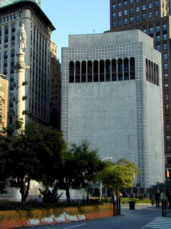 A couple weeks ago I came out of the subway at Columbus Circle and found myself looking up at Edward Durell Stone’s broadly despised 2 Columbus Circle. Even though I was in a hurry to make a stop before heading to the airport, I made myself pause to take a good look at the building because it’s not going to exist in its current state for much longer.
As I was standing there staring, a friend just happened to run into me. (OK, I admit it, a lot of people were running into me. This New Yorker was having an honest-to-goodness tourist moment in his hometown—standing there blocking the middle of a busy sidewalk, neck craned while gawking at the big buildings, dragging a suitcase on wheels behind him.) After we said our hellos, I asked her what she thought about the building. “I don’t know that I love it, but I remember when it went up,” she said. “It was the first building to acknowledge the Circle without turning its back on it.”
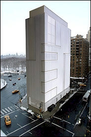 Built in 1964 by supermarket scion Huntington Hartford to house his alternative to the Museum of Modern Art, the building has become a site of controversy recently as its new tenant, the Museum of Arts and Design, plans to rebuild the façade, essentially turning the building into something completely different than what it is today.
Since it went up forty years ago, the building has always stirred strong responses from supporters and detractors. The fact that people have such passionate feelings about it indicates, to me, its success as a piece of architecture. The build is ugly, in an overworked, anachronistic sort of way. That’s what its detractors hate. That’s what I like.
In my view, the building has character like Tony Soprano has character. There's not another like it anywhere. You may not like it, but you recognize its power and originality. And you have to respect it. Not everyone shares my opinion, though.
There’s been enough written on the building, its place in architectural history, and its pros and cons that I don’t need to rehash that here. The new Times architecture critic, Nicolai Ouroussoff, ran a good recap on the controversy recently that summarizes the situation well. “Stone’s design,” he wrote, “and the people of this city, deserve more respect than this.”
Respect is exactly the problem here. Today 2 Columbus Circle is situated squarely in that preservation danger zone that I call the forty year itch. Every innovative object of art or design reaches a low point 40-50 years after its creation where it appears ugly, old, outdated, and in need of replacement. It’s too old to be new, and too new to be old. Styles have changed, and unless benign neglect or a passionate owner is involved, artfully designed objects tend to disappear during this window in time. People only realize the mistake later. I could list many examples, but think of the original Penn Station in New York, torn down 52 years after its construction.
More recently, American modernist and early post-modernist architectural works have started to fall into this 40-50 year danger zone. We’ve seen fights between preservationists and owners over what to do with buildings like Eero Saarinen’s TWA Terminal at JFK Airport and SOM’s under-appreciated masterpiece, the Wilde Building and corporate campus outside Hartford, CT (about which I may have more to say later this month if things go according to plan).
Although it has been listed on the National Trust for Historic Preservation’s 2004 List of 11 Most Endangered Historical Places, Stone’s 2 Columbus Circle doesn’t have the same level of support from architectural preservationists and advocates that Saarinen’s and Bunshaft’s buildings have had—primarily because the building isn’t universally appreciated by critics and practicing architects.
Should the building be re-clad with contemporary materials according to current plans, the neighborhood, the city, and American architectural history will suffer a loss. It won’t be one on the scale of Penn Station’s destruction, but it will be a loss nonetheless—a loss, ironically, caused by a lack of respect for the first building in its neighborhood to show respect for its site on Columbus Circle.
Tuesday, October 12, 2004
Our New Leaf
The problem is these magazines still print articles you have to read. And reading takes time. And it's a lot of work. So it made me really happy when I stumbled across this shortcut. Over at Dangerous Chunky, Carolyn provides a great summary of W's special October art issue. (That's W the fashion magazine, not W the President.)
If you spend 45 seconds reading her post, you won't have to spend 45 minutes reading the magazine. You can use that time to go shoe shopping instead. Or to read Gawker--if they ever manage to get their domain name back.
What Powers the Blogosphere
Here's how this little experiment worked. While you were reading your art blogs and very kindly filling out the art blog readers survey, From the Floor took two inbound links from Modern Art Notes on two consecutive days. (This experiment was so secret that Tyler Green didn't even know he was participating in it. My power to control other bloggers' posting behavior without their knowledge is very strong.)
Last Tuesday, this link referenced my discussion of corporate-museum partnerships with Petra Arends of The UBS Collection. On Wednesday, this link referenced my announcement of Tyler's new position as art critic for Bloomberg News.
Wednesday's hot link was on the words "Todd Gibson leaked the news." Tuesday's was on "discussing corporate art collections with UBS curator Petra Arends."
Among the same group of readers of the same site during the same time period, the gossipy "leaked the news" link generated approximately ten times more clicks-through than the more serious, issues-based link did.
Even though 63% of readers said in our readers survey that art world gossip is of little or no importance to them, gossip really is what drives site traffic. It's a well known fact in survey design that people don't admit to behavior that they exhibit but aren't proud of. This instance, I suppose, supports that point.
With this new understanding of your preferences, I'm considering taking this blog in a whole new direction--one inspired by Gawker's coverage of the arts.
So here are some examples of what you can expect to read much more of in the future on From the Floor:
- The Olsen twins show up at a Julian Schnabel opening
- Speculation about who's ratting on whom as museum board members are investigated for tax evasion
- Portraits by hip, young photographers of celebrity actors crying crocodile tears
- Coverage of opening receptions featuring cocaine use, puke on the floor, vandalism, and arrests
I think this new direction is going to be a big win-win for us: easier for me to write and more interesting for you to read.
So, let the fun begin! I'm hard at work on a post for tomorrow that features the skinny Olsen, Harvey Shipley Miller's drawing collection, lap dances, a prominent art critic, and an artist's studio in Brooklyn. I haven't figured out how, exactly, to stitch all these elements together, so if you have any ideas please drop me a line. Who knows, maybe I'll even work you into the post somehow if you have a brilliant insight that can make this combination work.
(Update: If you're trying to follow the Gawker links this morning and are getting a "This site is under construction and coming soon" message, Greg can tell you what's happening. Looks like Gawker has made just the sort of screw up that they love to drill other people for making.)
Monday, October 11, 2004
Art Blog Readers Survey Results
My blogging colleagues and I will be looking through the results over the next few days and weeks to develop a better understanding of who our readers are and why they read our blogs, but I did want to share a few preliminary findings with you.
- 85% of respondents find it important or very important that blogs provide content and perspective not available in the mainstream media
- 84% say that the opinion, perspective, and point of view provided by blogs are important or very important to them
- Painting, sculpture, photography, and drawing are the media that respondents report the most interest in reading about
- 84% of respondents are accessing the blogs they read directly via a web browser instead of using an online or desktop feed aggregator
- 76% of respondents report that they visit an art museum monthly, and 80% report visiting a commercial gallery monthly
- 59% of respondents say that they travel outside of their home area more than once a year specifically to see art
If we didn't know if before, we certainly do now. Our readers are intelligent, committed, and passionate about art. Thanks, to those of you who participated in the survey, for reminding us of that fact.
Why We're Called "From the Floor"
Please bear with me while I reminisce a bit.
When I was in graduate school, a senior professor in my department invited me to attend a seminar series he was organizing. The participants met every few weeks and focused on the development of modernism across art forms. Professors from different language departments (English, Spanish, and French) attended, as did representatives from the art and music departments. Every so often a historian joined us. Also in attendance at every session were some of my professor's buddies--the editors and critics of The New Criterion.
 Each session followed the same format. Hilton Kramer, editor of the journal, would lead small talk with the more reserved academics until everyone had arrived. (That's Kramer on the right in the photo.) On his cue, his alter-ego Roger Kimball (at left) would meticulously open a few bottles of cheap wine with a waiter's corkscrew. He would fill plastic cups halfway and pass them around the table.
One of the attendees would then give some prepared comments on his work--a recently published essay or a work in progress that we had all read--and the group would start discussion.
The art professor didn't say a thing all semester. At each meeting he sat leaning back in his chair, headphones draped around his neck, doodling mythical beasts in a sketch book. I always wondered why he bothered to come.
As the half glasses of wine were refilled, spirits rose. At each session, no matter what the topic, either Kimball or Kramer would inevitably bring the discussion around to a group rant on how politically correct academics and their partners-in-crime the deconstructionists were destroying the canon of western literature and culture. I don't remember Kimball using the word "rape" back then, but maybe I've repressed that part of the experience.
These meetings weren't about scholarship, and they weren't about art or literature. They were about the politics of aesthetics, but the participants never acknowledged that fact. The aesthetic beliefs they held in common were particularly reactionary, exclusionary, and (to me) offensive. I remember the occasional derogatory comment about a woman or minority artist or scholar bubbling up from beneath the tightly self-policed surface of their rhetoric after the wine bottles had been emptied. When I was invited to participate in the seminar for a second semester, I arranged to teach a course on the same night that it was held so that I had a reason to decline.
 At the same time that these reactionary morale building sessions were going on, Jacques Derrida was leading another seminar across campus. In the early 1990s, he did a well paid, four week residency at my university every fall before his classes started in Paris. I would see him on the street every so often, usually early in the morning, his short stature and head of thick, white hair marking him in the crowd. Students flocked to sign up for his class, even though after he left in October a lesser-known theoretician took over for the rest of the semester.
I remember that Derrida's subject during the semester I spent with The New Criterion crew was "the crypt." (This was during the period that he was working to resuscitate Paul de Man's reputation, trying to get at what was buried beneath the dishonorable tombstone created by de Man's recently discovered pro-Nazi writings.) I would overhear my student colleagues muttering about the hidden, the repressed, what was down there in the crypt and arguing about what Derrida had really said in class the night before.
To be honest, I think I got more out of my seminar with the shrill new criterions than they did from theirs with the name-brand theoretician. At least I learned how to use a waiter's corkscrew by watching Kimball work that mysterious device so masterfully. I'll bet they've all forgotten by now what was so important about Derrida's crypt.
Most learning we do comes from seeing others perform tasks well--like my learning to use a corkscrew from watching Kimball. We watch and then mimic their behavior. During this period of graduate study, though, I learned in another way--from negative examples.
Both my semester with the aesthetic fascists and my second-hand exposure to Derrida's hit-and-run pedagogy showed me the type of criticism I didn't want to write--criticism that was abstruse, that ignored its purported subject as it focused on its own process, that used works of art to further external political agendas, and that--frankly--no one wanted to read.
Kimball's diatribes and Derrida's dissembling showed me that I wanted to engage, really engage, with works of art. I wanted to look at them closely. To situate them firmly in the richness of their historical context. (If race, class, and gender were involved there, OK.) To ask what their creators were trying to do through their creations. To trace what happened once the works left their creators' hands and went out into the world on their own. And to understand how viewers related to these works in our age.
When I write about art today, I try to write about what happens when real viewers--naive or informed, curious or apathetic--take a moment to have an experience with an art object. That moment doesn't happen in books, academic journals, or on the web. That experience occurs when one person stands on the floor of a gallery, a museum, or someone's home and looks--really looks--at a work of art.
When writing for this blog, I try to remind myself of the importance of these experiences. Not many critics, and even fewer scholars, write from the floor anymore, and that's too bad. It's a good place to be. There's real feeling to be had there--passion and disappointment, both--and we could use more feeling in criticism today.
Friday, October 08, 2004
The Adjective that Must be Stopped
 I thought it was bad when Blake Gopnik, in his otherwise entertaining video review of the Dan Flavin exhibition, used the word six times to describe Flavin's work. (Yes, I watched his piece a second time and counted.)
But today's paper contains another, shorter review of the show by Michael O'Sullivan that uses the P-word twice to describe Flavin's work and once more in its adverbial form (which doesn't really count against him). But O'Sullivan does get a double demerit because all three instances occur in the same paragraph.
Let's all try not to use that word anymore when we describe Flavin's work (or anyone's work, for that matter), OK? If Michael Kimmelman can do it, so can the rest of us.
(Update: I just double-checked Kimmelman's review, and I was wrong. He makes reference to critical discussions in the 1960s about the "prettiness" of Flavin's art. New challenge: if any readers find a review of the show that doesn't use the P-word, send me a link and I'll give the reviewer a pat on the back in this space next week.)
Thursday, October 07, 2004
Radio Silence
Call it what you will, but it all means the same thing. No new material available.
I've got some deadlines pressing for the day job, so I won't have anything to post today. And maybe not tomorrow either. But I've got several ideas in the hopper that I hope to work out over the weekend to make next week an interesting one.
Since you don't have to spend five minutes reading fresh content on From the Floor today, why don't you invest that time in filling out the art blog readers survey? It's only available through Sunday, so you're running out of time if you haven't completed it yet.
Wednesday, October 06, 2004
Mr. Collector and His Curator Problems
I’ve visited Mr. Collector’s home before. The last time I was there, I was looking at a recent piece by a popular artist that, frankly, didn’t impress me. Mr. Collector snuck up behind me and said, “The first time I saw that I thought it was someone doing a bad imitation” of the artist in question. (Mr. Collector knows art and has a good eye.) I replied, “Well, what drew you to it? Why did you end up buying it?” Mr. Collector responded, “I didn’t. My curator did.” Then he walked away.
He doesn’t employ that curator anymore.
She may not have had the best eye for acquisitions, but that curator knew how to install a show. She anchored the home’s longest sight lines with showstoppers. She hung small, light-emitting pieces in dark corners. She successfully juxtaposed a grand with a tiny piece in the living room. The work was museum quality, but the apartment didn’t feel like a museum. I could picture myself living with art like that.
Mr. Collector’s current curator has recently reinstalled his home. In this year’s installation, Mr. Collector’s walls are, for the most part, crammed with masses of small works on paper. Photography predominates (some recent work, some vintage), but drawings make a solid showing too. Although there are a lot of them hung now, not many of the pieces have enough weight to stand on their own. As a whole, when installed in mass, the groupings don’t stand up well either.
The installation hung in the entryway, for example, mixes work by a 1920s photographer, a contemporary photographer, and photographers from several generations in between. A large number of German snapshots hang just around the corner—including one of someone’s seven-inch schlong laid out over a room-service tray with remnants of a morning meal still on it. (I don’t know if that particular photograph has a title, but Breakfast Sausage would be appropriate.) Ten non-descript drawings and prints hang clustered together on a short wall in another room.
For the installation, it seems, Mr. Collector’s curator has taken her inspiration from what Tyler Green calls the “scattertrash” approach to installation seen so much in Chelsea of late. Boiling it down, the approach works like this. You take a whole lot of different stuff, much of it cheap or junk (the “trash” part), and then you strew it around in great billowing piles without taking into consideration the space, the viewers’ experience, or really anything else at all (the “scatter” part). It’s grungy. Anti-aesthetic. Hipster. Farther downtown than downtown. It’s pure Williamsburg.
It’s also affected, boring, flat, and vapid.
Overall, Mr. Collector’s collection is both deep and broad. If you’ve gone to a museum show featuring contemporary art in the last decade, you’ve probably seen a piece that he owns because Mr. Collector is incredibly generous about sharing his collection by lending works to traveling shows. (He's also very kind about inviting people who don’t necessarily deserve the invitation—people like me—into his home.)
But for the next twelve months, traveling museum shows are the only places to see the best parts of his collection because Mr. Collector’s curator has scraped the bottom of the collection’s barrel and scattered that work all around his home. Mr. Collector’s curator isn’t going to let him live with his fabulous collection of art for the next year.
Maybe it’s time for Mr. Collector to find a new curator like he did after his old one bought the bad work I saw on my last visit. After all, the installation for this year is done now. It’s about time to bring on next year’s curator so she has some time to learn the collection for the fall 2005 installation.
Tuesday, October 05, 2004
Artnet to Add Gallery Sale Information to its Price Database
Auction sale results (which Artnet already has) are a matter of public record. The real trick is going to be to get dealers to provide Artnet with information about private transactions.
Having this information would be a boon to potential buyers evaluating the purchase of a work. But I can't imagine that gallerists or their clients are going to be eager to play along by providing purchase prices. I, for one, would be very uncomfortable about that. I would think twice before inviting guests into my home if I knew that with ten minutes of Internet research they would be able to figure out the exact value of what I have hanging on my walls.
It will be interesting to see if Artnet can actually bring this data to market.
While I'm on the topic of Artnet, can someone with connections there please ask them to re-redesign the interface and add XML feeds to their Magazine section.
Video Review of Dan Flavin Exhibition
On The Washington Post's website, Blake Gopnik presents a video review of the Dan Flavin exhibition that opened last weekend at the National Gallery. I've made positive mention of Gopnik's video pieces before, and this one is as solid as his others.
Sure I've got some quibbles. Gopnik could have used a thesaurus to find a synonym for "pretty," but overall I like the format and his presentation of Flavin's work. It's worth spening a couple minutes to check it out.
Take Two Hirsts and Call Me in the Morning
 On October 18, Sotheby's in London will be auctioning off the remnants of Pharmacy, the Damien Hirst designed bar and restaurant that closed last year. Lots in the sale include examples of most elements from Hirst's visual language: the butterfly paintings, the medicine cabinets, and the faux pharmaceutical packaging. Included, as well, are many of the restaurant's Hirst-designed fixtures (lighting, barstools, tables, etc.).
Most of the time, Hirst's work leaves me feeling apathetic. I just can't work up an interest in it. But the catalogue presents a few of his design elements for the restaurant that I find seductive.
 His Erlenmeyer flask-inspired light fixtures transform an industrial object into functional decor. The flasks survive the transformation intact, the reference to their former function remaining clear, and show Hirst's wit at its best without the pretention of most of his gallery pieces.
Hirst's collages of the 60 matchbooks he designed for Pharmacy also delight with the simplicity of their imagery, their tweaked and unnatural colors set against a clinically white background.
Browsing through Sotheby's catalogue, I was impressed by what a talented designer Hirst is. He has a knack for creating functional objects that draw a second look, that show an attention to detail, that have a sense of humor, that--frankly--are great design. It's a shame his art doesn't always work that well.
Monday, October 04, 2004
Impressions from an Afternoon in Chelsea
Overheard: Becky Smith of Bellwether standing in the middle of the Kirsten Hassenfeld show. "I've always thought of myself in the context of the zeitgeist." Uh, Becky. Short of embracing reincarnation, is there any other way?
I had been looking forward to the Sam Taylor-Wood show at Matthew Marks, but the work runs cold, dry, and artificial. There's no transcendence like in her last show with Marks.
 I made a new friend at a 20th St. gallery. Lulu was a little camera shy, but she let me snap this shot before retreating into the back room where she had important business to take care of with a rubber chew toy.
William Anthony collides zine style with an anxiety-of-influence theme to spoof everyone from Picasso and Bacon to Wesselman and Beecroft (and a few Old Masters to boot) at Dorfman Projects.
Blogosphere celebrity (an oxymoron?) sighting: James and Barry at Tenth Ave. and 21st St. The button gave them away.
At Ricco/Maresca, Bill Barminski shows a group of solid paintings that, as a special bonus, come prepackaged with their own critical discourse.
Finally, Ellen Gallagher knocks the ball out of the park at Gagosian in a space that usually only men with super-sized egos can fill well. Gallagher clearly loves material and process, and she marries that craft with a credible identity politic in this show.
Sunday, October 03, 2004
The MoMA Countdown Continues
Greg Allen posts on comments made recently by Terry Riley and Ann Temkin about the building and the new permanent collection installation. Greg has also been inside the building and gives some initial impressions.
The Times Magazine this weekend contains a feature-length piece about the new installation of MoMA's permanent collection. It goes into way more detail than any sane person would want to know, but it's an interesting skim and provides some insight into the new approach to telling the history of modernism that the institution will be using.
For those interested in the New York museum social statusphere, the Style section of this week's magazine is also of note. Tina Barney gives her WASP treatment to young New York art museum patrons, the "ladies [who] are the behind-the-scene movers and shakers, planning the parties, picking the art and making sure that the museums are as vibrant as the work that hangs on their walls." (And you thought those last two items fell into curators' job descriptions, didn't you?) What I really want to know after browsing through the spread is how Lisa Anastos gets her teeth that white.
(Update: As usual, Gawker is not nearly as nice as I am.)
Saturday, October 02, 2004
And the Verdict Is....
I got it half right in the prediction I made yesterday. It's the same old stuff, but with about the same amount of advertising.
The visual arts are featured in three pieces: a preview of a Met exhibition of Chinese antiquities, a close reading of a seventeenth-century Indian watercolor, and an appreciation of some pictures of Marilyn Monroe in the current exhibition of Life magazine photographs on view at the ICP. None of the Times's marquee critics makes an appearance in the section. As usual, the Sunday visual arts coverage is perfectly pitched to an affluent, suburban, AARP readership.
The close reading is an interesting idea, but it's quickly going to go stale if it's planned as a regular feature--especially if the Times is going to include another one in the magazine regularly like it does this weekend. Has the Times discovered close reading all of a sudden? And is this the big breakthrough they are bringing to arts and cultural coverage? Slow that bus down! Don't know if I can hang on.
If it weren't for a few new typefaces in the section and a new page of Choire Sicha's picks for each day of the upcoming week, I wouldn't have been able to tell that anything was different.
Friday, October 01, 2004
Art Blog Readers Survey Reminder
If you haven't seen it yet, I would encourage you to take a look at the post Franklin Einspruch made at Artblog.net when he asked his readers to participate in the survey. Franklin isn't so concerned with what his readers want to see on his site. He's participating for a completely different reason, and it's an interesting one.
Thanks, again, to those of you who have already completed the survey.
SOS, BMA?
I've been snarky about visual arts coverage lately in the Times, and I was hoping for good things from the remake. After looking through today's teaser, though, I'm not so sure we're in for any change.
The center two pages contain headshots and blurbs to introduce the paper's 26 critics, what it bills as "an extraordinary gathering of brilliant cultural commentators." Instead of providing additional coverage for the visual arts, the Times has kept the status quo in this field: Cotter, Kimmelman, and Smith.
I honestly hope I'm wrong about this, but here's my prediction. This long awaited, highly billed remake is going to give us the Same Old Stuff, But with More Advertising.
That said, things aren't hopeless. Browse on over there now to take a look at Michael Kimmelman's review of the Dan Flavin exhibition opening at the National Gallery this weekend. It's a nice piece on an artist who sits strongly in Kimmelman's sweet spot.
My Discussion with Petra Arends Concludes
Today we conclude my discussion with the Corporate Executive of the UBS Art Collection, Petra Arends. (The previous entry from our discussion is available here.)
In recent years, the issue of fiscal accountability and responsibility has become more of a concern for large corporations. With the focus on maximizing shareholder value, activity-based costing, and micro-measuring return on investment, how does UBS justify its investment in the arts?
Public cultural institutions are increasingly subject to enormous pressure and can no longer do the work of providing a place for culture on their own. The governments do not have a lot of money to acquire art any longer.
We believe that it is part of our cultural commitment to support and invest in parts of our culture, in the arts. And we are ready to give that back to our community. We do believe that it is our duty as a global corporate player to show a cultural commitment and give back to the community.
Corporate collections are often started by a senior executive who has an interest in the arts. Once a collection is up and running, and is part of an organization’s corporate culture, how do you retain support for it among the staff and the group of executives who have funding authority over it?
In former times it was more or less driven by the former CEO in the US. Of course, here in Europe there was a kind of committee that bought art.
What we have done now is, in a very long process, put these two collections together. The outcome is a wonderful, really great contemporary art collection. The more people are involved (and we involved a lot of people—including the whole group executive board in order to get their green light for proceeding with these collections), the more people see the outcomes of the merger, with the art as well, the more people are excited about it.
A lot of employees really see that this is a wonderful effort. They are all thrilled about it. Actually The Collection has great support from everybody in the company.
I imagine that the web museum will be another tool for building support for the collection.
The web museum is a very good tool. When we started it, nobody knew about The UBS Art Collection. Even people who saw the art works didn’t know what belonged in The Collection. Is it the art at 1285 Avenue of the Americas on the 13th floor? Is it the art that is hanging in my office? So we decided to concentrate on the web museum.
We will bring The Collection to everybody through the web museum, and we will curate shows at least twice a year so that people can get informed about The Collection. This is indeed a tool that we believe will drive the whole process to another level.
When will the web museum be complete?
It will launch on December 1, one day before Art Basel Miami Beach.
Will people outside the organization have the same access to it as employees have?
Exactly the same content will be available from our Intranet and from the Internet.
Next February Contemporary Voices: Works from the UBS Art Collection will open at the Museum of Modern Art in New York. (The exhibition will run February 4 through April 25, 2005.) The show consists of 72 works—44 of which UBS has donated to MoMA. What drove the decision to make such a generous donation?
What drove the decision to make the donation? It’s what I mentioned earlier. We do believe that it is part of our commitment to culture to give back to the community. The decision to give it to what I would say is the leading museum of contemporary art was an easy one. We also have a longstanding relationship with MoMA, and that was another reason.
Now we will have this wonderful exhibition.
Is there anything interesting about the show that we should be prepared to see?
I can’t give you any details about how it will be exhibited. I believe it’s too early to highlight anything in the show. It will be curated by Ann Temkin from MoMA, and she is still putting the concept together. But, as the name says, it’s contemporary voices. It’s an overview of important pieces from The UBS Art Collection.
Can you share names of any artists who will be included in the show?
Sure.
Joseph Beuys, Robert Rauschenberg, Claes Oldenburg, Andy Warhol, Roy Lichtenstein, Gerhard Richter, Dan Flavin, Ed Rushca, Donald Judd, Agnes Martin, Philip Guston, Blinky Palermo, Brice Marden, Robert Ryman, Elizabeth Murray, David Salle, Anselm Kiefer, Chuck Close, Jasper Johns, Bill Jensen, Cy Twombly, Willem de Kooning, Francesco Clemente, Bruce Nauman, Richard Diebenkorn, Cindy Sherman, Susan Rothenberg, Sigmar Polke, Tony Craig, Terry Winters, Lucien Freud, Richard Long, Frank Stella, Christopher Wool, Kiki Smith, Damien Hirst.
It’s an outstanding collection, you’ll see.
To conclude, what are the top five issues on your mind as the executive in charge of the UBS Art Collection?
- Maintaining the high level of quality, not only of the art but also of all the other activities we participate in—the advisory board, the curatorial decisions, and our global approach.
- Keeping The Collection fresh and meaningful as the nature of contemporary art changes.
- Keeping a collection of this size relevant will continue to be a challenge.
- Taking it off the walls and sharing it globally is a challenge.
- Last, but not least, developing the online museum: developing the content, managing all the legal requirements of putting art online and making it a unique experience for the art world, our employees, and our clients. I’m personally really excited about it. I can’t wait to tell people about it. It’s a great opportunity for UBS in general, and for me it’s special.
![]()